2014
15.11.13 - 30.3.14
Review: The Subtle Knife, Sara Barker and Ryder Architecture
BALTIC, Gateshead
by lUCY moSS
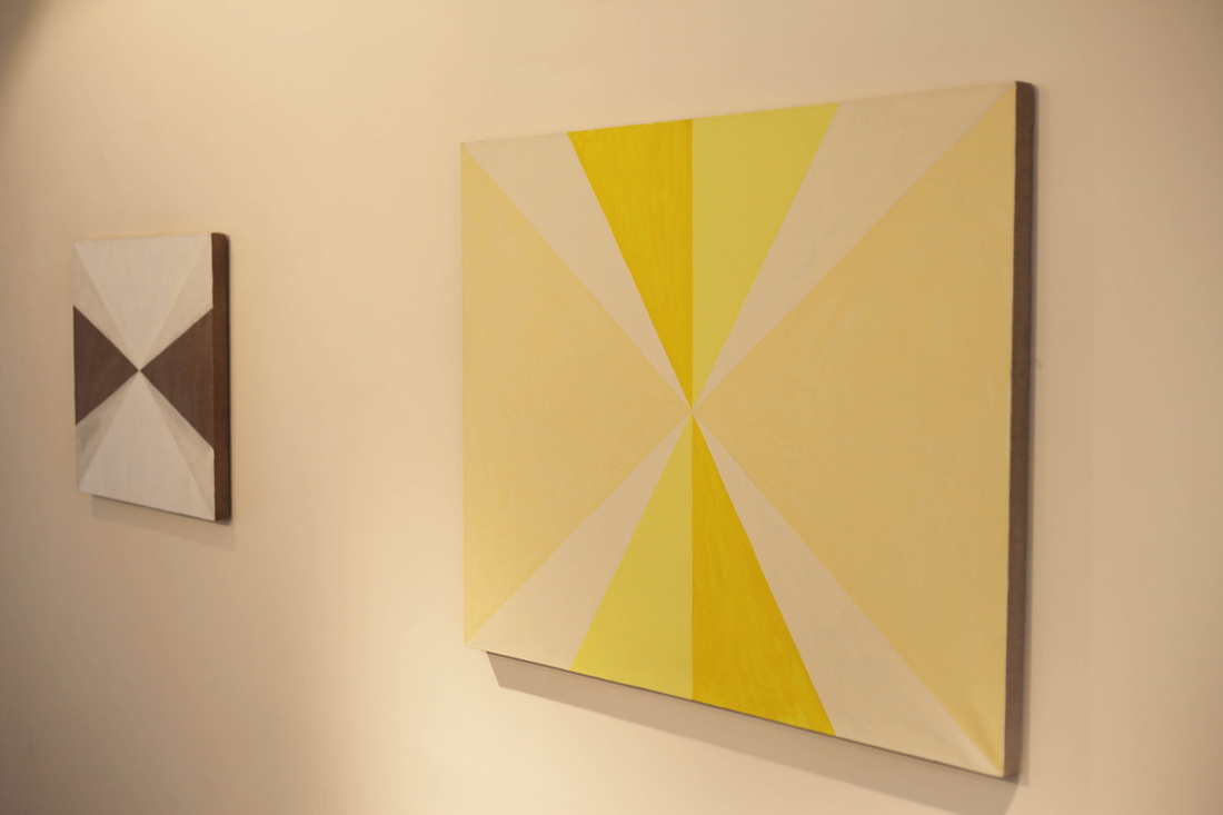
The Subtle Knife is the product of a collaboration between artist Sara Barker and Ryder architecture. The sculpture doesn’t quite fit into the material world; the glass and air within the structure create strong awareness of absence. The sense of the there and the not, wavers midway between echoed mirror images and disorientating transparency. It is similar, in a way, to how buildings act: while designed to appear as solid, immoveable sentinels, their insides are hollowed out. The real nature of a building is a empty, concealed behind a sheer façade, which is often little more than a shimmering boundary of half inch glass.
The Subtle Knife itself seems to lie halfway between being and not being; the forms it’s linear structures seem to reference melt away smoothly, fractured by their own reflection. These edifices are entities of space as much as material; both are only truly formed at their boundaries.
The work possesses a wealth of historical references and ‘mythological’ lineages, due to the structure being comprised of four contexts; the sculpture itself, its title, Sara Barker’s previous work and Ryder architecture’s own portfolio of buildings. These histories stretch into an intricate web that allows the piece to inhabit not only a physical space but a notional one as well. The sculpture thrives independently from these immaterial touches; it isn’t essential that these ideas are easily perceived by the viewer. However, they do allow it to exist within different contextual 'worlds', cutting through the boundary of the physical into the immaterial, very much like its name sake. The title refers to the literary creation by author Phillip Pullman, whose novel The Subtle Knife, (the second book in the His Dark Materials trilogy), describes a fantastical knife that can cut through any material, including the skin between parallel worlds. A blade so subtle that the edge melts away before vision, a swirling oil spill of, '…bruise purples and sea blues…' (Pullman, 1997), shimmering into being upon its tempered length, ‘If there was such a thing as shadow-coloured it would be the blade of the subtle knife…’(Ibid). These elusive tones are brought into being in the delicate shades that illuminate Sara's aluminium geometries, so delicately painted, imbuing the thick metal bands with a tenuous density.
The title as much as anything else alludes to the possibility of reference; it tells us this is a work that encourages our imagination. Like previous works by Barker it draws in surrounding concepts and histories, art history especially, turning painting's preoccupation with object on its head. The painted sections in this piece are taken off their grounds and turned into 3D objects, like a sort of expanded cubism. It’s a kind of ironic extension of lateral thinking, which shows a desire to both create and destroy the surface of the painting. While the cubists and futurists tried to create a pseudo-literal interpretation of the world (and the third dimension) on the flat plane, Barker evokes the 2D using the 3D. This subtle engagement with cubism, and other allusions to painting practices, especially her constant engagement with negative space, allows her pieces become very much about what they appear to leave out. It is the bits that are not there which define them. This leaves you feeling fairly free to impose fleeting ideas upon the sculpture.
Many of Barker’s actions and choices are open to interpretation, it is refreshing that Barker is obviously not precious about driving home a message. Skipping around content and context, it scraps the middle to focus on the peripheries. Physically, often the aluminium is scored and cut, shaped and welded, making edges out of edges. Each strip starting out as a sheet of metal is then altered and adorned with these subtle hues.
Perhaps it is due to the vague allusion to Cubism that the collaboration took place between Barker and Ryder architecture, a company with their own roots in Le Corbusian architecture. Ryder has a history of innovative collaboration within various artistic disciplines. Treading lightly around the boundary between form and function, creating a diverse array of architectural and artistic constructions.
The structure itself is a departure for both parties. It could almost act like a building, the gallery walls as its horizon, the ceiling its sky. Yawning upwards, its scale is much more in line with Ryder's aesthetic, and it’s materials slightly more substantial than Sara's usual work. For Ryder it's a building within a building, they constructed both the space and the structure inside. The new walls stretch right up to the ceiling, complementing the sculpture far better than the previous interior could have allowed. But it shouldn’t be thought of as some sort of oversized maquette, it never reveals any architectural inclination, and grows to be less a thing of exterior, as it is of interior. Paradoxically perhaps, it has no interior, the spaces it almost seem to enclose are never truly confined and meander off to create new never-w[h]ere’s. After a brief promise of safety within the metal shell, inside is left bleeding into the outside. Copper and brass, cleave through glass, shooting off, to come back in thin solitary lines and the hashed strokes of a music stave. Behaving a bit like the exploded view of a suspension bridge or, perhaps, becoming the outline of an invisible structure.
Alternately, it could be viewed as the structure of an event. As Kandinsky compressed a length of music into a single moment, this piece nods towards the idea of happening, happened. This sculpture allows us to move around it, and surprises us by moving with us. No image can be stationary caught up between all that glass; sheer sheets snaking through the structure, playing the devil’s advocate. Presenting us with fantastic hyperrealities, then turning tempestuously blank, contrarily negating negative space by being at once there, and not. It might be thick enough to slice cruelly through the marble like slabs, (I imagine them being settled on top of the blocks at some point previously, weight slowly sinking through the density like a scalpel blade rested precariously on the surface of lukewarm butter), below but the density is constantly annulled, as it is suddenly whisked away, invisible ice melting, by the turn of the head. These reflections are ghost worlds, you can look at them, almost sure that you could reach out and touch them, but it’s as insubstantial as a daydream. Like the plaintive whispers from the world of the dead from the Pullman novel, these spectres seem to hold some material presence in the world, yet disappear like air the minute you reach out to hold them. What exists is not solidity. What exists is as much a reality as a sky viewed in the surface of a pool would be. Bridging the gap between worlds as we see a parallel dimension sitting improbably in the sky.
Pullman, P. (1997) The Subtle Knife, London: Scholastic
https://www.balticmill.com/whats-on/exhibitions/detail/sara-barker--ryder-architecture
Lucy Moss is currently in her final year studying Fine Art at Northumbria University
11.1.14 - 15.3.14
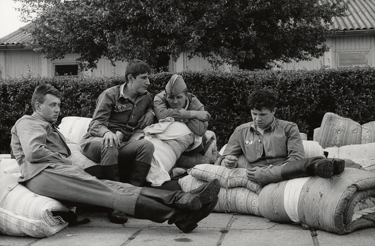
In 1982 Jindřich Štreit was handcuffed and brought to prison. His negatives, photographs, and darkroom equipment were seized. The Prague exhibition he was participating in was shut down by the police, and he was ordered to never photograph again. While in prison, Štreit lost his job as a teacher. His crime: photographing a local Communist Party meeting where members had fallen asleep.
|
Jindřich Štreit (c1985) Sovinec ©Jindřich Štreit
|
Stiff legal consequences were common in the communist era of Czechoslovakia. Maintaining the image of a healthy and prosperous communist state required fire hoses of propaganda. Štreit's photograph, however small a gesture, was enough to undermine the facade. When he was released from prison, Štreit was under the supervision of the State Security Service. Despite his ban, Štreit defied the government and continued making images.
In 1988 Amber Film & Photography Collective (Side Gallery, Side Cinema, and Amber Films in Newcastle upon Tyne) photographer Richard Grassick attended a workshop at Gallery 4 in Cheb, Czechoslovakia. While walking around the gallery, he saw Jindřich Štreit's photographs. Grassick resolved to find and invite Štreit to Newcastle upon Tyne. While preparations were being made to bring Eastern artists including Štreit to the Side Gallery, the Soviet Union collapsed, and the world watched as the people of East and West Berlin tore down the Wall. After the revolution, Štreit and the other international photographers successfully made it to Newcastle, and exhibited at Side Gallery. Fast forward to today, and the Side Gallery exhibition attempts to resurrect the communist drama.
In 1988 Amber Film & Photography Collective (Side Gallery, Side Cinema, and Amber Films in Newcastle upon Tyne) photographer Richard Grassick attended a workshop at Gallery 4 in Cheb, Czechoslovakia. While walking around the gallery, he saw Jindřich Štreit's photographs. Grassick resolved to find and invite Štreit to Newcastle upon Tyne. While preparations were being made to bring Eastern artists including Štreit to the Side Gallery, the Soviet Union collapsed, and the world watched as the people of East and West Berlin tore down the Wall. After the revolution, Štreit and the other international photographers successfully made it to Newcastle, and exhibited at Side Gallery. Fast forward to today, and the Side Gallery exhibition attempts to resurrect the communist drama.
Dana Kyndrová The withdrawal of Soviet troops from Czechoslovakia (1991)
|
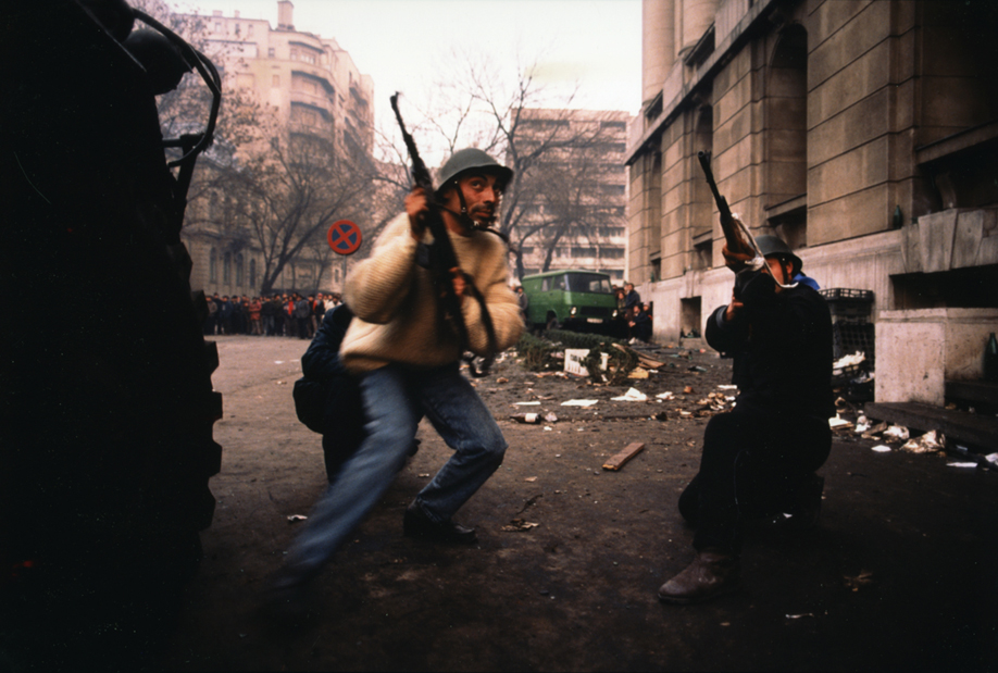
Paul Lowe (December 23rd 1989) Revolutionary militiamen shoot at Securitate snipers. Bucharest, Romania
|
All That Falls, the current exhibition at the Side Gallery, is the first of three Eurovision exhibitions marking the fall of the Berlin Wall. The photographs and films are pulled from the archives of the AmberSide Collection, and include the works of Mark Power, Paul Lowe, Dana Kyndrová, and Jindřich Štreit.
Side Gallery is located in a small lane, (the Side), at the bottom of Dean Street near the Quayside of Newcastle. When it's open, a sandwich board at the head of the lane advertises the current exhibition. The hidden location of the gallery is a poignant reflection of their mission to document working class and marginalised communities. The work shown is often strong and moving. Unfortunately, the interior of the gallery does not match the power of the pictures. Amber has a rich history, and a white cube space would not be appropriate, but neither is the gallery's current aesthetic. The wooden stairs to the top floor bend and twist, and the furniture is dated. This is likely a budgetary issue, rather than an oversight. Luckily, Amber recently received a large development grant from the Heritage Lottery Fund. After nearly half a century in operation, they deserve it.
Side Gallery is located in a small lane, (the Side), at the bottom of Dean Street near the Quayside of Newcastle. When it's open, a sandwich board at the head of the lane advertises the current exhibition. The hidden location of the gallery is a poignant reflection of their mission to document working class and marginalised communities. The work shown is often strong and moving. Unfortunately, the interior of the gallery does not match the power of the pictures. Amber has a rich history, and a white cube space would not be appropriate, but neither is the gallery's current aesthetic. The wooden stairs to the top floor bend and twist, and the furniture is dated. This is likely a budgetary issue, rather than an oversight. Luckily, Amber recently received a large development grant from the Heritage Lottery Fund. After nearly half a century in operation, they deserve it.
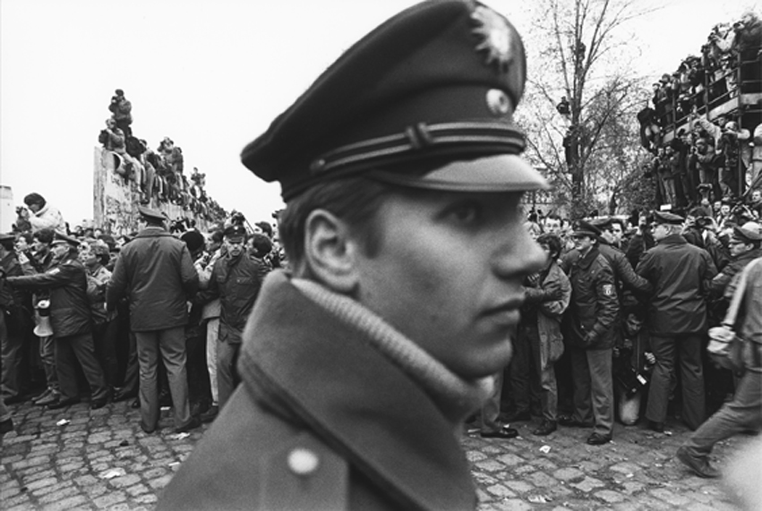
Mark Power (Potsdammerplatz, West Berlin, 11th November 1989) East Germans pour through after a section of the wall is demolished ©Mark Power
The photographs in the exhibition are strongly composed and emotive, yet at times I found the curation of the works a slightly illogical. Rather than one coherent exhibition, there seems to be four exhibitions taking place at the same time. On the bottom floor, one series is headed with "GLIMPSES OF CHANGE IN THE EAST, 1989 / BERLIN WALL and POLAND, Mark Power + ROMANIAN REVOLUTION, Paul Lowe." On the other side of the room there is THE RUSSIANS, Dana Kyndrová." On the top floor of the gallery, there is "SOVINEC by Jindřich Štreit," and "UNCLEAR FAMILY, Dana Kyndrová / Crook, County Durham + Luby, Cheb County." There are photographs from Germany, Poland, Romania, Russia, Czechoslovakia, and County Durham. It took me several readings of the exhibition text to connect the dots. I've come to understand that the photographs are linked through exhibition and workshop connections from the late 1980s and early 1990s. This may have been ascertained quickly by those familiar with the Side Gallery, but the curious and at times disconnected curation left me conflicted on departure.
Regardless of the organization, these interesting and powerful images are worth seeing. The effect of communism and the Soviet realm of influence cannot be understated or forgotten. At the Side Gallery you will see vignettes of the many struggles and stories.
All That Falls is open until the 15th of March, 2014 at the Side Gallery in Newcastle upon Tyne. For information on the side gallery, and event coinciding with the exhibition visit http://www.amber-online.com/sections/side-gallery.
William Flynn is an American artist currently based in Newcastle upon Tyne. He is a student at Newcastle University in the Master of Fine Arts program. He is the founder ofwww.photistoric.com, a website that showcases historic prints and photography. You can find out more about his artwork at www.william-flynn.com.
22.11.13 – 2.3.14
Review: Salla Tykkä, The Palace
BALTIC, Gateshead
By Stuart Burke
|
Finnish artist Salla Tykkä’s The Palace is new exhibition at BALTIC, showcasing a trilogy of her films; Airs Above the Ground (2010), Giant (2013) and Victoria (2008). As you enter the room you find yourself consumed by the vast space that houses three large screens, the rest of the space filled with darkness. The screens are laid out in a kind of arc, a formation not unlike a cul-de-sac of skyscrapers, containing and intimidating the audience. These screens impose themselves upon the audience, filling their vision and personal space, eliminating the gap between art and spectator. This bond of audience and art causes the films, on their large arresting screens, to possess a soft intimacy beneath their apparently overbearing scale, enveloping the audience totally. |
|
Each screen is assigned its own film, all played in a looped sequence, allowing you the time to view each one on an individual level, with no distractions within the blackness of the gallery space. You feel as though it is just you and the work in there, a personal encounter of sorts.
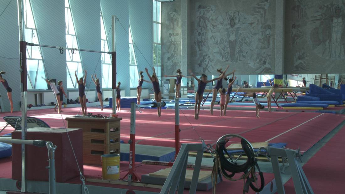
Numerous themes run throughout the films, however, the one most notable and prevalent through all three being the colour white. Airs Above the Ground depicts a Lipizzan horse going through a variety of dressage training manoeuvres. Lipizzan horses, throughout their lives, progressively become lighter until there are pure white. The giant water lily shown blossoming in Victoria begins as a white flower and, as the film records its short existence, slowly transforms into a bold red-pink colour just before it closes and dies. The third film Giant, is shown for the first time at BALTIC, and documents the culture and training programme of two Romanian Gymnastic boarding schools; showing archive footage, Tykkä’s own film footage and recordings of her interviews with some of the gymnasts. The costumes of the Romanian gymnasts traditionally consisted of white leotards, linking all three films together by a hue.
On top of this, human control and oppression are dominant and pressing themes in all three films; there is a sense of people wanting to tame and manipulate everything. Airs above the Ground and Giant both document the taming of performance animals/other people in order to represent a cultures ideals; the Lipizzan horse performing the dressage manoeuvres and the gymnasts training for their events, all controlled by a trainer/coach trying to tame them, control their every action. Tykkä contrasts the idea of control in Airs Above the Ground by cutting to roaming horses galloping through vast, open plains, yet even these moments it transpires are part of the horse’s training. Any oppression or human control is less explicit in Victoria, of course the giant water lily conducting a natural process isn’t being dictated by some kind of human persuasion. However, it is the hidden connotations of the water lily which connect it again to the other two films. It is a symbol and reminder of the European colonialism during the 19th Century, which is hidden behind the beauty of the lily, its tranquil appearance obscures the reality of the way in which this lily was snatched from it’s native home in the Amazon. Not only are there symbolic notations in Victoria of the human condition trying to control all, but the film’s mannerisms and own context contribute towards this understanding. The lily we see was not filmed in its natural habitat, but in the Botanical Gardens in Helsinki. A manmade greenhouse with an artificial environment is what encouraged this exotic plant to undergo its ‘natural’ process.
On top of this, human control and oppression are dominant and pressing themes in all three films; there is a sense of people wanting to tame and manipulate everything. Airs above the Ground and Giant both document the taming of performance animals/other people in order to represent a cultures ideals; the Lipizzan horse performing the dressage manoeuvres and the gymnasts training for their events, all controlled by a trainer/coach trying to tame them, control their every action. Tykkä contrasts the idea of control in Airs Above the Ground by cutting to roaming horses galloping through vast, open plains, yet even these moments it transpires are part of the horse’s training. Any oppression or human control is less explicit in Victoria, of course the giant water lily conducting a natural process isn’t being dictated by some kind of human persuasion. However, it is the hidden connotations of the water lily which connect it again to the other two films. It is a symbol and reminder of the European colonialism during the 19th Century, which is hidden behind the beauty of the lily, its tranquil appearance obscures the reality of the way in which this lily was snatched from it’s native home in the Amazon. Not only are there symbolic notations in Victoria of the human condition trying to control all, but the film’s mannerisms and own context contribute towards this understanding. The lily we see was not filmed in its natural habitat, but in the Botanical Gardens in Helsinki. A manmade greenhouse with an artificial environment is what encouraged this exotic plant to undergo its ‘natural’ process.
|
|
The Palace is open at BALTIC until March 2nd 2014 and I would highly recommend a visit. You will be engrossed, compelled and captivated by each small detail that Tykkä’s videos have captured and by the dominance of the installation. An all-round fantastic show, and, after speaking with Tykkä and hearing her ideas for future projects, I cannot wait for her next show but for now we have this one for a few more months to keep us topped up with Tykkä’s work.
For a preview of her work, and to view some trailers of the films talked about, go to: http://www.sallaTykkä.com/web/index.php?id=21 Stuart Burke is an artist currently based in York, for more information about his work and his writing please visit his website www.stuburke.com |
28.9.13 - 9.2.14
Curated by Helen Baker, (who worked closely with Sarah Richardson, Keeper of Art at the Laing, and Sue Spark, Head of Painting at Northumbria University), Painting Past Present: A Painter’s Craft, prompted eleven contemporary artists to scour the Laing collection for a work by a ‘past’ painter to display alongside their own. The decisive move to focus the exhibition on painting was by no means a dismissal of other creative specialities, purely grounding the exhibition a little. In a show where so many different artists, with such diverse approaches to the same discipline are involved, the inclusion of multiple disciplines would have distracted from the exhibition’s specific aim of underlining a key component of all artist’s practices: the importance of influence, a persistently significant element of all artist’s practices, evident even in the most deceptively self-contained ‘final’ pieces.
|
Ali Sharma, 'Ingrid II', Copyright the Artist
|
In this sense using the term ‘craft’ is almost a double entendre; referring obviously to the craftsmanship and skills of the painters in terms of their technical abilities, but also to the on-going theoretical engagement required of any successful art practice, something which is often overlooked by the casual spectator.
As Baker points out in, A Painters Craft (2013) [Essay], (well worth a read), ‘influence’ extends across all areas of an artist’s practice; in material choices, the methods and processes employed, and the attitudes and ideas expressed. Some of the pairings expose natural and perhaps predictable alliances; similarities between Laura Lancaster and Frank Auerbach’s paintings are explicit, likewise the coupling of Ali Sharma and Victor Pasmore or James Ryan and John Piper set out the intention of the exhibition in plain terms. Once over the threshold of the theme the twosomes become more and more interesting, as it becomes clear how work of the ‘present’ painters is made possible by their ‘past’ counterparts.
Sue Spark selected a piece by Paul Huxley with obvious aesthetic connections, yet much more binds the painter’s practices together. Huxley’s work was solely achievable due to the invention of acrylics; still a relatively new material, now Spark continues a dialogue enabled by the development of the medium, and by artist’s like Huxley, who chose to adopt it. Spark’s paintings themselves converse from right to left and back, the abstract and the messy share pictorial space, and demonstrate a highly sophisticated use and understanding of colour. This visual back and forth could be seen as a metaphor for what is going on across the works in the show, as they partake in conversations across time, all part of a continuous momentum which drives art forwards.
Sue Spark, 'Dropzone', Copyright the Artist
Just about all the works making up the ‘present’ half of the exhibition were made in the past couple of years, with the oldest being made in 2009. Artist Emma Talbot has actually gone as far to make a piece specifically for the exhibition, in response to the work she selected as her twin. Peer of the past, William Holman Hunt’s work Isabella and the Pot of Basil (1868), becomes both influence, inspiration and subject, as Talbot’s distinctive narrative painting style combines the original story of the Keats’ poem and the tragic story of the artist himself. Talbot describes the influence of the pre-raphaelites in general upon her practice, recalling them as the first works of art she was exposed to as a child, emphasising how deep connections between artists run on a personal and emotional level. As Baker describes, all these paintings are, ‘...visual conversations with past painters’¹, Talbot’s work simply directly adds to an existing conversation, and therefore contributes to future conversations about narrative painting itself. These conversations and connections seem to map out a great family tree of artists, all looking and borrowing from one another.
Although Paul Housley’s counterpart for the show is Louis James, Housley appropriately references the ‘wolf’ artist, and chief-art-thief Picasso. Appropriating styles, subjects and ideas should not be confused with plagiarism, by visually asserting their influences, artists align themselves to the conversations that they want to be part of, and the legacy that they want/hope to add to. The ways in which they may evoke another’s work pays homage to the sense of inspiration that they originally found in it. Spark cites Bourriaud in her text Dirt and Craft (2013), ‘...connecting chains of ideas [and methods] to remix, re-present and re-enact, using the past as part of an understanding of the present’², a suitable quote considering that Spark has borrowed the title of her painting from a J G Ballard novel, a reminder of the breadth of influence upon the artist.
Housley’s, Portrait of the Artist with Seven Eyes and Two Noses (2013), probably looks in the mirror and sees Picasso’s The Weeping Woman (1937), so much of influence is of course the artist looking upon the work of another and recognising something of its essence in their own work or even in themselves. To truly be influenced by another often goes beyond basic appreciation, artists seem to relate to one another with a sense of deep kinship. Housley had not actually seen any of James’ works before coming across, The Entrance (1962), in the Laing collection, but instantly recognised some of the same concerns central to his own practice. In another unexpected pairing, Narbi Price was surprised at finding the work of an artist, (Derek Hirst), with whom he felt such a close affinity, especially from what is largely regarded as a reserved collection of artworks. Significantly, Price goes as far as to point out that Hirst produced the work featured, Shangri-La Number III (1962), at a similar age to himself, this anecdotal detail reveals a sentimental aspect of ‘influence’, important nonetheless.
James Ryan, 'Grid I', Copyright the Artist
Some of the pairings don’t make for obvious companions, Helen Smith’s choice of Niels Møller Lund’s painting, Newcastle upon Tyne from the East (1898), if anything acknowledges how much painting has moved on. The works by Eleanor Moreton and Edmund Blair Leighton stylistically bare no relation to each other, and in terms of subject matter their only connection is the inclusion of a female subject. However, fittingly, it is both artist’s retrospective gaze which binds the works together, as each artist looks back upon extinct places and ways of living.
The exhibition bears witness to the artist’s continual act of looking back in order to look forwards; connections can be traced by the knowing eye beyond the ‘past’ painters much further, in some cases primitive influences are even visible. Influence is a chain reaction, whilst Baker acknowledges William Brooker influence spills forth, Baker citing also William Coldstream and Giogio Morandi. In a domino effect ideas are passed down as each young artist inherits a creative wealth from their artistic forebears. Mali Morris salutes the only female ‘past’ painter of the group, Winifred Nicholson; Morris’s choice highlights the progress the arts have made in their continuing journey towards equality, shown in the ratio shift between female and male artists included. All works respond to and document the time they are produced in, in some way, and moreover their influences provide markers from which to measure cultural changes.
Paying tribute to the genuine respect that all artist’s feel towards the works of those they most admire, this exhibition brings together influence and influenced so conspicuously it allows intense examination of an artist’s practice beyond a studio visit, allowing the spectator to get to grips with the ideas which drive an artist’s practice forward. The exhibition reiterates that the best way to understand a work of art is to look both at it’s author and influence, reminding us that all ‘new’ artworks are produced during séances with artists of the ‘past’.
¹ Baker, H. (2013) A Painter’s Craft [Essay]
² Bourriaud, N. cited by Sue Spark Dirt and Craft (2013)
http://www.twmuseums.org.uk/laing-art-gallery/whats-on/exhibitions/painting-past-present-a-painter-s-craft.html
Zara Worth is an artist and writer living in Newcastle upon Tyne, she currently is Editor in Chief of PEEL magazine
|
Images courtesy of Gallery North
|
In December 1917, Georges Braque compiled a list of ‘Thoughts on Painting’ (Braque, 1917)1, the above statement was number eight on his list. Now, almost a century after this statement was made, one could ague that this proposition still holds true for many painters today. The artistic climate in Newcastle upon Tyne seems to be re-entering an epoch of painting. In the BALTIC 39 Project Space, the painterly Riff/t exhibition continues, and simultaneously, Painting Past Present: A Painter’s Craft is on display at the Laing Gallery. Perhaps it’s all a coincidence, but on 23rd of January, Gallery North presented COLOUR/Boundary, where one can gaze upon (yes, you guessed it) yet more paintings. With a cross-city dialogue emerging, I went along to have a look at this rendering of contemporary painting.
COLOUR/Boundary is artist and curator David Sweet’s vision. A proposition, investigation, and area of research, ‘colour in painting’ resides at the centre of this thesis. Northumbria University have motive to hold such an exhibition in Gallery North, as their Colour Studio Northumbria (CSN) shares interests in the central themes of the exhibition. It’s not just at Northumbria University though, ‘Colour Research in Painting,’ it seems, is gaining reputation through other institutes such as the Slade School of Fine Art in London, and the Academy of Fine Art in Helsinki.
Colour is not a new concern within painting. In the early 16th century Titian’s disregard for the rules of composition in favour of a concern with colour, was one of the first major investigations into colour as a vehicle within painting2. Leaping forward to the 19th and 20th century, Paul Klee used colours and shades to create a feeling of balance or ‘rightness’3, and Mondrian was concerned with exploring the relationship between elementary colours.4It seems that more so than any other fine art practice, painting certainly has a hold over matters of colour.
Entering Gallery North, it is a minimalist hang. Mostly small paintings are hung formally on white walls, each artist displays two or three paintings side by side, and as the space is navigated, one observes each artist’s work in turn. It’s a fairly conservative set-up, but it seems appropriate for the works on display.
Images courtesy of Gallery North
Modest paintings by Caroline de Lannoy seem to initiate the exhibition; two small square boards hang side by side; according to the list of works, they are both part of a series of works titled Re-echo (2013). The compositions are a division of space via lines (creating precise geometric sections), and each of which is painted in hues of the same colour; in the case of these two paintings, red and green. They looked, to me, familiar; modernist renderings of a spectrum of hues. Lannoy’s works seem to evoke the deconstruction of fields of vision and the separation of colours through geometric forces. The alchemy of colour seems of significant importance, the precise mixing of gradients of colour and also the application of the paint in such a way as to remove the artists’ hand told me that this was not a painting born of passion, but of science.
Moving on, I found myself drawn to a painting by Mali Morris. Titled Wilbury (2012), the wet translucent repetitive brush strokes build a lattice, and at the front of the picture plane, a series of circular motifs are painted in flat colour. There is intensity in the latticework. Each layer has been painted out of synch with the prior, some of the colours are muddied and blurred from working wet on wet, whilst the ground of vivid colour holds true and firm. There is a tension between the wet painterly latticework and the hard-edged circular motifs. The paintings of Morris explore the boundaries of different kind of pictorial spaces, using colour and opacity as the means for this separation.
In the accompanying catalogue to COLOUR/Boundary, David Sweet sets out his curatorial agenda, drawing up a compelling dialogue through which he creates a comparison between the role of music in film, to the role of colour in painting. He compiles a short history of colour in painting from the 16th and 17th century via the Impressionists, to arrive at the modern day, all the while proposing that the works on display in COLOUR/Boundary involve an ‘invented terrain’ in which ‘colour relationships become visible within chosen boundaries’5 (Sweet, 2014).
Of Sharon Hall’s paintings, the work ‘Not titled (White Diagonals with Linen)’ (2013) grabs my attention. A small linen canvas is primed with a transparent ground. White diagonals stretch out from the centre of the canvas to the frame, and within these sections we find white triangles of different opacities. The result is a refined study of the relationship between the pure white and textile of the linen. The opaque white paint moves to translucent white, and then bare linen. The white paint acts as a device to create a separation between reality and painted space, the tools of a painter laid bare.
|
|
Images courtesy of Gallery North
In contrast to the other paintings on display, Clyde Hopkins presents a series of larger paintings that use a much wider array of colours, forms and marks. His energetic paintings feature swirling colourful forms sat atop pointillist renderings of organic forms. I am reminded of sedimentary layers in the earth, the twisting branches of trees and of cellular structures. His palette is diverse, but tonally muted, as if one were viewing colour through a heat wave. His investigation into colour is chaotic, the eye sweeps across the surface of the picture plane, restless, and the vast amount of visual information tricks the retina and the colours and forms change with each dart of the eye.
David Sweet, in line with his curatorial vision, presents his own work. The alchemy of paint sings from his paintings, especially in ‘Moulin Rouge’ (2013). Made in response to Matisse’s ‘L’Escargot,’ the composition is a geometrical rendering, with a central diamond motif surrounded by coloured rectangular subdivisions. Colour, and its placement within the pictorial space, is the central goal of this work. Sweet recognises this within the catalogue, in which he suggests that the opposition of primary colours is breached via the use of green, which is of course born of blue and yellow and also the complementary of red. Sweet’s methodology is one of carful consideration of how colour constitutes the painted form, and through minimalist renderings in paint he is able to investigate and manipulate this process.
COLOUR/Boundary goes a long way in achieving a visual thesis of the use of colour and it’s boundaries within painting. The works on display evidence different approaches to this theme, and provoke one to look and think, closer and deeper. Thinking about the other paintings on display in Newcastle at the present time, whilst not as avant-garde as ‘Riff/t,’ or as summative as ‘Painting Past Present: A Painter’s Craft,’ ‘COLOUR/Boundary’ presents a much more academic, even scientific, approach to painting. Paring painting down to its quintessential concerns, I am again reminded of Braque, and reflect that sometimes, it’s the most overt statement that is the most thought provoking.
Images courtesy of Gallery North
Rachel McDermott is an Artist and Writer based in Newcastle upon Tyne
1 BRAQUE, G. 1917. ‘Thoughts on Painting’. IN: HARRISON, C & WOOD, P. 1992. Art in Theory 1900-2000. USA: Blackwell Publishing. pp. 214.
2 GOMBRICH, E H. 2006. The Story of Art. London & New York: Phaidon Press Limited. pp. 251.
3 GOMBRICH, E H. 2006. The Story of Art. London & New York: Phaidon Press Limited. pp. 448.
4 GOMBRICH, E H. 2006. The Story of Art. London & New York: Phaidon Press Limited. pp. 451.
5 SWEET, D. 2014. COLOUR/Boundary [exhibition catalogue]. 20 January 2014 – 21 February 2014. Gallery North. Northumbria University. UK.
29.11.13 – 23.2.14
Review: Thomas Bayrle, All-in-One
BALTIC, Gateshead
By Holly Hendry
It is no surprise that a show containing pieces spanning Thomas Bayrle’s entire career to date, is an expansive mass of works, where technical craftsmanship is fused with the world of mass production. Experiencing Bayrle’s work, collectively (or ‘All-in-One’ as the title of the show, in this sense literally implies) in the space of the BALTIC, is like being subsumed into the Charles and Ray Eames’ video work ‘Powers of Ten’. It is a vacillation between macro and micro that throws the viewer’s perspective as if from viewing a single cell in the body to vast aerial views, where the body is no more than a single dot in the landscape. Prompting us to question where we stand in the grand scheme of things. The show draws on themes of image saturation and censorship, morality and belief systems, consumerism and political propaganda, using repetition (bordering on obsession) as a provocative tool embedded within Bayrle’s wider oeuvre of Pop Art, or Grey Pop.
Before Bayrle began working as an artist, he trained as a graphic designer and weaver, working as an apprentice at a textile factory. It was here that he learned the pattern and repeat processes that would later become his symbolic visual code. Throughout the exhibition, these production methods and serial repetition, inherited from his craftsman’s expertise and inspired by Structuralism, are used as a tool to develop a critical engagement that began in the midst of the Cold War. It is this type of autobiographical event that is unavoidably linked to Bayrle’s work through his subject matter. These ideological circumstances are referenced with clear intention by the artist, representing something so dominant that we cannot avoid being a part of, despite our partialities.
The definition of homogenise is ‘to make uniform or similar, to standardise’ expanded upon through the example of ‘(Milk) A process in which the fat droplets are emulsified and the cream does not separate’. Bayrle’s sculpture that stands proudly at the front of the gallery, is a physical manifestation of this. The large-scale work Glücksklee (1969), crafted from individual condensed milk cans formulated to make a giant version of the post-war consumer item, pokes fun at the excessive culture of the era he was living in. As a viewer, you become quick to realise that almost every work in this exhibition, is somehow highlighting the fact that each individual is part of a larger whole.
There is something mechanical about the title ‘All-in-One’, a phrase usually employed as a marketing tool, but in this case a re-appropriation of its devices and a reference to the broad effect of homogenisation. Corporate logos like the laughing cow or political symbols like Stalin’s moustache, become the pixels within our vision, an emulsification of consumer society and political propaganda which raises an awareness of the de-humanisation and regularisation within larger systems.
At the back of the gallery on level 4, there is a room rather like the ‘back room’ of a seedy video shop. However, this room is far from dark and discrete but instead, full of bright colours where erotic images appear across the walls and the scent of PVC is infused in the air. Here, the silkscreen series Naked Lunch/ Feuer im Weizen (Fire in the Wheat) (1970/ 2013) presents a repetition of sexually explicit images that reference the digital, like an image stuck on a computer screen. One cannot help but consider the growing availability of online pornographic imagery in today’s society. The content in these specific works refers to a magazine series from the 1960’s that presented various sex positions as life enhancing, which Bayrle utilises to highlight the exploitation of sex as a marketing tool.
Alongside the images stands Kleiderständer (Coat Hanger) (1968/2008),consisting of transparent, printed coats addressing ideas of mass production within the fashion industry and the representation of sex in the popular culture at the time. They focus on the body, begging the question - are they a form of protection or an object of temptation? There is a certain anxiety to this room that is perhaps a reflection on the sexual politics of the1960’s and the abundance of that imagery. One leaves the room feeling the senses overwhelmed yet at the same time somewhat numb to it all.
On the ground floor gallery Bayrle presents a collection of recent works; exposed car engines that turn on intermittently, allowing the viewer to see the internal workings of the machines that are so common in our everyday lives, and the incessant repetition of their gear cycles. One of these works entitled Rosary (2012) has a particularly mesmeric and almost haunting effect. A reverberation of religious rites is played out in sync with the rhythmic movement of windscreen wipers fixed to the wall of the gallery. The work boldly addresses our systems of belief through comparisons drawn between Capitalism and Catholicism. They are presented as ritualistic forms that verge on the sacrificial. These works seem to be a physical manifestation of Bayrle’s ideology of every image as a machine, and become extremely powerful pieces.
The incessant aural repetition, alongside the cross emblems dotted throughout the show, bring to mind ideas surrounding religious geometry - where architectural repetition is created as a means to represent an all mighty power. In some cultures, each architectural shape in a pattern is made slightly different from the next, to maintain a constant striving for perfection that can only, truly be attained by a holy power. In Bayrle’s case this imperfection lies in his manual mode of manufacture, due to the fact that many of the works are hand-printed. Human production becomes a mechanical, a labour intensive activity, relating back to his days as a factory worker. It is a bodily submission to the motions of the machine.
It is fascinating to see that a survey of Bayrle’s work, covering a considerable time-scale, is still so current in 2013, with some pieces happily fitting into, and addressing, contemporary subjects. Nowadays, his art cannot be viewed without thinking about pixels or 3D printers, the Internet and our information rich society. Yet it still manages to question our own definitions of ‘progress’, while speaking of Bayrle’s own horror at the modern. His images, coded like a machine or a puzzle, are a therapeutic resistance to the world of information that we are persistently bludgeoned by, offering an alternative ‘bludgeoning’ through a systematical presentation of these meditatively optical (and sometimes humorous) images plucked from life. Thomas Bayrle is a weaver of the masses, a craftsman of the pixel, and a master of repetition. By grinding down to the basics, he demonstrates to us that each individual thread of society can collectively become something much more powerful.
Holly Hendry is currently Woon Tai Jee Fellow, based at Baltic 39 in Newcastle upon Tyne
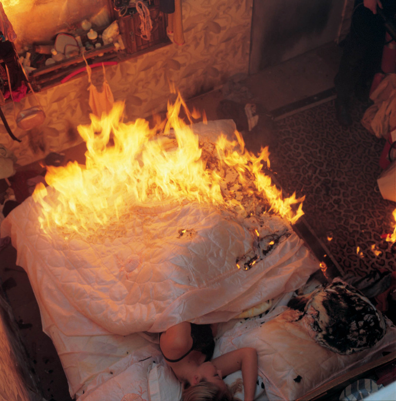
Reynold Reynolds/Patrick Jolley, ‘Burn’, 2002
|
|
You Are the Company In Which You Keep forms part of The Social: Encountering Photography; the first festival of international lens-based media presented in the North East. Staged across two venues, NGCA and Sunderland Museum and Winter Gardens, it reveals the diverse ways artists and photographers create images which map out our new social networks.
Beginning my sojourn at NGCA, it becomes apparent that the show boasts a vast selection of artists. Impressive names such as Gilbert and George and Martin Parr feature alongside new work from Tim Mitchell, and commissions from Craig Ames to name a few. With over 20 artists participating, and all with anthropological and ethnographic focus, they pose bold questions to the viewer. In our society today, are our replicated images the only way we know ourselves? Do these imagined and highly saturated images then become our own reality?
The exhibition seems to question three main themes: firstly, the consequences of mass consumption on our society, secondly, the place of military presence in our lives and last but not least, the notion of the ‘beauty’ of the world when viewed through a subjective lens.
|
Before entering the exhibition space, you are met with a television screen documenting a contemporary twist on European Romanticism. Thiago Rocha Pitta’s, Homage to JMW Turner’ (2002), illustrates a burning boat on an ocean, calm as dusk settles into night. Heavy with symbolism, the boat offers a chance of escape, of travel, of a journey. Now disintegrating in the flames, perhaps it is a metaphor for the material world once it’s life span is over; an endlessly symbolic end?
The first gallery space screens Nick Crowe and Ian Rawlinson’s video The Opera (2011), Youtube footage of modern warfare is spliced with avatar soldiers, lip-synching to a musical version of US military phrase books; the latter given to troops to learn prior to overseas deployment. Certain sentences jump out, ‘We are not here to harm anyone’, and, ‘The goal of our checkpoint is to increase your security’. The singsong voices seem to echo out like an incantation, and the repetition becomes an interrogation, the lines between reality and fiction have become blurred. This piece is conscious of the overall exhibition title, perhaps the ‘company’ is ourselves, or perhaps it is the civilians whom the troops are trying to win over. Craig Ames, ex-soldier and photographer, continues the show with several of his most recent works, including Modern Warfare, Kill Zones and Next Gen: The Battle For Hearts And Minds (2013). The video projection watches Afghanistan veterans complete realistic but virtual scenarios using the British army’s training simulator, overlaid with the soldier’s personal accounts of combat. In the next room photographs depict landscapes used for military training, sitting alongside the replica guns and badges used to create the ‘authentic military experience’. |
Natasha Caruana, from the series ‘Fairytale for Sale’, 2010-13
|
A world alight recurs throughout the exhibition; Reynold Reynold and Patrick Jolley take this concept literally in Burn (2002). In the video, a house and the occupants are set alight by a figure who seems unconcerned by the destruction he is causing. In an almost sacrificial manner, objects are lost along with the unobservant victims who culminated them.
The capitalist consumer dream is a central component of the exhibition. The modern obsession to have the body beautiful, as well as possessing the perfect home, are highlighted themes in the untitled collages by Linder. Created in the 70’s and 80’s by using found images and photographs, they suggest the notion of ‘owning’ happiness through the consumption of beautiful ‘things’.
The capitalist consumer dream is a central component of the exhibition. The modern obsession to have the body beautiful, as well as possessing the perfect home, are highlighted themes in the untitled collages by Linder. Created in the 70’s and 80’s by using found images and photographs, they suggest the notion of ‘owning’ happiness through the consumption of beautiful ‘things’.
Linder, ‘Untitled’, 1977. Copywright the artist. Courtesy of Stuart Shave/Modern Art, London, and Arts Council Collection, Southbank Centre, London
The final installment is an interactive piece, ‘Historic Photographs: To Crawl Through Vienna, March 1988’ by Gustav Metzger. The artist and political activist, (who developed auto-destructive art), asks the viewer to take off their shoes and clamber underneath a heavy green sheet to ‘view’ a photograph. Nontraditional and subversive, it’s a struggle to be able to see the print as a whole. The concept behind the piece is to bring the viewer closer to those in the photograph to really get a sense of what they may be going through. I leave feeling claustrophobic, a little perturbed and my hair disheveled.
The other half of the exhibition continues just up the road, at Sunderland Museum & Winter Gardens. Focusing on similar veins of thought, the show here also re-imagines the history of recent photography, its genres and accepted modes of working; attempting to rethink social history.
A smaller space, the Museum & Winter Gardens host seven artists and photographers, inviting them to reexamine the ideas of portrait and the portrait studio. Well known names including Jo Spence sit alongside lesser known emerging British artists such as James O’Jenkins, and international figures are thrown in for good measure too. Yee I-Lann features, not only here but also at NGCA in their Project Space, for The (Post) Colonial Photo Studio II.
This idea of cross-over is prevalent, an exchange, (not only by exhibiting across two venues), continual overlap, points to what ‘the social’ is or could be. By uniting international photographers and artists to create dynamic exchanges within the North East, ‘the social’ deems itself to provide new opportunities for audiences, which are both ‘accessible and relevant’. You Are The Company In Which You Keep successfully brings together NGCA and Sunderland Museum and Winter Gardens in a joint exhibition, posing some poignant questions about the world in which we live.
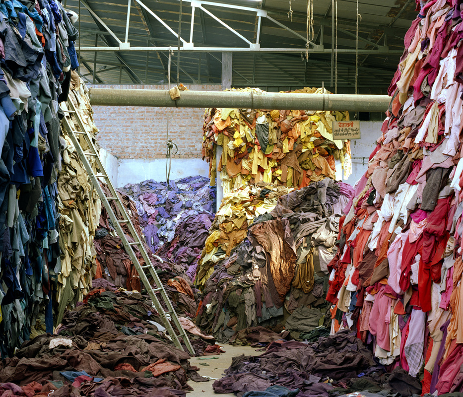
Tim Mitchell, ‘Clothing Recycled’, 2009-13
http://www.ngca.co.uk/home/default.asp?id=191
http://www.twmuseums.org.uk/sunderland/whats-on/exhibitions/you-are-the-company-in-which-you-keep.html
Jessica Dolby is an artist and writer living and working in Newcastle upon Tyne.
http://www.twmuseums.org.uk/sunderland/whats-on/exhibitions/you-are-the-company-in-which-you-keep.html
Jessica Dolby is an artist and writer living and working in Newcastle upon Tyne.
