Interview: Eleanor wright, artist and warwick-stafford fellow
by Zara Worth
Zara Worth Can you tell me about the development of the work which has come out of the Warwick Stafford Fellowship and your thoughts in the lead up to your solo show at Gallery North?
Eleanor Wright The exhibition Thin Cities at Gallery North is a continuation of the work titled Prow (2012), which I produced for the Switch exhibition at BALTIC39 in 2012. The two floor-based sculptures in Prow were made in response to the Gateshead Millennium Bridge which spans the river Tyne. Among countless structures commissioned throughout the UK to mark the Millennium, this bridge is emblematic of modern Gateshead. The digital print in Prow was an image lifted from Zaha Hadid Architects website depicting a ring from her luxury jewellery collection.The work also benefitted from a research trip I took to Baku, Azerbaijan to see the Heydar Aliyev Cultural Centre designed by Zaha Hadid.
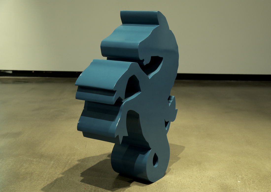
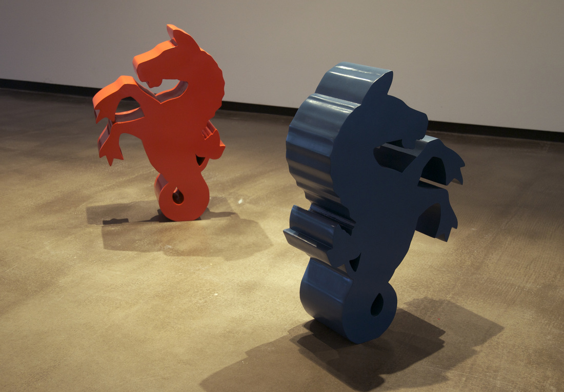
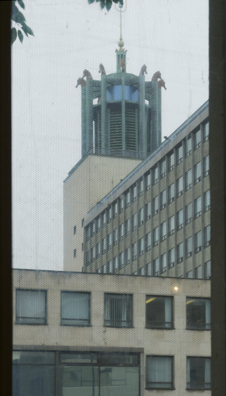
I have been working with a seahorse motif derived from the ‘supporters’ within Newcastle’s coat of arms, signifying Tyne and Wear’s prominent shipbuilding industry. The bronze cast seahorses found atop the Civic Centre are used as the building’s logo and a more heraldic creature is inset into every public bench in the city.
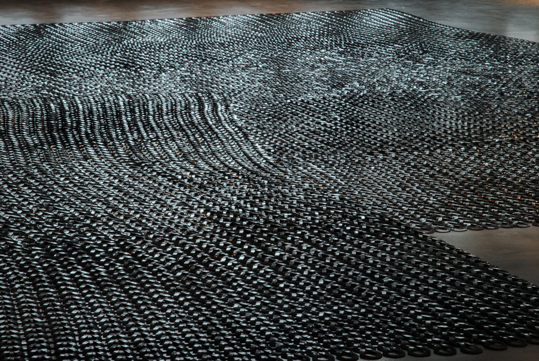
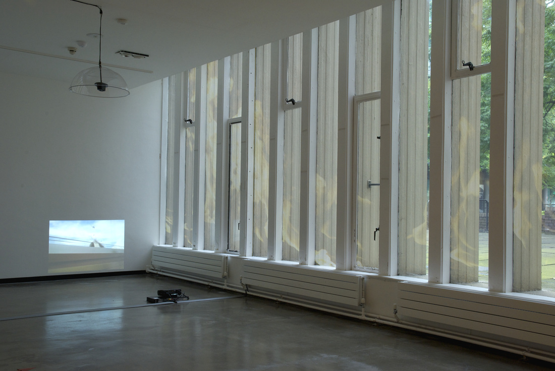
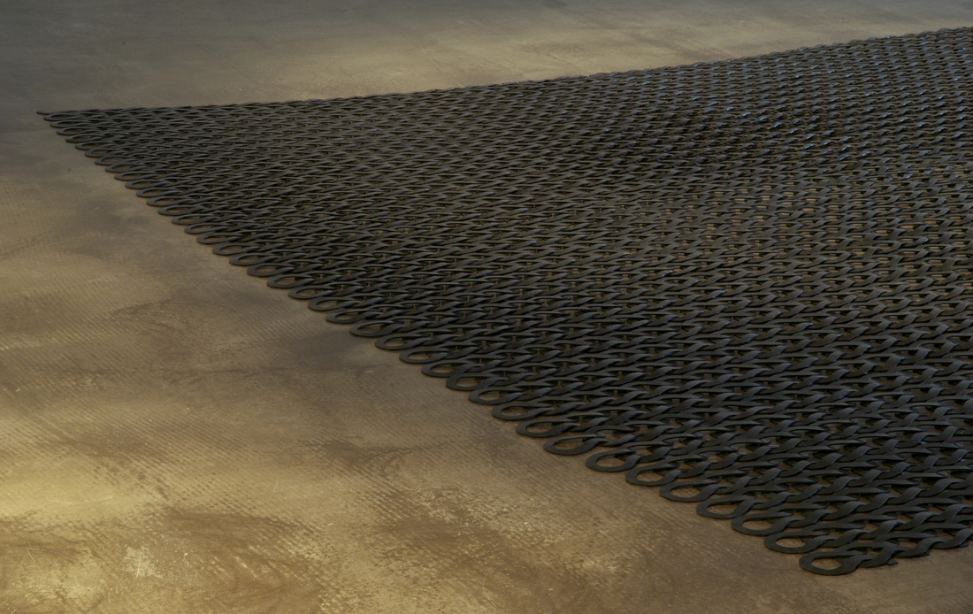
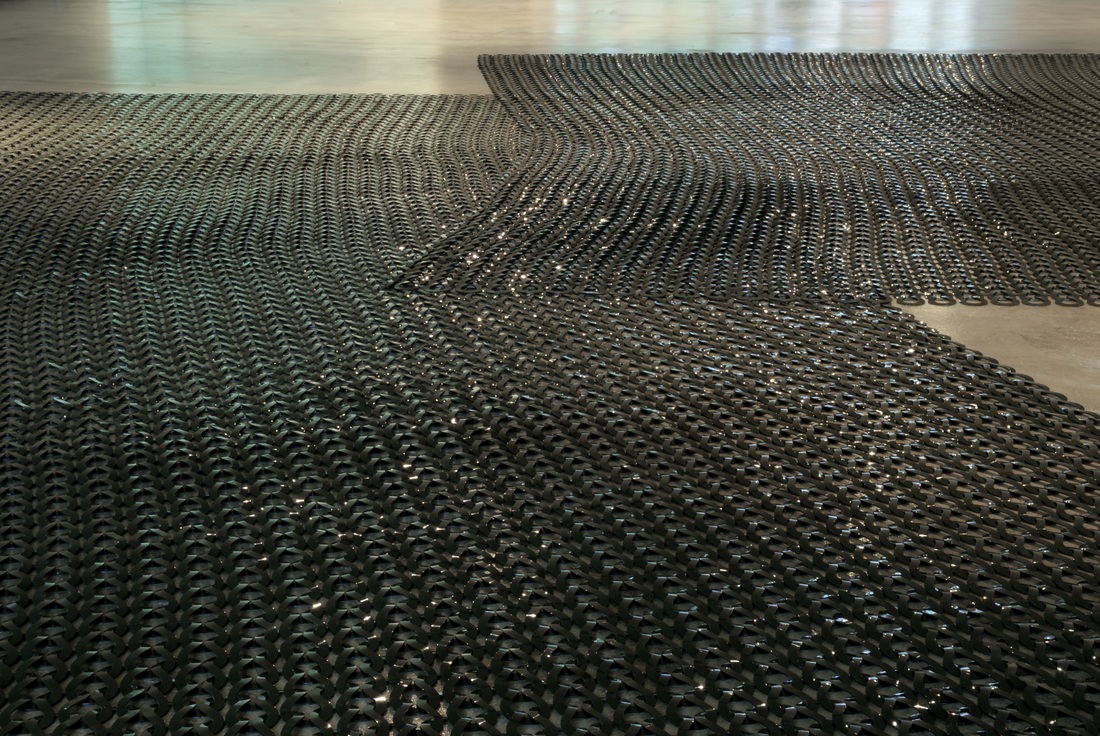
For Thin Cities I have responded to the architecture of the gallery; which is dominated by a vast poured concrete floor and strip windows at both ends. I decided to accentuate these features by making mats which stretch across the floor, and by fixing Contra Vision vinyl to the strip windows.
During a recent conversation, I was talking about how it’s a shame that the top deck windows of the double-decker buses in Newcastle are all plastered with one-way vinyl. The material is called contravision vinyl and it is stuck to the exterior of windows, utilizing them as prime, mobile advertising space. The image appears solid from the outside and ‘transparent’ when viewed from within. When you are looking through the perforated vinyl, rather unappealingly, you are looking through the back of an advert.
After recalling this anecdote, the person I was talking to then showed me an image depicting a large modernist office tower with a façade that had been turned into a gigantic billboard, windows and all. The image was taken in Warsaw by Dr Ella Chmielewska, who is senior lecturer in cultural and visual studies at Edinburgh University. She was researching the historical and symbolic meaning of place change through the presence and form of logos on the surfaces of buildings in Warsaw, Poland, where many of the city’s buildings are used as advertising space. I decided to fix an image to the exterior windows of the gallery, which depicts a fire that broke out at the Heydar Aliyev Centre in Baku, only a few months after it opened in 2012.
I also fixed an image to the other set of strip windows that I took of YanarDagh, which means burning mountain and is situated just outside Baku. It is a natural gas fire, approximately 10 meters wide that comes out of a rock face and has been burning for centuries; Azerbaijan means Land of Fire.
I fixed this image to the interior face of the back windows, and the Hadid building on fire to the exterior of the front windows. It is only possible to see the images when the space in which you are viewing it from is lighter than the space on the other side of the glass. So during the day Yanardagh is so transparent it is barely visible. When it gets darker outside and with the artificial light of the gallery, it becomes a very opaque and prominent image. Likewise, this occurs with the building on fire, where one can only make out the image during daylight hours. When it darkens outside and with the artificial light of the gallery, the image disappears.
The vinyl also affects how daylight enters the gallery. The clearer and sunnier the sky, the better the contravision works at being this transparent/opaque film. When it is cloudy or murky and you are looking out through the back of it, its elusiveness is less successful and you can quite easily make out the perforated surface stuck to the face of the glass.
There are many aspects of the exhibition that involve surfaces that shift from one state to another. Meshes and nets made up from repeat motifs out of materials that shift between reflecting and absorbing light and moving between being transparent and opaque. I was thinking about the facades, or ‘skins’ of these iconic buildings designed by the likes of Hadid and Gehry; mainly characterized by low-level level reflective cladding, which complicates the definition of the building’s edges. I’m interested in how the image of these icons can bleed in with the physical presence of them, in terms of how we encounter them. We know the image, we can easily acknowledge the symbol, which takes precedence over our physical interaction with it, the former ultimately governing our relationship with the building and our subsequent memory of it.
Eleanor Wright The exhibition Thin Cities at Gallery North is a continuation of the work titled Prow (2012), which I produced for the Switch exhibition at BALTIC39 in 2012. The two floor-based sculptures in Prow were made in response to the Gateshead Millennium Bridge which spans the river Tyne. Among countless structures commissioned throughout the UK to mark the Millennium, this bridge is emblematic of modern Gateshead. The digital print in Prow was an image lifted from Zaha Hadid Architects website depicting a ring from her luxury jewellery collection.The work also benefitted from a research trip I took to Baku, Azerbaijan to see the Heydar Aliyev Cultural Centre designed by Zaha Hadid.
I have been working with a seahorse motif derived from the ‘supporters’ within Newcastle’s coat of arms, signifying Tyne and Wear’s prominent shipbuilding industry. The bronze cast seahorses found atop the Civic Centre are used as the building’s logo and a more heraldic creature is inset into every public bench in the city.
For Thin Cities I have responded to the architecture of the gallery; which is dominated by a vast poured concrete floor and strip windows at both ends. I decided to accentuate these features by making mats which stretch across the floor, and by fixing Contra Vision vinyl to the strip windows.
During a recent conversation, I was talking about how it’s a shame that the top deck windows of the double-decker buses in Newcastle are all plastered with one-way vinyl. The material is called contravision vinyl and it is stuck to the exterior of windows, utilizing them as prime, mobile advertising space. The image appears solid from the outside and ‘transparent’ when viewed from within. When you are looking through the perforated vinyl, rather unappealingly, you are looking through the back of an advert.
After recalling this anecdote, the person I was talking to then showed me an image depicting a large modernist office tower with a façade that had been turned into a gigantic billboard, windows and all. The image was taken in Warsaw by Dr Ella Chmielewska, who is senior lecturer in cultural and visual studies at Edinburgh University. She was researching the historical and symbolic meaning of place change through the presence and form of logos on the surfaces of buildings in Warsaw, Poland, where many of the city’s buildings are used as advertising space. I decided to fix an image to the exterior windows of the gallery, which depicts a fire that broke out at the Heydar Aliyev Centre in Baku, only a few months after it opened in 2012.
I also fixed an image to the other set of strip windows that I took of YanarDagh, which means burning mountain and is situated just outside Baku. It is a natural gas fire, approximately 10 meters wide that comes out of a rock face and has been burning for centuries; Azerbaijan means Land of Fire.
I fixed this image to the interior face of the back windows, and the Hadid building on fire to the exterior of the front windows. It is only possible to see the images when the space in which you are viewing it from is lighter than the space on the other side of the glass. So during the day Yanardagh is so transparent it is barely visible. When it gets darker outside and with the artificial light of the gallery, it becomes a very opaque and prominent image. Likewise, this occurs with the building on fire, where one can only make out the image during daylight hours. When it darkens outside and with the artificial light of the gallery, the image disappears.
The vinyl also affects how daylight enters the gallery. The clearer and sunnier the sky, the better the contravision works at being this transparent/opaque film. When it is cloudy or murky and you are looking out through the back of it, its elusiveness is less successful and you can quite easily make out the perforated surface stuck to the face of the glass.
There are many aspects of the exhibition that involve surfaces that shift from one state to another. Meshes and nets made up from repeat motifs out of materials that shift between reflecting and absorbing light and moving between being transparent and opaque. I was thinking about the facades, or ‘skins’ of these iconic buildings designed by the likes of Hadid and Gehry; mainly characterized by low-level level reflective cladding, which complicates the definition of the building’s edges. I’m interested in how the image of these icons can bleed in with the physical presence of them, in terms of how we encounter them. We know the image, we can easily acknowledge the symbol, which takes precedence over our physical interaction with it, the former ultimately governing our relationship with the building and our subsequent memory of it.
All images courtesy of the artist
ZW I understand that over the past year your research has come to focus on the impact of architecture as a form of regeneration for towns and cities. Did this interest form part of the appeal of Newcastle upon Tyne as a post-industrial city when you first applied to the Warwick Stafford Fellowship?
EW I am interested in the built environment being used to initiate urban renewal through city branding, particularly through the use of civic iconography. This can take the form of a logo, statue, bridge or building, anything that can be configured to project outwards, to potential visitors and investors. A building acting as symbol is by no means new (think of St Paul’s Cathedral or the Vatican), but in recent years it has become an established, even necessary part of leisure and tourism led regeneration policy. A prime example is Frank Gehry’s Guggenheim in Bilbao, the museum responsible for initiating the so-called ‘Bilbao effect’. Completed in 1997 the building is widely known for revitalising a declining area and placing the city on the world tourist map. I am examining the socio-political, architectural and visual discourse surrounding these constructions and trying to question their relationship to cities and people. In this sense, Newcastle appears as a symptomatic place that is relatively transparent about the social and ideological characteristics that have determined the artificial construction of our urban centres.
EW I am interested in the built environment being used to initiate urban renewal through city branding, particularly through the use of civic iconography. This can take the form of a logo, statue, bridge or building, anything that can be configured to project outwards, to potential visitors and investors. A building acting as symbol is by no means new (think of St Paul’s Cathedral or the Vatican), but in recent years it has become an established, even necessary part of leisure and tourism led regeneration policy. A prime example is Frank Gehry’s Guggenheim in Bilbao, the museum responsible for initiating the so-called ‘Bilbao effect’. Completed in 1997 the building is widely known for revitalising a declining area and placing the city on the world tourist map. I am examining the socio-political, architectural and visual discourse surrounding these constructions and trying to question their relationship to cities and people. In this sense, Newcastle appears as a symptomatic place that is relatively transparent about the social and ideological characteristics that have determined the artificial construction of our urban centres.
ZW Your work recently has involved constructing large floor mats out of woven PVC, rubber and magnetic sheeting. The forms you create sculpturally and in print are often flowing, much like the architecture of Zaha Hadid, whom I understand to be an influence on your work. Do you want architectural iconography to be evident in your work, and if so do you want it to connect clearly to specific buildings or/and locations?
EW At times my work refers to a specific construction, such as the piece I made for Switch at BALTIC 39, which was a response to the Gateshead Millennium Bridge. My interest in Hadid arose out of a discussion about ubiquitous forms or signs and their prevalence within contemporary culture. It had been pointed out that the shape I was making bore resemblances with the fluid forms that prominently feature within Hadid’s practice. I looked her work up, and found a series of rings she designed which looked exactly the same as the sculpture I was making. Rather than being horrified that my work looked like Hadid’s luxury jewellery, I became excited by the notion that perception can shift through referencing different contexts. I have frequently worked with motifs, but I then began to view elements of the built environment as brand motifs, which is what I mean by civic iconography.
I’d been reading Richard Seymour’s ‘The Meaning of David Cameron’, published just before the 2010 general elections, which refers to the ‘thoroughly modern’ Cameron as a cipher for a general set of ideals. Rather than representing the Conservative party with its now very blurred identity, he stands for everything the people want, social democracy, the green movement, big and small business, youth minorities, traditionalists etc... This interests me because I feel that trends of contemporary culture reveal that specifics have become interchangeable, or can bleed into one another.
Take the Sugababes as an example, which first formed in 1998, they have now been named the most successful female act of the 21st Century. Although none of the original band members remain, the Sugababes still exist. Sure, something of this nature has happened with other bands, The Fall for example, but the front man/woman usually continues to maintain the helm – with this manufactured band, which now don’t write their own music, we are supposed to just acknowledge them as the Sugababes, regardless of who the band members are. Incidentally, I really liked their successful debut single, Overload. I also like the Gateshead Millennium Bridge.
So rather than referencing specific elements of Hadid’s practice, I am examining what her more fluid designs represent, which, in my opinion, reflects a modern desire for shifting qualities such as flexibility, adaptability, transience, permeability etc… Hadid’s fluid forms propose a negation of solidity and permanence, attributes that, historically, are intrinsic to architecture.
|
|
ZW The nature of the materials you have been using recently are very tangible and tactile, whereas when we think of civic branding we think of an image, so that the architecture and buildings themselves become abstracted. Does this relate to your media choices?
EW My choices of materials are usually tied up with their inherent functionality and tend to be associated with industrial processes and scales and proximities relative to architecture. As I mentioned earlier, I am interested in how the acknowledgement of images and symbols can bleed into and influence the physical encounters of what those images and symbols represent.
The hand is always present in the work whether this is an indexical recording of something or in its assembly, which, for example may refer to production lines. The scale usually references the body in some way and the proximities between the works in an installation, and the galleries’/cities’ architecture is relative to how we encounter surfaces/objects outside of ourselves; within the built/natural environment. In this sense, I try to continually maintain and dissolve a distance between the viewer and work so that elements shift in relation to one another. I like to draw the works through various contexts.
So in one sense, the work is very physical because of its scale and materiality, which is what I believe people first think when they encounter it, but then I also want it to drop into a more 2D/flat space, where it can be read with a totally different frame of reference. In a way this mutability reflects my cynical attitude towards Hadid’s fluid architecture. Through incorporating this mutability, I’m trying to make work that assesses and exposes complications that can arise with the physical rendition of an idea.
ZW Does the use of Contra-Vision relate ideologically to the building and/or the gallery space or was its use primarily an aesthetic decision?
EW The contravision vinyl is a response to the fact that it is totally acceptable to plaster advertisements over surfaces that are supposed to afford clear vision. As I mentioned, my first encounter with it was on the top decks of Newcastle’s buses. Rather than affording a clear view, the perforated vinyl actually obscures it, while also bathing the top decks’ interior in a sort of dampened, muddy hue.
I was interested in exploiting its aesthetic appearance; the perforated surface is after all another mesh/net that is a prominent feature in my current work. I was interested in the subtle distortion it creates. I also tend to distort images by severely blowing up low-resolution images to billboard scale. By doing this they enter the realm of drive-by advertising i.e fast communication through direct/subliminal messaging, but the lack of quality and focus (literally) means that their message is obscured. This ‘message’ is further obscured by its shifting status in relation to daylight.
My use of it also relates to the status of a gallery embedded within a very large institution and how one might approach that sort of space and what they might expect from it. I think that the Gallery North space is very problematic, both spatially and in its relation to the university and wider art community. I think for an exhibition to be successful, it needs to address aspects of the space in which it is shown. I think that the gallery is a bit isolated, which is why I wanted to incorporate aspects of the city into Thin Cities. This is partly why I used the contravsion, because its presence on the buses is continually filtering throughout the city.
This is also why I asked someone who works at the Civic Centre to play the Carillon Bells whenever she got the chance. I wanted to strike up a relationship between the insular/isolated nature of the recording I made of the ambient muzak that is piped out into the main atrium of the Hadid centre (this recording is played through a sound dome in Thin Cities) and the notion of civic pride inherent in the Carillon Bells. Both forms of music are embroiled with messaging associated with a sense of belonging with a given space, be that a connection with a city or cultural centre. I was interested in how they both aided a sense of containment and security even though the motives behind their implementation are very different.
ZW It sounds as though your work almost finds the fallibility of these 'signs' and 'iconography'. It may interest you to know that the gallery itself was previously a printmaking studio. Do you see your works and interventions in Gallery North as extensions of the motifs and icons which inspired them or perhaps as examples of the ever changing nature of such 'icons'?
EW I am interested in how motifs become abstracted, where obfuscation or simplification affects their reading. I consider abstraction as a process of transformation, which I regularly employ within my work. I relate it to processes found within printing and casting methods and indexical references, copying, repeating, tangential decision-making and traces of origin. I like how a key that hasn’t been cut from the master is an abstracted version of a copy, which usually doesn’t function very well but might just about get you through the door.
EW I am interested in how motifs become abstracted, where obfuscation or simplification affects their reading. I consider abstraction as a process of transformation, which I regularly employ within my work. I relate it to processes found within printing and casting methods and indexical references, copying, repeating, tangential decision-making and traces of origin. I like how a key that hasn’t been cut from the master is an abstracted version of a copy, which usually doesn’t function very well but might just about get you through the door.
Eleanor Wright's Thin Cities is currently showing at Gallery North, where she is exhibiting work resulting from her time as Warwick-Stafford Fellow. For further information please see Rebecca Travis's review, or visit Wright's website: www.eleanorwright.net
