2011
25.6.11 - 30.10.11
'the impossible image'
mariah robertson at baltic
reviewed by louise winter
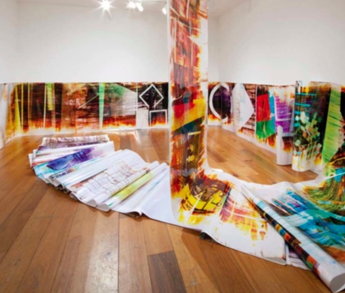
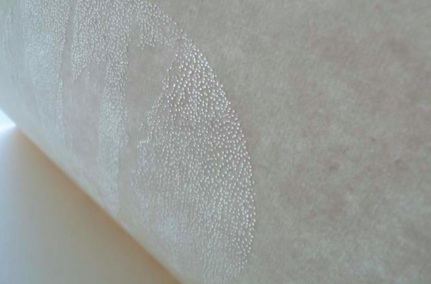
Mariah Robertson 9, 2011,Unique C-Print on metallic paper, 1968 x 50 inches, Courtesy Museum 52, New York, Copyright the artist
Last chance to see New York- based artist Mariah Robertson’s first UK solo exhibition showing till the end of the month on the ground floor of the Baltic.
The works demonstrate the artist’s attempt to create what she has termed an ‘impossible image’ to which we might wonder: how might one go about achieving such a task?
Robertson attributes this seemingly paradoxical working method to her process of layering several techniques onto a single image, a reference perhaps to the multiple realities now seemingly arrested in the instant of the final image. Or, what Foucault would have referred to simply as ‘in one place all times’. (1967)
Despite the use of such overlays, for which we might be tempted to infer a kind of chronology, Robertson is keen to emphasize her images as traces of artistic endeavor, downplaying any potential narrative associations, ‘the thing in the end is not an illustrative story telling image, but evidence of the guts of the process of making photographic images.’ The resulting marks are therefore freed from the burden of indexicality.
This process led activity, in which the artist simultaneously violates and reinterprets photographic rules results in images shown as objects evidencing an inherent permeability (if there is such a thing) between film,
photography, painting and sculpture. Arguably the strongest of these links, and one re-enforced by the curation of the work, is that of its relationship to sculpture.
Aside from sheets hung from and over walls and spilling from the ceiling and onto the floor, we are met with a number of images awkwardly positioned in deep frames in a smaller, adjoining room. In one instance a monumental frame leans against a wall bringing to mind the precedents of Richard Serra’s ‘Prop’ pieces of 1969, and echoing the tension of the latter as one edge leans precariously against another.
This tension seeps into frames that appear too small to accommodate the images as they crumple or are forced to curl at the edges. This is hardly an oversight on the part of the artist and what begins as an aesthetic strategy ends by forcing us to question notions of linear and historical time. We are presented with the old adage similar to that of the chicken or the egg conundrum (substitute these for frame or image) to ask: which came first?
And yet, in spite of the strengths of such works we are left with the underling sense that the unframed, suspended sheets, however sculptural, appear too contained. The initial perception of their seemingly haphazard arrangement soon gives way to the fact that they are carefully positioned perhaps even a little contrived. By contrast the press release refers to the framed prints as ‘pushing against the limits of the heavy frames’ and we may wonder what would happen if this quality was applied with the same rigor to the draped sheets in the context of their display. What would happen if they were allowed to push more against the physical confines of the gallery to become more chaotic or enveloping? These suspicions are confirmed by institutional barriers that limit our access to these hanging pieces, quite literally standing between us and the work with as we are thus relegated to the role of mere spectator and not as a participant within the space and left to peer in from an imposed edge.
Nevertheless, a strong conceptual thread returns us to the initial paradox of the impossible image that in turn presents us with another; if Robertson is to ever succeed in making the impossible possible then the task itself is rendered obsolete. We must concede then that true success could only be a failure.
6.9.11
Interview: Joss Humberstone
by louise winter
Recent Northumbria University graduate Joss Humberstone characterizes his practice as a response to the metropolitan landscape. It is this environment that influences his sculptures that are loaded with connotations of the urban and postmodern.
Understanding what the terms utopia and dystopia might mean in a postmodern context underpin his practice as he seeks to create sculptures in conjunction with these ideologies.
We catch up with Joss as he prepares to start the Graduate Studio Northumbria (GSN) scheme at the University which aims to support graduate enterprise, innovation and professional development in the visual arts.
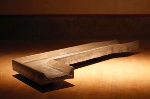
Here's a Lone Horseman cast concrete. Joss Humberstone, 2011. Image Courtesy
of the artist.
of the artist.
LW: Your work references to the ‘metropolitan landscape,’ do you regard this as a primarily urban space and what does it mean to you?
JH: Yes, definitely it’s to do with history, brutalist architecture and 1960s postmodern concrete buildings. Specifically for the graduate show I looked at LA a lot and one of the works ‘Here’s a lone Horseman’ (see below) was based on a concrete river.
LW: You describe a poignancy and reverence that this landscape evokes and I wondered whether this reflected your own personal and subjective experience of these spaces?
JH: Yeah, it all starts from my own experiences. Architecture is something that changes how people feel..LW: ...I think often people don’t realize how much architecture affects their behavior and directs their movement through a space without us even noticing...
JH: Yes and this is how the works originate, on how that has an effect socially and more widely affects the human condition. The concrete river in LA actually has no use now. It used to transport good into Los Angeles, now after all these years it’s no longer needed and it’s dried out so it almost becomes a metaphor for utopias and dystopias, a paradox. LA can be seen as a paradox itself in that it is often perceived as a kind of paradise or an image of utopia when it is quite often the opposite and sinister.
LW: Have you ever visited LA?
JH: No I’ve never been but I’ve read about it and spoken to people who have visited, I would like to go, that would be good. I’d quite like to do a residency there in future.
LW: This concrete river in LA is it featured in the film Grease, you know when they have the car race, I have that in my mind?
JH: Yea that’s it. It features in quite a lot of films including Terminator 2. It runs right through the city, it’s about 50 miles long, splitting it in half.
LW: I imagine it’s a space that artists would be interested in due to its history and loss of function?
JH: Yes I heard there was a regeneration scheme planned involving the site which artists were getting involved with. That’s the thing with buildings from the past, in New York there are these old railway stations that are completely overgrown and that are now being transformed into green areas or wild parks. LW: I was also interested in your reference to brutalist architecture which you describe as both minimal and graceful which would seem contradictory. Do you think that these kind of spaces have the potential to be both?
JH: Yes, it is a contradiction or paradox really. I guess it’s a matter of opinion. You often find that people hate that kind of concrete architecture. I find it has a melancholy aspect to it, its very much of its time and we don’t look at it now as we once did.
|
LW: A local example of this would be the now infamous car park in Gateshead that also
featured in the film Get Carter which was pulled down after much criticism from the public and yet at the same time it was also iconic. It divided opinion and yet was inextricably part of the public consciousness. JH: Yes absolutely, that’s a good point. I like how you can’t destroy those kind of buildings easily, they’re made out of steel so they have to be broken down or cut away slowly piece by piece. I like that about it. |
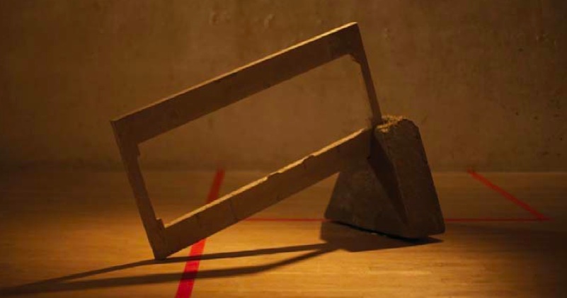
Aleph cast concrete, wood and speaker. Joss Humberstone, 2011. Image Courtesy of the artist.
|
LW: Really? I hadn’t realized that! I noted as well that you mention parody and this is something that I use in my own works in terms of the parody of function. I was wondering how this concept relates to your work and context in which you apply it?
JH: Yes, it’s the parody of utopias and dystopias. The parody is to do with the idea of paradise and in one of my sculptures
‘Aleph’ for example I have a brutal concrete block that ordinarily shouts but here it contains a speaker playing the sound of peaceful running water.
LW: I would think of it as something that also challenges our perceptions of a specific site in the unexpected juxtaposition of elements... and this would perhaps relate to our earlier reference to the uncanny presence of the now dry concrete river. The experience of the work is transformed into something poetic perhaps.
How was your experience of curating your work for the degree show?
JH: It was really good, I shared a space with Dylan Shields who was using cardboard so there was interesting contrast with the lightness of his materials and the weight of mine. I really loved it, I’d love to do it again!
LW: You’ll get plenty chances this year through GSN! What made you apply for the scheme this year and what do you hope to gain from the experience?
JH: It’s a platform that will help me move towards other things. One part of it is that you’re
expected to get out there and make things happen. ..
LW: I think that’s really important for emerging artists...I know some of the students from last year organized a lot of their own shows.
JH: Yes, apparently a couple of guys received funding to travel to Detroit to show work.
LW: That’s great that it can lead to all kinds of opportunities so you can be really ambitious. I look forward to speaking to you again when you’ve finished GSN to see how your work develops over the course of the year and keep me posted on any shows you’re involved with!
Joss Humberstone’s selected texts:
Lasch, C. (1991) The Culture of Narcissism: American Life in an Age of Diminishing Expectations. London: Norton
Hines, T. (2010) Architecture of the Sun: Los Angeles Modernism 1900 - 1970. New York: Rizzoli
Siebers, T. (1995) Heterotopia: Postmodern Utopia and the Body Politic. Michigan: The University of Michigan Press.
Follow Joss on tumblr: wastedstyle.tumblr.com
14.9.11
Diana Afanador-Vargas
Newcastle MFA Degree Show
Interviewed by Louise Winter
‘Monsters’, Newcastle University MFA Degree Show, 2011, Diana Afanador-Vargas. Courtesy of the artist.
|
|
“I do think it’s a bit strange when your objects are bigger than you, and you get to look at beings that only lived in your imagination face to face.
Now, the environment that they live in is like going inside my own head. It's exciting to walk inside of my mind”
Diana Afanador-Vargas, artist’s blog, 2011
The Fine Art graduate degree shows this Summer were eagerly followed up by the post- graduate degree shows at both Northumbria and Newcastle University. I caught up with Diana Afanador-Vargas who has just completed her two year MFA at Newcastle, shortly before she plans to return to her native Colombia, to discover more about her practice and her experience of studying art in the North East.
LW: In the exhibition catalogue you refer to possibility of permeating another reality. How do you attempt to do this through your work?
DAV: I think that when you’re planning an installation you have to involve the viewer in some way even if it’s really subtle, it doesn’t have to be trumpets going off!
LW: Haha, yes...
DAV: ...and when the shadows are in the space itself I like how people move around them and pass over the shadows thinking, ‘ah right that’s just where I walked’. So it’s that thing of being able to make people move around the objects. I think that in my mind the monsters live an imaginary world and so I have tried to create a part of that.
LW: : I was interested in how you refer to your pieces as ‘monsters’ to me that conjures up associations of childhood or primal fears which the works encapsulate but then there is also a humor to them as well so a slippage occurs..DAV: To me they are monsters but I called them this before I really looked at what this means and their other connotations. They start off as drawings. It’s something that the work has given back in a way, in my mind they are scary and for me they relate very much to feelings towards people around you, you often protect yourself from things around you as if you are in your
own space.
LW: Would you say then that for you they embody states of mind or psychological states certainly the pieces do seem to have their own identities or personae even?
DAV: Yes, it’s also a huge reflection on depression and how when you’re depressed it’s really hard to get out of it and I don’t think people become depressed by choice. It’s like being in a hole. The piece in the corner for example there is not much space to move around it so people really have to squeeze past it, which they do. Have you seen any children in the space?
LW: No I haven’t...
DAV: It’s really good because mostly they are not scared, they really play in the space and between the works and even hug them! I’m interested in their response because unlike adults who are more conditioned and behave in certain ways when encountering an exhibition, children don’t have the same inhibitions, they don’t care!
LW: Haha, yes that’s true their response is therefore much more playful and intuitive.
DAV: I love that people feel they can touch the works.
LW: It’s interesting that you can have a certain idea or feeling about the work but then when it goes out into the world it can often acquire new and varied meanings beyond those that you initially anticipated. I know you referred to the function of the shadows previously and I was curious as to how you negotiate the 2 and 3 dimensional aspects of the work?
DAV: Prior to this I didn’t have any experience of making sculpture so I often used drawings and was interested in reflections and shadow such as those created in the moonlight, I need to do more research around that but for me shadow itself is almost like a living thing. I’m also interested in the difference between a trace and a shadow.
LW: The shadows lend them a strange semblance of reality if we consider that a ghost for example doesn’t have a shadow...
DAV: Yes and it is important that each one is different and unique and has their own way of being. What is important is that the objects interact so I arrange them and see if they are in conversation with one another and if not why not.
LW: How did you find the experience of the MFA and how do you feel it has impacted on your practice?
DAV: I’m really glad I chose to study here in the UK and the North East in particular instead of London, without a doubt. Up here people are very proud of who they are. My practice started off more as drawing and painting but I’m now making 3 dimensional works so that’s quite a shift but it’s great that in doing fine art I haven’t been confined to doing just one thing I’ve even experimented with animation. It’s had a massive impact. I think it’s not just the course but also conversations with the tutors are really important where they question and question and question. Also your classmates. I think I was really lucky
I had a great class who were critical but also really supportive. I think going forwards I have to do what makes me happy, when I think some musicians practice for two hours everyday alongside their normal working hours then why shouldn’t I do a couple of hours of work a day as an artist? This shows discipline and commitment.
For more information on the artist visit: www.dianaafanadorvargas.com
17.9.11 - 20.11.11
International Print Biennale
at the Laing Art Gallery
Reviewed by anna jesson
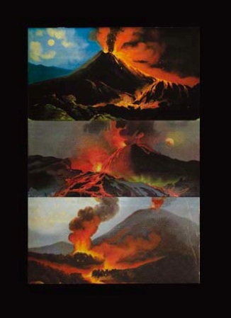
Natural Disaster variant II screenprint. Ian Brown, 2009. Image Courtesy of the www.internationalprintbiennale.org.uk
|
September saw the launch of the International Print Biennale. The Biennale takes place all over the north east, in the form of 15 gallery shows and plenty of workshops and opportunities to get involved.
The Biennale aims to cast aside the generally-held misconceptions about printmaking to showcase instead its potential to be ‘an original, unique, eloquent and engaging way of making art’. I went to see the centrepiece show at the Laing Art Gallery. What I found was a small but intriguing exhibition that showcased the diversity of style and approach possible in printmaking and that cast light on its most of-the-moment themes. The exhibition, held in a fairly small space, features an impressive selection of international artists. Much of the work here goes beyond the usual expectations of the printmaking medium. Even the familiar form of the woodblock print is taken to new levels of creativity and experimentation that are unexpected and in some instances quite breath-taking. For me, the stand out pieces are by Katsutoshi Yuasa. Yuasa was born in and works in Tokyo and his art has the intricacy and subtlety expected of Japanese printmaking, but with modern subjects and monumental scale. On display are two large works Pseudo Mythology #2 (2011) and Pseudo |
Mythology #3 (2011). #3 in particular is stunning. A mushroom cloud fills the work, printed in gold ink. It manages to be both exquisitely delicate and beautifully bold. #2 shows an ocean liner run aground. The image is reminiscent of something from a front page news story, and so it ties in well with other works in the show that draw on digital images for inspiration.
There is also pleasure in process to be found in the work of Fatima Ferreira, where the evidence of the artists hand is more obvious. Her contribution features multiple overlapping circles drawn in a kind of elegant scrawl. In this work we can glimpse the inherent thrill of printmaking – the care taken and the culmination of the process when the paper is peeled from the block to reveal the final result. The welcome room for ‘error’ can be seen in Lasting Dream (2011), although this is not to undermine the subtleness and delicacy of her work.
Reykjavik Primaries 9 (2011), a series of woodblock prints of a fire hydrant by Chris Thomas, carefully mimic the pixelisation of an expanded digital image and the four coloured inks used in a standard printer. Thomas’ process is a slow and highly exacting one and the result is a pleasing subtly and difference between each of his 10 colourful prints.
Thomas’s work has a dialogue with that of Yuasa, Paul Coldwell and Ian Brown in its exploration of modern digital media. Their handmade work is inspired by mass reproduced images and this gives their work a very contemporary feel.
Ian Brown’s Natural Disaster Variant II (2009), a work showing 3 erupting volcanoes with plumes of black smoke and rivers of fiery red lava, is a pleasing sort of stand in for the apocalyptic work Sodom and Gomorrah by Laing favourite John Martin, whose works are currently on loan to Tate Britain. The theme of threat and natural disaster is apparent throughout, with volcanoes, mushroom clouds, POW camp buildings, invasive species, eerily empty buildings, and beached ocean liners all on show. The overall effect is not nearly as gloomy as this subject matter might suggest.
In the centre of the room is a freestanding wall, covered on all sides by etchings by controversial artist brothers Jake and Dinos Chapman. The works on show here conform to Chapman type by featuring a provocative mixture of scandalous and cute imagery – one print depicts a teddy bear crucified on a swastika. While it is impressive to see such high- profile names, the Chapman work seemed out of place and didn’t inspire the same level of contemplation as many of the other prints. In addition to this, the placement of the wall directly in the middle of the room seems odd. Perhaps it reflects the separate nature of their work but, unfortunately, it blocks what could have been an impressive view of Yuasa’s monumental ocean liner woodblock print that is hung on the far wall as you walk in.
This subtly curated show works well. The connections to be made between works keep this Biennale show firmly in the realm of art rather than craft. At times it is almost startlingly contemporary. Collectively, it encompasses all you would want from a print exhibition and more. The International Print Biennale is shaping up to be a jewel in the crown of the North East arts scene – here’s to its continued success.
19.9.11
Interview: Chris Dorsett
by louise Winter
|
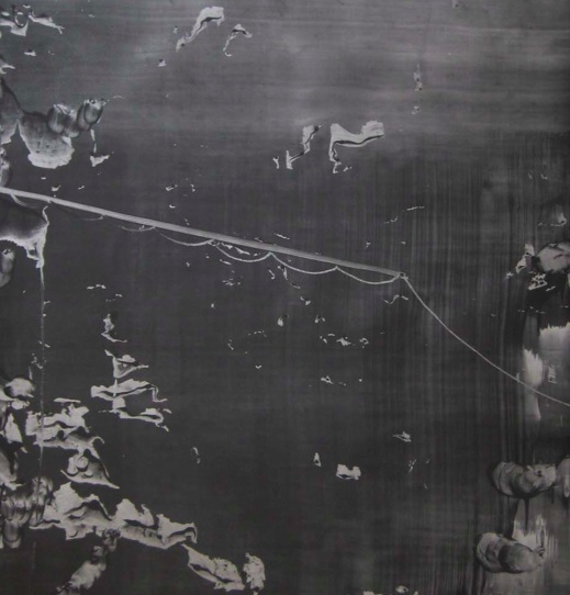
LW: What are the works that you have selected for the exhibition?
CD: I’ve decided, in conjunction with Chris Cook, to exhibit some of the over drawings that I’ve made on photographs of old shellac records. LW: So was it Chris who decided with you about what to include? I was wondering if you had picked them specifically because you felt they were relevant to the exhibition. CD: Yes, well I think they’re relevant. In the sense that if we’re thinking about Dust in the Mirror, they remind me very much of old round mirrors that have an encrusting, encrusted surface, because these mirrors, these recordings were made on aluminum plates, the shellac that coats them on which the grooves have been cut, have now become dislocated and have now powdered away into nothing at all. It just sits on the surface in a very fragile state. I suppose for me there is an immediate connection with the idea of Dust on the Mirror. The interesting thing is in 1999 when I was doing a project for the Centenary of a Cheltenham Art Gallery and Museum I discovered a dust covered round mirror in the store room which belonged to a large tram that was in the store room which would have been placed by the driver... |
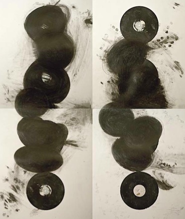
7 chakras (twice), graphite over digital scans of recordings of my father's voice. Chris Dorsett, 2011.
|
LW: Ah ok, so right where the driver sits so he can who’s on the bus...
CD: Yes, it was a round convex mirror that had been detached from the tram and was underneath it in storage. I mean the interesting thing was that
I exhibited the mirror with the coat of dust in the exhibition. The curators told me that they thought there was a photograph of the tram being renovated in the 1960s before it was presented to the museum and somewhere around 1969 it was found on a farm near Cheltenham where it had been used as a chicken shed until the Cheltenham Bus Enthusiasts Trust bought it. They renovated it as much as they could and presented it to the museum. The reason I was interested in the photograph was that it was of the bus enthusiasts on the tram and among one of the renovators is a young thirteen-year-old Brian Jones from the Rolling Stones who was an enthusiast...
LW: ...Really, I would never have thought that!
CD: Anyway we never found the photograph the curators didn’t have a copy of it, neither did the bus enthusiasts who are still going. I think the mirror with its coat of dust is a nice kind of stand in for the photograph because the mirror at one point would have reflected Brian on the bus and the coating of dust has sort of sealed in the image. There are all kinds of myths about taking mirrors to sacred shrines about exposing them to relics and then putting it into a leather bag and sealing it and in a way it predates or was an early version of the idea of photography.
LW: Yeah and there’s a thing about Native American Indians who didn’t like having their photographs taken because they felt as if it was stealing away their soul.
CD: Yes. So that’s the complicated idea by which I came to the recordings, I had the idea in my mind of a sort of mirror that held the past.
LW: Yes, it also reminds me of Duchamp’s piece with dust..
CD: Oh yes The Large Glass...
LW: Yeah he showed this with the dust and incorporated it into the piece
CD: Yes the vapor things are layered with dust which have then been varnished. I mean that is a link because that piece is very much a kind of exploration of the idea of the indexicality of photographs with the shadows and light the dust that is a receiver of images is quite a complicated idea.
I haven’t really been thinking about historical precedents really, I mean the important thing is that when I’m doing these over drawings is that they are an engagement with the types of objects and seem to have a lot of resonance and that resonance has got a lot to do with them not being able to function as they normally would so they become extraordinary in an ordinary way. They encapsulate the ‘extra’ in the extraordinary! I mean a lot of museum objects and historic objects are like that and, in a way I just take it for granted that they are rich in stories, in that gap, the gap between ordinary function and extraordinary function often the narrative just pops up. I know they have references but I don’t necessarily seek to entirely control it and it’s the same with the drawing. It’s interesting to me to use the drawings as another way of surfacing and what then happens is that over the course it becomes a mirror and something grows out of it that transforms it, it becomes another thing.
For more information about the artist see:
www.chrisdorsett.com
www.unfinishedbusinessatwallington.weebly. com/chris-dorsett.html
21.9.11
Interview: Siân Bowen
by Louise Winter
LW: Which are the works you are presenting for the Dust on the Mirror exhibition?
SB: The works are the Wrapped Stone Drawings from a residency that I carried out at Salisbury Museum and Stonehenge World Heritage Site in 2009. This was part of a larger project Art+Archaeology, involving a range of artists. I’m also showing two drawings from a separate series that I made earlier this year, Site:Refuge, through which I explored sites of former overwintering huts in the Arctic. For the last few years I’ve been working with quite complicated processes, experimenting with traditional Far Eastern methods and materials and dedicating them to news ends in contemporary drawing.
LW: I was interested in where you found these artifacts, were they just in storage?
SB: Yes, and this was interesting in terms of the relationship that I developed with them. It was obvious that they had been in storage for some decades
LW: I know when I spoke to Chris Dorsett he also referred to objects that he had also found in museum storage which seem to function almost as a treasure trove for artists!
SB: Yes, unpacking the tools and being able to hold them was very much part of the creative process. The sense of them being hidden in the museum stores echoes the reality of them lying beneath the earth before they were discovered. Two places of preservation. It also really struck me of that the tools had been handled thousands of years ago for survival and had
never been used since. So the idea of using them as tools for drawing really intrigued me.
LW: How did you create the drawings?
SB: The idea was quite simple. I was interested in the relationship between the very heavy tools and the lightness of paper and graphite dust. I wanted to make a series of drawings that involved far more touch than sight. So the tools were hidden underneath the sheets of paper, out of sight. I then explored their forms through the paper, creasing, wrapping the paper into and over the forms and surfaces
LW: So the paper was creased round them?
SB: Yes, that’s right. Finally graphite dust was worked into the creases and crevices, the tools still being out of view. Very simple, very direct, purely about touch, the drawings emerged slowly almost like photographs in a darkroom.
What I found interesting was that I could understand the form and presence of the tool without actually seeing – and was left with a drawing that has exactly the same scale as the tool and somehow retains that sense of presence. And yet there is a tension between the heaviness of the original object and the lightness of the paper with its dusted surface. I created something like 300 drawings which I edited down to 18. As composite piece, this brings us back to drawing so to speak - rhythms of line and form echoing and cross referencing one another, from one drawing to the next. And the tools are “preserved” through the drawing process so to speak.
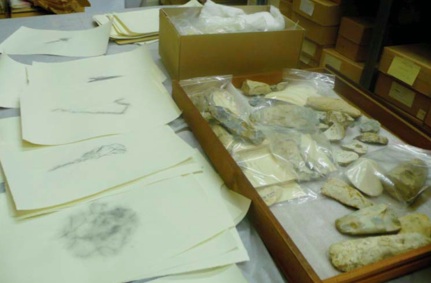
Wrapped Stone and Antler Drawings Salisbury Museum and Stonehenge World Heritage Site. Sian Bowen. Image Courtesy of the artist.
|
Detail, Site: Refuge pinpricks and tarnished silver on paper. Sian Bowen. Image Courtesy of the artist.
|
LW: I was interested in was your relationship with site, I know you have mentioned this briefly before, in terms of how your work is associated with place, is it that you are drawn to sites of historical interest or sites which have some kind of personal significance?
SB: What is central to my work are states of flux and the ephemeral, so I’m intrigued by sites
that invite us to understand change through material traces. For several years I made works through which I explored notions of the temporary space in the form of Japanese paper folding teahouses from the 18th century. Some of them had been taken out into the countryside to create temporary meditative spaces, others were used to create an intimate space in vast temple interiors. I then became interested in places of refuge in more extreme environments. In particular trappers’ and overwintering huts in the Arctic. Many of these huts have collapsed, and near disappeared, the traces of their site only being clearly visible from the air.
LW: I wanted to ask to about how you think touch relates to visual language?
SB: I suppose in the past all visual art involved some sense of touch, the artist’s hand was ever present in paintings, drawings, sculptures. Now we are in a different place with contemporary practice, with the range of possibilities in terms of how much of the artist’s “presence” is felt. What interests me is how a visual work of art to can help us to understand touch – so through by looking at a work, we might experience it through more than one of our senses. Sometimes like looking at a work and having a sense that you were also there when line was brushed across the surface of a piece of paper or the paper was softly creased against a surface.
For more information about the artist see:
www.rijksmuseum.nl/sian-bowen
www.bowenatrijksmuseum.wordpress.com
www.vam.ac.uk/sianbowen
23.9.11
|
|
LW: Describe your experience of being both curator and participating artist within this exhibition.
SB: It’s a complex issue, because the nature of this exhibition has altered over the three venues, and the role of co-curator Tony Godfrey has varied with each one - he has no part in this selection, but is contributing an essay. The artist-curator is a more familiar beast these days, and whilst I would worry if I were constructing a show for the purpose of framing my work, I feel the other artists are one step ahead of me, which is much healthier.
LW: Your work involves creating an image by scraping back a graphite covered surface. Yet, this description seems insufficient and crude to describe the enigmatic surfaces you produce! Can you tell us a bit more about your process of creating works and the decisions it involves?
SB: yes, that’s a crude description! My process is one of ‘push and pull’ as it was once called, a continuous adding and taking away until the work begins to find a direction, or a ‘voice’ and then a little artistry to hold that voice on the best note. Sometimes there is an idea ‘in play’ (from the previous work, usually) but there is also a determination to challenge anything known. The materiality of the graphite adjudicates this contest.
LW: What influences your selection of graphite powder as your primary material, if I can go as far as to describe it as such? To me the ephemeral markings also seem reminiscent of sand drawings...
SB: A sequence of sand drawings, made on the banks of the Ganges in India, were indeed the initial ‘prompts’ that instigated the move away from oil paint toward a greater ‘materiality’. The graphite powder was at first a surrogate for sand, but soon imposed itself as both material and illusionistic, sensitive to the touch but capable of geological indifference - which is precisely why it has been impossible to give it up.
For more information about the artist see: www.cookgraphites.com
7.10.11 - 26.10.11
REVIEW: 'Dust on the mirror', gallery north
BY ANNA JESSON
Dust and mirrors - it might seem that such everyday things would be fairly unremarkable. Yet as soon as the two words come together as ‘dust on the mirror’, we begin to understand the evocative and metaphorical potential of both.
We understand ‘dust on the mirror’ as the subtle distortion of reality, as the obstruction of clear understanding, as an almost imperceptible veil between ourselves and the supposed truth of the mirror. The mirror carries connotations of clarity and dust is the residue that makes the reflection murky and dimmed. Yet we all know that most dust is dead human skin - we are ashes to ashes and dust to dust. It would seem that often the thin film that distorts reality comes from ourselves and our own preconceptions. This unsettling thought is offset by the potential of meditation to wipe away the dust of ourselves to reveal a new clarity of vision. Many of the artists in Dust on the Mirror describe their process as in some way meditative. Their actions are inspired by both the need to clear the dust that dulls their motivation but also by the allegorical properties of dust itself and its contradictions – its smallness and its collective mass; its ephemerality and its pervasiveness; its insubstantiality and its impact. The process of clearing the dust must be repeated, or else in time it will return and thicken.
Mirrors claim to be truthful and reflective but can also inspire vanity and obsession and can be distorted or cracked. The physical infirmness of
dust is matched by the infirmness of its connotations. Dust can be a dull by-product of life, unsightly and unhygienic, or it can be gold dust or fairy dust and many things in between. The flatness of the work on show suggests not only the smooth, hard surface of the mirror and the lightness of dust, but also the thinness of the separation between ourselves and the apparently clear world within the mirror. As much as dust conceals it also reveals. Dust caught on a surface, like marks made in a painting or drawing, can prompt contemplation of the meeting points between physical fact and allegorical meaning.
This exhibition features art made from something normally undesirable. The labour of converting dust into art is a truly transformative exercise. It makes a thing of beauty and curiosity from a material usually considered to have no monetary or visual value. The work in Dust on the Mirror speaks of slow, considered thoughts and of layers of meaning - dust exists in shades of grey.
The Gallery North show is part three of Dust on the Mirror – parts one and two were held in the Djanogly Gallery, Nottingham, and the ICA, Singapore. The show features work by seven artists – Sian Bowen, James Brooks, Christopher Cook, Susie David, Susan Derges, Chris Dorsett and Sean Maltby.
We interview some of the artists participating in the exhibition to find out more about their practice as understood by them.
Lazily, graphite and oil. Chris Cook, 2011. Image Courtesy of the artist.
10.10.11
Interview with Richard Fish
by Louise Winter
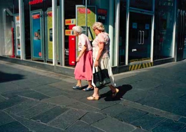
Recently a finalist in the London Street Photography Festival and now a member of the GSN Scheme at Northumbria, Richard Fish talks to peel about his current practice.
LW: How would you describe your practice?
RF: Primarily I would class myself as a street photographer but at the same time I hate the term because it ties you down to one thing. Urban spaces and the social landscape are my subject matter as is the medium of photography itself. I still use analog technology for my work as I find it the best medium of expression.
LW: ...ah right so you don’t use digital?
RF: No, I use 35mm film, its permanent, engrained into the film, exposing the negative and creating something from that split second decision to press the shutter.
LW: The images seem very much like one off happenings that you are able to capture or at least temporarily hold...
RF: Yes, they are very much about chance. A lot of my photographs could be seen as a gamble on timing, however I believe it’s also about predicting people’s behavior.
LW: Why do you prefer to use 35mm film as opposed to digital?
RF: I use a rangefinder camera to make my photographs. This type of camera is suited to my practice as it’s far smaller, quieter and generally a lot less intimidating than an SLR. A rangefinder’s viewfinder allows me to see if I caught the exact moment I wanted. We’ve spoken about the idea of chance and it allows me greater control, almost like a director of the chaos.
LW: So it allows you to be much more spontaneous and makes the activity itself less contrived?
RF: Yeah, I don’t want to intervene too much so that I spoil that moment. So I take the photo and then just walk on. It’s also important to me that I photograph in colour. There are plenty of street photographers who use black and white but I think if you want to document reality then do it as your eyes see it.
Redbull, archival pigment print, 20 x 16", Richard Fish Image courtesy of the artist.
LW: I’m just looking at all your images on the wall and to me they seem quite chaotic although they probably make sense to you! How do they operate?
RF: I pull certain images out that seem to relate to one another and I form them into various categories often relating to when and where they were taken or any other little reasons, it could be anything really. I see them as a kind of visual diary which helps me to look at them.
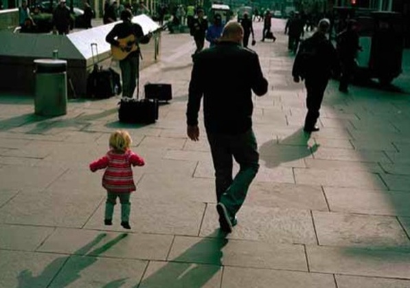
LW: You mention a need to keep yourself concealed within the landscape in order to observe changes without interfering with people’s everyday business..RF: I try to! It is important to try and capture that split second without disrupting it. For example, the image where the little girl is jumping, it’s a split second decision and I feel if I stand there shooting like a machine gun, the photograph becomes a lot less true and is less about that moment in time.
LW: How do you respond to the idea that to observe something is necessarily to change it?
RF: The Copenhagen theory, yes, I think you do. I’ve talked about the relationship between the subject and the photographer and to me, it’s parallel with that. However, if I wasn’t doing it then there wouldn’t be that single moment again.
LW: In another interview you refer to how light can transform the street into a stage and spotlight where a stranger can become a ‘performer’ which really interests me. In relation to this how do you view your own activity as an artist? Do you see this as a kind of performance on that same stage?
RF: I don’t see myself as a director as such, it’s literally the fact that I can walk round with a little box that makes these pictures rather than interfering with anyone.
LW: Would you not consider this activity, however unobtrusive, performative in itself? When I use the term performance I mean this in the lowest possible sense of the word of course!
Untitled, archival pigment print, 20 x 16", Richard Fish Image courtesy of the artist.
RF: It is, I mean the whole act of taking a picture is a performance. I gave a friend some prints of mine that I didn’t want and was going to throw away. She’s gone through them and picked out all the images where my own shadow or reflection has been captured in the picture...
LW: ...presumably your shadow being caught was quite accidental?
RF: Yes, so I’ve become part of the picture and this performance or rapport. I think it’s an important way of authorising it by saying you were there, then, taking that picture.
To find out more about Richard visit:
http://rich-fish.tumblr.com www.RichardFish.co.uk
RF: I pull certain images out that seem to relate to one another and I form them into various categories often relating to when and where they were taken or any other little reasons, it could be anything really. I see them as a kind of visual diary which helps me to look at them.
LW: You mention a need to keep yourself concealed within the landscape in order to observe changes without interfering with people’s everyday business..RF: I try to! It is important to try and capture that split second without disrupting it. For example, the image where the little girl is jumping, it’s a split second decision and I feel if I stand there shooting like a machine gun, the photograph becomes a lot less true and is less about that moment in time.
LW: How do you respond to the idea that to observe something is necessarily to change it?
RF: The Copenhagen theory, yes, I think you do. I’ve talked about the relationship between the subject and the photographer and to me, it’s parallel with that. However, if I wasn’t doing it then there wouldn’t be that single moment again.
LW: In another interview you refer to how light can transform the street into a stage and spotlight where a stranger can become a ‘performer’ which really interests me. In relation to this how do you view your own activity as an artist? Do you see this as a kind of performance on that same stage?
RF: I don’t see myself as a director as such, it’s literally the fact that I can walk round with a little box that makes these pictures rather than interfering with anyone.
LW: Would you not consider this activity, however unobtrusive, performative in itself? When I use the term performance I mean this in the lowest possible sense of the word of course!
Untitled, archival pigment print, 20 x 16", Richard Fish Image courtesy of the artist.
RF: It is, I mean the whole act of taking a picture is a performance. I gave a friend some prints of mine that I didn’t want and was going to throw away. She’s gone through them and picked out all the images where my own shadow or reflection has been captured in the picture...
LW: ...presumably your shadow being caught was quite accidental?
RF: Yes, so I’ve become part of the picture and this performance or rapport. I think it’s an important way of authorising it by saying you were there, then, taking that picture.
To find out more about Richard visit:
http://rich-fish.tumblr.com www.RichardFish.co.uk
Untitled, archival pigment print, 20 x 16", Richard Fish Image courtesy of the artist.
20.10.11 - 15.1.12
'A journey into the ancient'
review: mike kelley and michael smith A Voyage of growth and discovery
at the baltic
by zara Worth
Friends since 1975, it’s surprising that it has taken so long for Mike Kelley and Michael Smith to collaborate, (Kelley renowned for his use of found objects, predominantly stuffed toys, and Smith for his performances as the long established character of ʻBaby IKKIʼ), their practices seem to work in absurd harmony. Both prolific, eccentric and somewhat polymathic, they have both previously employed live performance, installation, drawing, painting, sculpture, puppet shows and video. A Voyage of Growth and Discovery could not be criticised for being restrained, however it has to be asked whether the outlandish nature of the exhibition overwhelms the astute nuances attempting to be communicated.
The vast gallery space is filled with lighting, sound, sculpture, video screens and found objects. The two and a half hour film shown on the six screens follows Smithʼs Baby IKKI on a ʻjourneyʼ, following his adventures and experiences at The Burning Man Festival, held in the Black Rock Desert, Nevada. The installation conjures the playground, the crèche, the carnival, the festival and is even complete with portaloos and burnt-out VW camper van reflecting the nature of the festival itself. Kelley designed most of the installation after studying maps of the festivalʼs campsites; “A fantasy stage-set, evocative of the tents and towers of the eclectic festival.” (ents24.com) The only lighting is from brightly coloured spotlights, casting fantastical shadows over cage like sculptures, farcically over sized in comparison to the stuffed toys which inhabit them. Dominating the room, a 30 foot junk metal sculpture of Baby IKKI parodies the emblematic gigantic figurine burnt on the final day of the festival.
The six video channels reflect the time scale of the journey, the four days and nights of the festival itself and time on the road. During IKKIʼs journey in his camper van, his infantilism is reflected in his choice of entertainment, gorging on sweets, watching cartoons and B-movies, fascinated by water and fire. The work serves not to mock the nature of such festivals as infantile, as shallow reading of the work could suggest, but instead Kelley and Smith have constructed a subtle investigation into primal instinct, survival and the elements. Proving that as much as Smithʼs Baby alter-ego maybe bold and exaggerated, it isnʼt lacking introspection.
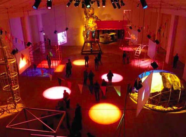
A Journey into the Ancient, Mike Kelley and Michael Smith Image courtesy of the Baltic, 2012
During the course of the festival IKKI meets and interacts with people as he goes along, simultaneously blending in, but still not one of them. There are others dressed in baby attire but generally he is ignored. IKKI goes to raves, dances, waddles about, even gets a lap dance off three women dressed as provocative vampires (and is very distressed when one confiscates his soft toy off him), but still he remains an outsider. Wandering out into the desert he makes a solitary
figure, almost swallowed whole by a dust storm, these tender moments which are almost sublime linger as we fall again into the merry-go-round of the festival itself. The exertion of staying in character for the entirety of filming took a massive toll on Michael Smithʼs health, leaving him ill for months after. Exploring the themes of the festival; self-reliance and self-expression to a new magnitude the work throws the ultimate ʻdependentʼ, a baby, into the harsh and barren environment of the desert. The site of the festival itself is on the ʻplayaʼ, an area of ancient lake bed, as old as the primeval as the act of burning totems.
Notably the ʻcagesʼ are reminiscent of the architectural aesthetics of Buckminster Fuller designs, most remarkably the geodesic dome, its floor covered in soft toys, quilts thrown over the top like a child’s den. The sculptures, combined with the sound, lighting and film, create overall an air of festivity, tinged with moments of anxiety, fear and isolation. In IKKIʼs infantilism we see the pre- lingual frustration, selfishness and curiosity which perhaps lingers in our own souls. Kelley and Smith suggest that we are not so distant from our ancient instincts for survival as we may have believed, presenting a transitory city in the desert, which, as quickly as it appears, melts away without trace. Baby IKKI is our unassuming dragoman in this foreign wasteland, translating a language that we all speak, but we have just forgotten.
Zara Worth is an artist and writer living and working in Newcastle upon Tyne.
21.10.11 - 8.1.12
Turner prize
baltic centre for contemporary art
review by anna jesson
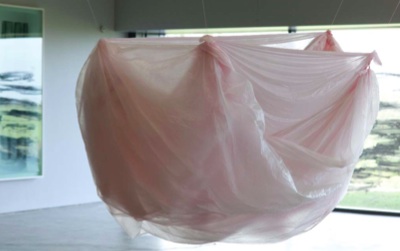
KARLA BLACK What To Ask of Others, 2011 Polythene, Chalk Dust, Thread. 120 x 180 x 100 cm Installation view at Longside Gallery, Yorkshire Sculpture Park Photo: Jonty Wilde © the artist, Longside Gallery, Yorkshire Sculpture Park Courtesy Galerie Gisela Capitain, Cologne
|
GEORGE SHAW Poets Day, 2005/06 Humbrol enamel on board 92 x 121 cm © the Artist. Courtesy Wilkinson Gallery, London.
|
This year, for the first time in its 27 year history, the Turner Prize is to be held at a non- Tate venue. The gallery chosen is BALTIC. The Prize is awarded to an artist, aged under fifty and based in Britain, for an outstanding exhibition held in the twelve months before April 2011.
This year’s nominees are Karla Black, Martin Boyce, Hilary Lloyd and George Shaw. Black makes innovative sculptural works using unusual materials, while Shaw paints images of the council estates of his youth that are both grim and nostalgic. Lloyd creates thoughtful video works and Boyce’s sculptural work draws on modernist design. The winner, announced on the 5th December and broadcast live on Channel 4, will receive £25,000, with £5,000 each for the runners up. The Turner Prize is the UK’s most prominent contemporary art prize and never fails to attract interest. Here, we consider the role of the Prize and the significance of its new host gallery.
The famous (possibly infamous) Prize can catapult an artist to fame, especially when their work is controversial - Tracey, Damien and Grayson have all been nominees. But the Prize does not guarantee future success. It’s important to remember that it’s not a life time achievement award given for a consistently outstanding career, but is awarded on the basis of one exhibition of the artist’s work, recognising good practise and potential. The Turner Prize is
a year by year snapshot of contemporary art, a barometer of what is considered to be at the forefront of art practise at a given moment. Half of the interest is waiting to see if the decisions made by the judges are confirmed by continued success.
The Turner Prize fuels debate because of the uncertain process of judging contemporary artists against one another. How do you judge a video work against a piece made from sugar paper and hair gel? What is the merit of a competition at all - why not simply award a worthy artist the Prize and keep the short-list private? The ‘accuracy’ of the result is arguably less important than the simple fact that the Prize gets people talking about contemporary art. This is regarded by many as the Turner Prize’s greatest asset. It is the only contemporary art event in the UK that is guaranteed to get column inches throughout the press and as well as being broadcast live on T.V. Admittedly, the press - particularly in the tabloids - can be lazy, overly reliant on the question ‘is it art’ and often downright derisive. But on the whole, the Prize ensures a level of consideration and debate that can be lacking at the average contemporary exhibition. The Turner Prize gives the audience, and particularly those who are less familiar with contemporary art, a framework through which to consider the art on show. The average contemporary art show provides the viewer with a few paragraphs of text and little else, making it all too easy to wander round, achieve little but a state of confusion, and leave. When you know that the artists are in competition with one another, you feel compelled to choose your own personal victor. And once this decision has been made, it must be justified. The viewer must consider why one work is of more value to them than the others – whether it be because of emotional response, pleasure derived from evidence of skill, or a connection with a theme expressed in a work.
The decision to host the Prize outside of London for only the second time (it was held at Tate Liverpool in 2007) is an interesting move. Evidently, those responsible for the Turner Prize now recognise that there are enough contemporary art galleries outside London and the Tate brand to sustain the alternation of the Prize between Tate and non-Tate venues from now on. These galleries include BALTIC, Mima and Northern Gallery for Contemporary Art in the North East alone, as well numerous other examples across the country. None of this year’s nominees studied in the capital, and only Lloyd is based there. Traditionally, the capital has undeniably had the lion’s share of contemporary artists, galleries and events but the real significance of the Prize’s arrival in Newcastle lies in the acknowledgement of the increasing interest in and maturity of contemporary art galleries in smaller regional centres across Britain.
BALTIC is a tactical choice of venue – it is a symbol of Tyneside’s cultural regeneration and its position by the river, alongside the iconic bridges, ensures plenty of views worthy of
Channel 4’s television coverage. BALTIC also has a history of big shows and bold ambition. Antony Gormley’s Domain Field in 2003 and Spencer Tunik’s installation involving 1,700 naked volunteers in 2005 would suggest that in the North East there is an appetite for getting involved in contemporary art. The Turner Prize continues this trend – every viewer is a judge. The gallery is promoting the spirit of participation by hosting Turner Prize Cafe events to encourage debate.
Director Godfrey Worsdale seems keen to push the ambitions of BALTIC even higher. Along with the Turner Prize there is the recently announced BxNU initiative, an innovative educational collaboration between the gallery and Northumbria University. That BALTIC has been selected to host the Prize reflects both its current success and its bold ambitions for the future. The arrival of the Turner Prize in Newcastle is an encouraging sign for many other contemporary galleries outside London, and also acknowledges the increasing appetite for contemporary art across the country. The variety and quality of the nominees means we can look forward to a fascinating exhibition.
HILARY LLOYD Crane 2010 Copyright the artist, Courtesy Sadie Coles HQ, London.
Marianne Wilde
‘So often is the virgin sheet of paper more real than what one has to say, and so often one regrets having marred it.’ Harold Acton
versus ‘The pages are still blank, but there is a miraculous feeling of the words being there, written in invisible ink and clamouring to become visible.’ Vladimir Nabakov |
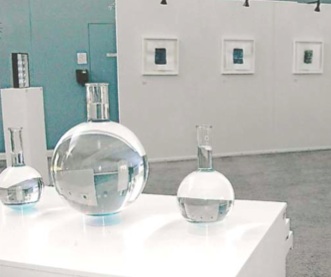
Presents as... Exhibition View, Bio Science Building, Centre for Life, 2011.
|
Entering the Bio Science Building at the Centre for Life for the first time I felt a great deal of excitement and anticipation. Having only ever seen Marianne’s works in her studio I was eager to re-discover them in the context of her latest exhibition, Presents as.
The alternative presentation of this exhibition at the Centre for Life (not taking place within the typical white cube space) is the culmination of a research collaboration between the neuromuscular research group at Newcastle University’s Institute of Genetic Medicine, the TREAT-NMD Network and Northumbria University. This AHRC funded Arts Research PHD, which Marianne is currently undertaking at Northumbria University, is a 3 year project entitled “ Words as Things: Visual metaphors and scientific explanations in the context of arts and health research.”
According to the artist, by studying how linguistic, visual and artefactual metaphors impact on the construction of technical explanations within the scientific network it is hoped that we can come closer to answering how we can make a ‘thing’ that we cannot see into something that we can say. Or, conversely, how can we make a ‘thing’ that we cannot say into something that we can see? A philosophicalproposition if ever there was one and yet here it is also cited as a central scientific concern.
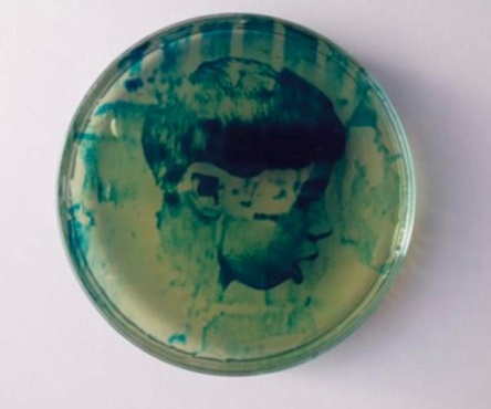
Cyanotype Agar gel portrait, 2011. Marianne Wilde. Courtesy of the artist.
Cyanotype Agar gel portrait, 2011. Marianne Wilde. Courtesy of the artist.
The scientist Professor Volker Straub explains “In a highly specialized and complex field like that of inherited muscle diseases, specialists tend to simplify complex facts related to genetic diagnosis and potential treatment strategies by using metaphors, analogies and models. Based on our differing backgrounds we visualize and reflect on things in different ways.” Enter Marianne Wilde whom Straub believes explores these processes by using art as a more general, non-linguistic concept which has the potential to give us new insights into ways of explaining diseases.
And yet for me, the merits of the work extend far beyond any discernable means of mere articulation. Testament to the strength of the
works is that I question the relevance of the scientific, contextual background to my understanding or response to the work. I feel confident in the potential for audiences to engage with the work and be equally as rewarded with little or no reference to this.
Or, if we take Harold Acton’s earlier reference to the virgin sheet of paper as a metaphor for the art object (or at least that which waits to be inscribed by the artist) then we could agree that this can indeed be more real than one has to say, (or we could say that of scientific explanations.) This premise, however, betrays the previous alliance I struck between scientific and artistic practice. (I did warn you of the dangers of such a comparison!)
Central to the exhibition is a white chest on which are seated three large medical Florence flasks, each containing an ‘image’ held within liquid in which language is uncharacteristically absent. The draws of the cabinet are ajar providing just enough access to a series of petri dishes containing disc-like images of medical portraits from the 1850s. These are juxtaposed with contemporary images of The Western Blot in an attempt to create an alternative form of portraiture. Taken to its extreme one could envision strips of DNA as portraits in themselves.
The anonymity of the sunken images provokes an unexpected empathy with figures that have been objectified previously in medical journals and would otherwise have remained lost to history and time. Here they return as enigmatic signifiers appearing and disappearing according to the navigation of the viewer. Within this space there is the potential for narrative to emerge, an a fact the artist is not unaware of when she says ‘textual absence is informed by the tracery of memory and remembered knowledge and perhaps sometimes an imagined truth.’
The images within the flasks are made from ager gel combined with cyanotype photography, their very nature means that, like all mortal things they will be subject to an entropic demise, degrading over time as they are exposed to UV rays amongst other things. This provides an interesting foil to the attempts to archive and classify materials and objects inherent not only in science but also in art. (A fact that is made more pertinent by the fact that many of the works in the exhibition are presented in entomological display cases.)
Concise analogies and metaphors endeavor to reveal the possibilities of art as a means of operating beyond the coded interface of science and linguistics. And, as a number of the images degrade and disappear, we end as we begun, with a blank sheet of paper, with only the memory of what has taken place.In fact, this collaboration provides a fascinating insight into the activities of the artist especially in the context of studio-based practice: If science can be defined in part as a knowledge of the physical or material world through observation and experimentation then what of the activities of the artist? Despite the problematics of such a comparison, it nevertheless creates an interesting parallel between diverse practices that are each reliant on process, observation and experimentation within which, Wilde is able to extract a kind of synergy: the artist as alchemist.
3.11.11
interview: john walter
by louise winter
LW: How did the Two Peacocks project begin?
JW: It began as a joke. My ex-boyfriend used to work in a florists and when I met him he had become a gardener and we were both very flamboyantly dressed. We both used to get hassled individually but together it was amplified so, just to digress, but meaningfully, we got very badly verbally abused on a bus one day and I think that’s where the political element for Two Peacocks came from, which is about saying that flamboyance isn’t meaningless and that there is an agenda to being visible. But I don’t want it to be dogmatic or preachy. After, I did this thing called Zsa Zsa which is about hospitality and trying to have an opening which is friendly and where you can meet the artists and be greeted by them and dissolve the barriers between them and also the real world and the fictional world of the gallery were collapsed. Not in a relational aesthetics way, I mean when you go into the white cube they always hide the plug sockets and they have fire hazard symbols and I was thinking: why do we do that? So it tends to start from that position. Another vein is how I work with other people – and because my work is so visually dissonant I wasn’t getting asked to be in many group shows. So instead of waiting around to be invited I thought I would instigate something. In this way I could make a bigger project than I could on my own, not that I’m using them hopefully, but more that I was extending my own range through collaboration.
LW: I’ve deliberately avoided using the term ‘curator’ as I noticed on the Two Peacocks posters you are referred to as an ‘organiser’ and not a curator. How do you distinguish between the two and why is this important?
JW: I really try to avoid the term curator because I’m not a curator, I’m an artist and I’m in the show and all over the show as a kind of conjunctive within it that sticks everyone together.
LW: Like the glue?
JW: Yeah exactly or the goo! I’m not trained as a curator and I don’t really believe in it. I’m not fussy and don’t hang paintings exactly. If I was a curator then I couldn’t have been in the show. It’s more of a collaborative experience where everyone comes together.
LW: It sounds almost like a family!
JW: Hopefully it is! I don’t like things to be too fake and want you to feel that spirit. I’m not a collectivist, I’m really an individual so it’s quite an odd thing for me to instigate something but I guess I’m a leader but I also defer to other people’s views and better knowledge. That’s what this is about – admitting the fact that I have limits and that I couldn’t do a solo show.
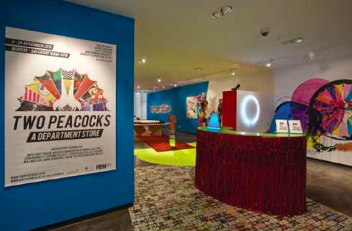
Two Peacocks, Gallery North, 2011, Image courtesy of Ollie Harrop
LW: Why not?
JW: Because the range of voices and the languages within it are so nuanced which is what makes it so special. I mean take Jamie's train set for example, it's a really boyish hetero thing and that is not a language that I could have access to ordinarily! You also start to see rhymes and rhythms between works that have emerged quite by accident and have become symbiotic.
LW: The busy, overlapping aesthetic of the department store is a stark contrast with the modernist, white cube that we are accustomed to. The previous show at Gallery North ‘Dust on the Mirror’ in many ways typified this minimal, monochrome aesthetic. What is its relationship to the audience?
JW: For them deciphering it? LW: Yeah
JW: I want them to come in and immediately say ‘Whoa what the fuck is this?’ I want hot colour and visual overload and Two Peacocks is part of a longer project which is to build up the level of colour and increase saturation and in so doing go through this trance which I suppose is a fictional world and I would like that level of transformation that you get in film or in a story book. I do think certain things work well in the white cube so I’m not altogether dismissing it, but it’s a very conceived notion just as the Salon was a pre-conceived notion in the 19th Century and I’m suspicious of many things we take for granted and of relational aesthetics and art so what I try to do is combine them in order to make a brand new form.
21.11.11
Interview: Laurence Sillars
by Anna Jesson
On 5/12/11, Martin Boyce was announced as the winner of the 2011 Turner Prize. His work, a restrained but arresting installation inspired by a modernist garden, was praised as an “opening up of a new sense of poetry”. He triumphed in a strong year that was met with much critical praise and, in its first incarnation outside of a Tate venue, received a phenomenal number of visitors.
Laurence Sillars has been chief curator at BALTIC since 2009, following on from his time at Tate Liverpool where he curated the 2007 Turner Prize, the first to be held outside of London.
Anna Jesson spoke to him about the Prize and the idiosyncrasies of curating at BALTIC.
AJ: You curated the 2007 Turner Prize at Tate Liverpool, and obviously this year’s Prize at BALTIC – what do you think holding the Prize outside of London means for the Prize and for the regions where it is held?
LS: First of all, I think it means a lot for the Prize. The Prize was set up 27 years ago, essentially to raise awareness of contemporary British art and it’s been tremendously successful in doing that. But to always keep the heart of that debate in London is kind of limited. It’s great that everyone’s talking about the Prize but the important thing is actually seeing the art.
The great thing about the Turner Prize is that it brings people in like no other exhibition. People are still often, sadly, pretty afraid of walking into a contemporary art gallery. The Turner Prize obliterates that. In London, the Prize exhibition gets on average 70,000 visitors in its three month run. We’ve seen that in less than a month, already. So, I think there definitely will be a legacy and the really important one for us will be bringing people into the building for the first time - I really think that will make a difference; people will be more tempted to come and see us again in the future.
AJ: I know that you must travel internationally pretty regularly. To what extent do you get to directly experience contemporary art in Newcastle and the north east?
LS: Thankfully, a lot. And the north east is an incredibly vibrant and inspiring place to be and so there are some great artists here - we’re kind of blessed with three very strong art schools. There are good studios here too. The testament to that strength is that when artists graduate often they stay here, rather than just being drawn immediately to London.
AJ: Do you go to degree shows, or student or graduate exhibitions?
LS: Yeah absolutely, degree shows, studio visits, and many other projects that are organised here and they’re popping up all over the place. The Workplace is vital, Newbridge studios have been incredibly important and are doing very exciting things.
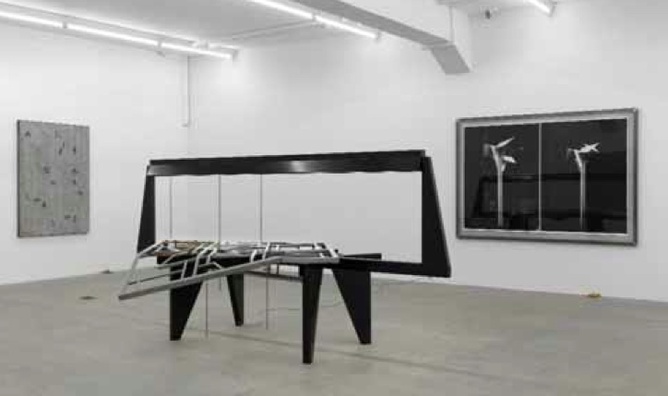
A Library of Leaves, 2010 installation view, Galerie Eva Presenhuber, Zürich, Martin Boyce
AJ: In your role as chief curator, do you aim to anticipate art trends or to you try to present up- to-date but already established trends?
LS: I think BALTIC is such a unique space you have to do both. There’s no other space quite like it in the country, I don’t think, where at the same time you might be presenting a major new commission by an internationally renowned artist, a historical show, and then perhaps giving exposure to an artist for the first time in a public gallery setting. And I think we have to get the balance right between all of those things. So, I want our program to reveal trends that have already been established as important, but also to initiate them and give artists a chance when they’re just starting to break through.
AJ: I suppose that’s the benefit of having such a big space, you can have each thing on each level...
LS: Exactly, and how those things interact with each other and start having a dialogue. We’ll
pair a very established artist with a more emerging figure. Links might be found or they might not but it‘s giving you that dialogue between historical and established and younger and emerging.
AJ: To what extent do you consider your audience when you’re finding things to put on here? Do you aim to please?
LS: I think there’s nothing wrong with aiming to please, there’s nothing wrong with aiming to challenge as well. Where the real consideration of audiences comes into play is that there has to be a relevance and a reasoning behind presenting a particular artist’s work at a particular time. You’re not going to please everyone all the time, but hopefully if they come in and hate what’s on level four then there’ll be something to preoccupy and engage on level three and I think having a kind of coherence but a disparity between simultaneous projects is very important.
