2013
21.9.13 - 21.12.13
Review: The Hatton, ‘Art of the 1960s’, ‘The imaginary body- art of the 1980s’ and ‘Realtimelapse’
by Lucy Moss
FREE ENTRY
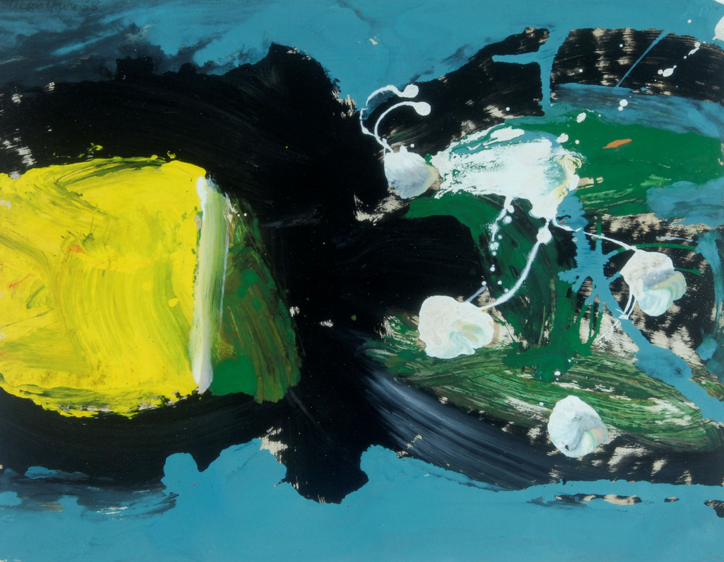
Art of the 1960s: Alan Davie Yellow Pool Pull, Courtesy of the artist and Gimpel Fils, London
No less than three, and soon to be four exhibitions are currently on show at The Hatton Gallery. The amount of art (and the variation of styles) in the show is reminiscent of a museum installation. The retrospective inclination of two of the shows, Art of the 1960s and The imaginary body- art of the 1980s only seems to reaffirm this. The third show, Realtimelapse by contemporary artist John Topping, highlights the contextual reasoning for this historical perspective. The dialogue between historical and contemporary practices is a subject undergoing a current revival.
The Laing, Newcastle's city art gallery is also taking a closer look at historical influence in contemporary art currently holding a sort of painterly conversation between painters past and present. However, at the Hatton this contextual influence is not only apparent in the relationship between the older artworks and Topping’s more recent contribution. It obviously holds a vitally important role within the practices of the sixties and eighties as well. By including artists working with decades between each other and alluding to the influential lineage of even earlier ones, we can glimpse how every generation of artists helped to mould the next. Each treading the path from influenced to inspiration.
Every artistic ideology is a mix between historical influence and current zeitgeist. For the sixties, a mix of earlier 20th century innovation, (including artists such as Duchamp and the beginning of movements such as pop art), fuse with new ideas about form and process-lead creative practices, such as 'Basic design'. Moreover, co-founders of the basic design principles Victor Pasmore and Richard Hamilton feature prominently in the show; both through their individual artistic practices and through their contributions to ideologies prevalent in the sixties.
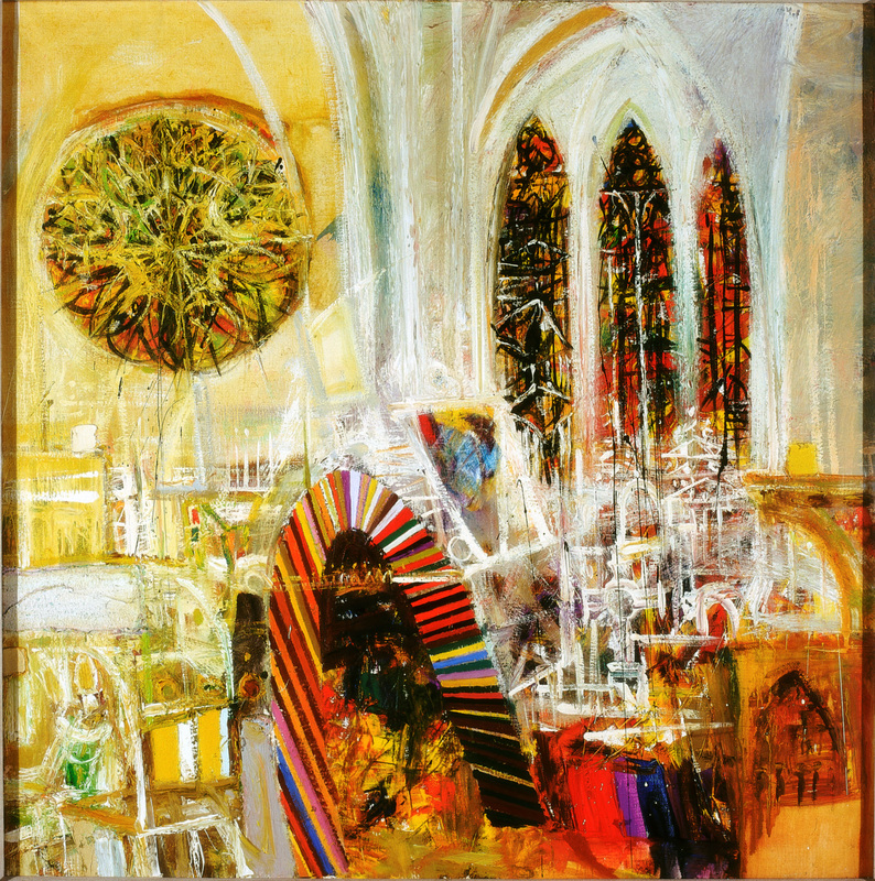
The Imaginary body - Art of the 1980s, Sir Robin Philipson Cathedral Interior
This involvement in process-art and design collided with interests around architectural and sculptural form; coming together perfectly in Pasmore's Apollo Pavilion (1969). Situated at Peterlee, the pavilion is the temporal locus of the show. Each work in the Art of the 1960s collection was created around the time of the build. Like flipping to a page in a book, this allows us to take a peek at the emerging 'narratives' within key artistic concepts and concerns of the times.
Themes of materiality feature heavily; painterly works, such as those by Alan Davie and Robin Phillipson use the materiality of paint to convey a deeper sense of form. Davie creates paint structures on the canvas, while Phillipson uses this viscosity to delineate existing architecture itself. This was not the entire breadth of thought in the sixties however. The inclusion of posters created to advertise past exhibitions hints at the playful 'life inclusive' atmosphere present in the era. Art was fluid; the art object not limited to a singular ideal. Rita Donagh's The Studio (1970) celebrates the importance of community, by mapping the topography of social interaction, instead of a more usual geographical depiction. Meanwhile the theme of artistic collaboration, one important to the sixties ethic, is addressed in Richard Hammilton’s designs for the reconstruction of Marcel Duchamp's 'large glass’.
This emphasis on peer influence is still relevant today. The exhibition featuring most recent works; John Topping's Realtimelapse, draws direct inspiration from Victor Pasmore's Apollo Pavilion. Topping re-imagines the pavilion in a two screened animated model, which describes the passage of the sun around the structure in a single day. One film, shown in real time, takes place at the winter solstice. The almost imperceptible change in light throughout the day results in the impression of a static image. The second, located at the summer solstice, is shown in time-lapse style- taking mere minutes. Watching the sun glide around the structure the building dissolves surprisingly readily into abstract form, as if solidity were negotiable. Perhaps the steady mental images we hold of our surrounding architecture, that assurance of ‘solid space’, never actually exist in the real world. Form is as much described by light and shadow as it is by steel or stone. I watch the building shake out and transform, windows stretching to a streak, walls snaking across the floor in the evening shadows. At midday, it becomes nothing more than the faintest outline; dissolved in a minute more effectively by the modest light of the sun, than by a hundred years of wind and rain. Of course this image is only an animation; nonetheless this feels like a real insight into how naturally solidity dissolves into obscurity.
This is not to disregard the many other motives abstract artists might have for dealing with pure form. It’s instead a curious vision of how logically physical fabrications seem to counter-intuitively progress into abstraction. We can change the world merely by squinting, dissolve the sharp outlines of tower blocks, or turn the intricate web of branches and leaves on a tree into an awkward blob. Having sat with Toppings work a while, I no longer get any structural sense of the pavilion that I saw upon walking into the room. The sun itself draws the building into being; we are witnessing a continual process of creation and dissolution.
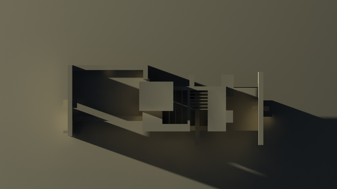
Realtimelapse, John Topping (2012), still image from Realtimelapse
Realtimelapse’s reactive relationship to Pasmore’s pavilion is intelligently cohesive and a strong curatorial decision, even Kurt Schwitterz’s Mertzbarn (1948), a permanent feature of the Hatton’s collection, compliments the other artworks. What is surprising however, is their clear connection to the third exhibition The Imaginary Body, which centres on the emerging engagement with the body and imagination in 1980s art. These are looser, more introspective works that create surreal combinations of figure and fantastical landscape; visually there is nothing more dissimilar. The minimalistic architectural interests of the sixties draw more from design; leaning towards a purer ethic of subtle shades and clean geometries. The Imaginary Body is a half formed memory of a vivid nightmare; structure is splintered in the vibrant realm of the fantastical. Colour conveys, form stutters and composition relies less on architectural order, more on the fluid curve of the body. However, for all their superficial differences, the core concern of all three exhibitions undoubtedly, is form itself.
Sometimes art tries to ally itself with others who share an aesthetic, when, like a reflection, often the most important similarities reside within. The shift in concerns between the decades highlights the synthesis of influence and counter-reaction that moves modern art forwards. For all its architectural concerns, elements of the surreal still crept into the work of artists during the sixties. Now they flooded through. As if gates had been pulled wide and the sluice of the imagination had been set free. Form had mutated, or perhaps just shifted focus, recognising a different architecture, one of the self and the inner world.
Interestingly, while the art of the sixties had been dominated by a concern with exterior structure, the works in The Imaginary Body physically dominate the room. Whether it was the colour, scale or possibly the loudness of the subject matter, the images actively seem to seek viewing. Artists such as Alan Davie were by no means constrained in the manner they painted, but they didn't shout quite as loudly as these did.
The eighties creations projected outwards. Adrian Wiszniewski’s Aloft in the Loft 1987) uses its impressive scale to capture the gaze and lock it into heady swirls and strikes of colour. It’s location hard to make out, almost drowning between eddies of green and red; again here, despite the diversity of style and subject matter, every work compliments the others in the room. Each uses a different voice to express the overriding concerns of the decade.
Projecting forwards, the art of the nineties again retained some of their predecessor’s values. Given to introspective explorations, their artworks contained autobiographical self-exploration, and some became self-referential critiques of the art industry itself. In contemporary art, as is evident in Topping's work, artists still look to the past for inspiration, and employ, not only previous ideals, but reinterpretations of the art objects themselves. Returning to form, that artistic staple; so plumbed and mined but still yielding treasure. Topping contributes a new type of structure to the theme of form, a work regarding the external, but written in the language of that extra-internal medium, the virtual.
http://www.twmuseums.org.uk/hatton-gallery.html
Lucy Moss is currently in her Third Year studying BA Fine Art at Northumbria University
9.12.13 – 10.1.14
Review: A Machine Aesthetic, Gallery North
Andrew Bracey, Eric Butcher, David Connern, Robert Currie, Paul Goodfellow, Simon Granell, Emma Hart, Dan Hays, Natasha Kidd, Tim Knowles and Michael Roberts
By Lucy Moss
The machine aesthetic has a very human touch. Far from the cold aspirations of a steely modernity, it is celebration of an animal instinct for aesthetic beauty (if I may use the word). Not a base instinct, but one that is, I suspect, more universal than we might usually think. Like birds who collect colourful items to bed their nests and catch a partner, this exhibition collects artworks for their visual joy.
This is the reverse side of sleek utilitarianism, as if safe inside those metal boxes there are mechanical souls, lurking like some oil spill rainbow within the somber depths of a rusting machine. Gone are the cold analytical robots. Even the chill of metal is brought to life with luminescent colour, by paint more delicate than the shell of a water droplet, almost holographic, ever changing. It catches the light and spits it back in a shimmering splitting of a spectral spectrum. A delicate array of Infra-thin tones.
This is the reverse side of sleek utilitarianism, as if safe inside those metal boxes there are mechanical souls, lurking like some oil spill rainbow within the somber depths of a rusting machine. Gone are the cold analytical robots. Even the chill of metal is brought to life with luminescent colour, by paint more delicate than the shell of a water droplet, almost holographic, ever changing. It catches the light and spits it back in a shimmering splitting of a spectral spectrum. A delicate array of Infra-thin tones.
|
|
|
|
Surprisingly, given the title, the exhibition is not dominated by a bank of computer screens or drawing machines, instead a mix of mediums incite exploration. Here, the wire mesh rigidity of a crosshatched cassette reel appears to unravel into a nest of tape under the influence of light. Its straight lines seem to curl and twist, forming interiors; it has more insides than it should. There, a sleepy snow laden forest dissolves pixel-like as if the canvas were a screen. Move closer and distance paints a different picture, refocusing the scene.
Each artist has engaged with machinery in a completely different way, some without touching anything mechanical at all; their behaviours instead mirroring the actions of mechanism, assuming again those labours we have delegated to technology. For others it is mechanical labour itself that fascinates, so they display those processes, presenting means as an end. Who are the machines here? The boundaries of identity seem fluid. This exhibition goes against so many of the stereotypies of technology. It is certainly not uniform or unoriginal, it places aesthetics over functionality. And yet none of these emotionless qualities accurately describe the role of the machine in everyday life. We use it to share and socialise via the smartphone; to escape into fantasy. Of course, a computer makes it easier to do the accounts, but at heart they are not serious machines.
Each artist has engaged with machinery in a completely different way, some without touching anything mechanical at all; their behaviours instead mirroring the actions of mechanism, assuming again those labours we have delegated to technology. For others it is mechanical labour itself that fascinates, so they display those processes, presenting means as an end. Who are the machines here? The boundaries of identity seem fluid. This exhibition goes against so many of the stereotypies of technology. It is certainly not uniform or unoriginal, it places aesthetics over functionality. And yet none of these emotionless qualities accurately describe the role of the machine in everyday life. We use it to share and socialise via the smartphone; to escape into fantasy. Of course, a computer makes it easier to do the accounts, but at heart they are not serious machines.
|
|
|
|
Likewise, this exhibition isn’t the attack on technology I has perhaps expected, instead it is more of an exploration into the process and perhaps the identity of mechanisation. The machine is very much an extension of ourselves, two bodies joined to make a bigger machine and it is often very difficult to pinpoint the precise boundary between them. Technology has a place in our lifestyle, in our bodies and even in our memory (what else are photographs for). We have outsourced ourselves, but this is a concept that is taken very lightly by 'The Machine Aesthetic', indeed it is enjoyed. Engaging with the machines ability to be creator and artwork, and the artist’s ability to be machine, in a variety of objects that feed our inquisitive natures with an array of visually edible artefacts.
Then there is the question of authorship, do we collaborate with these machines, or are they simply a vessel that we create things through? A camera, for example, has a unique way of seeing the world; and in turn creates a unique version of the truth, as seen through its eyes.
Machines are translators, coding the natural world into streams of data. Often, these translations are regurgitated back into visual imagery, a new reality approximating the real; as if we could catch the world on a camera screen. But these mediations are far from unnatural; we too run off electricity after all. Machines mimic our own information systems, as our eyes code the world into suitable food for neurones, we forget our parlay with reality. Seeing might well be believing, but its a long way from the authentic. The world is mediated by our own agency, and our agency is moderated by our creations; man makes a machine made man. Although we might not live inside a metal shell, or completely understand how to rewire our circuits, we are, I think, the machines after all.
Lucy Moss is currently in her final year studying BA (Hons) Fine Art at Northumbria University
15.11.13 - 20.12.13
Review: All Depth, No Substance, Richard Talbot
The Globe Gallery, Newcastle upon Tyne
by Rebecca Farr
‘I use drawing as a way of thinking, and a way of bringing together apparently disparate ideas and images. Through drawing I can start with a gut feeling, a vague thought, a hunch or an idle observation and can distil and combine these into something concrete.’ [1]
Richard Talbot’s latest video installation All Depth, No Substance, currently showing at Globe Gallery, shows an extension of Talbot’s complex, long-standing practice and interconnected research. His work is primarily concerned with geometric linear perspective, construction and layering to produce intricate large-scale pencil drawings. Talbot develops ambiguous spatial forms within the surface of a rigid two-dimensional space, referencing architecture, landscape, maps, water, vessels and containers.
All Depth, No Substance presents the viewer with three large adjacent screens on the rear wall of the gallery space. A bench is placed directly in front of the middle screen, the two outer benches set at an angle, subtly drawing the viewer into the work. This immersive installation shows a visual morphing of geometric patterns; each screen contains a consistent black structure used as a ground for constructing the overlaying white grids, subsequently pushing the depth further afield. The slow mesmeric movements of the lines create an awareness of the significance of the relationship between Talbot’s methods and the history of linear perspective itself, which has led him to create these intuitive images.[2] Thus Talbot draws the viewer into this illusionistic depth created within the flat surface of the projection screen. His constructions of lines and grids evident in his drawings, come alive within the space as we are subject to a visual layering, a composition of vanishing points and converging lines.
This practical use of geometric forms inherent in Talbot’s work, derives from his fascination with early renaissance paintings; particularly those from the early 15th Century, in which are known to be the first manifestations of the systematic use of linear perspective. The painters including Masaccio, Domenico Veneziano and Piero della Francesca are seemingly clear examples of such. On the surface these paintings are coherent transformations two-dimensional space into three-dimensional illusion; the surface and depicted depth clearly consider perspective. This has led to what Talbot believes is the
typically commonsense perception, and that therefore, linear perspective is used as purely a tool for depicting three-dimensions. However, through thorough interrogation of history as practitioner and researcher, Talbot proposes this assumption as myth or misunderstanding. Therefore, upon closer inspection of such renaissance paintings; each one betrays a certain level of uniqueness that defies the strict logic of linear perspective, confirming that it is instead used to transform the space of the canvas from a flat surface matrix.[3] Talbots practice and enquiries have informed him to take his practice against the historical grain so to speak. Though this video installation he has successfully challenged this notion, embodying this spatial ambiguity through his geometric forms and transforming a flat surface plane into a space that illustrates the depths of his findings, referencing the misunderstandings.
The title All Depth, No Substance could apply quite literally to the visual. A construction of geometric scaffolding adhering to depth, without an overlay of image, a frame without any physical substance. However, when witness to the overwhelming complexities involved within his practice, we can see that the exhibition projects not only a visual depth but also the depth of his knowledge of linear perspective, and the ideas and definitions which he has personally refined over his years as practitioner. This depth however, can only be adequately conveyed and understood through further reading into his extensive practice and research, things which are not entirely conveyed by the exhibition itself.
Yet I do suspect there are those like me who stay for a long while sat on the bench, in the cold and clinical atmosphere of the Globe Gallery space. Sat, taken in by the almost hypnotic movement of the spatial structures, which spark interest into Talbot’s thought processes and previous practice. To refer back to the opening quote in which Talbot states that he uses drawing as a way of thinking, it may be fair to speculate that Talbot’s known practice as primarily a drawer is also misunderstood. Through his video installation we see a stable black structure that becomes the basis for building the depth; through a layering of complex geometric patterns, resulting in the construction of a three-dimensional space: perhaps confirming his position as a sculptor. His self reflection is evident within this work, that through his thought process, his drawings, he is able to produce his observations as something concrete. All Depth, No Substance gives ample opportunity to begin to unpick some of the insightful research Talbot has engaged in and provide an interesting snapshot of his practice.
[1] Richard Talbot, http://www.richardtalbot.org/pages/writings.htm, <4 December 2013>
[2] ibid.
[3] Richard Talbot, An enquiry into the Contemporary Use of Linear Perspective, http://research.ncl.ac.uk/sacs/projects/Talbot.html, <4 December 2013>
Rebecca Farr is in her Final Year studying Fine Art at Newcastle University
31.10.13 - 14.12.13
Review: 'Skittish' by Lisa Watts and David Kefford
VANE, Newcastle upon Tyne
by lily mellor
Blow
Bustle
Frame
A4
Blood
Vane
Bright Fresh
Playful
SKITTISH
Kitten with a ball of wool
Back and forth
Forward thinking
Space Hopper
Aftermath
Collaborate, Sculpt, Activate
Interact, Initiate
My grandma used to have a sock on a stick that she used to reach dusty corners with. Nostaglia. Make-shift. Sentiment.
Transitional
Orange
Industrial/
Fragile
Leaning, Magic
Mundane
Help protect the environment. Alive
Felt
Rub
Rug
Click & collect
Click
Thank you
Balance
Texture, Hands, Skin
Bollocks
Stain
Crack, Plaster, Scales
Tension
Gender
Murmur
Plan, Arrangement, Arranged, Arrange.
Sectioned, Sections.
Copy
Domestic
Bum
Dance
Slide(s)
Bench, Rock, Sheet
Blackout
Rocking
Metal
Heightened
Consider
Time
Vacuum, Volume
Suspense
Static, Humour, Tension
Car showroom, Country fair, Sex kitten
Bad Luck
Russell
Comfort
Sculptor
Film Maker
Sound Designer
Plastic arts
Performing arts
Transforming
Arts, Everyday
Sweet
Mundane, Giant bubble-blowing mechanism
Repeated ritual, Bread, Baking
Jumping
SKITTISH, Material
Body, Gender
Figuration
Humour, Likeness
Colour, Associate
Collaborate
Respond, Develop
Initiative
Spontaneous
Constant, Space
Programme
Snowgum
Disturbing, Sickly
Wall
Stretch, Pulling, Playing
Public
Response
Response to
Visitors, Bodies
Intrude
Debris
Residue
Duration
Character
Grease
Co-dependent
Persona
Scale, Reach
Handle
Relationship
Pace, Experiment, Discarding
Monumental
Pop up
Go Figure
Coming Together & Falling Apart
Converse
Muted
Mutate
Image courtesy of the artist and Vane
Lisa Watt’s live performance schedule;
Thursday 31 October 12-5pm / Friday 1 November 12-3pm
Wednesday 13 November / Thursday 14 November / Friday 15 November 12-5pm
Wednesday 4 December / Thursday 5 December / Friday 6 December 12-5pm
Thursday 12 December / Friday 13 December 12-5pm
http://vane.org.uk/exhibitions/skittish
Skittish is a travelling show, created by live artist Lisa Watts. For each of the three installments (the second currently being shown at Vane), she works with another artist to create a playful exhibit, initiating a set of developing performances. The relationship between live and visual arts is explored in the conversation between the two ways of working; though there are also shared themes within the works that blatantly run through both the artists’ interests. By injecting humour into the everyday, both Watt’s and Kefford have succeeded in producing an exhibition that is constantly renewing itself and remains fresh and exciting, but manages to hold on to the nostalgia of make-shift domesticity. The reasons for this particular collaboration are clear, but perhaps a little too obvious for those of us that enjoy a challenge; the ideas and links between the two practices are handed to us on a plate. Nevertheless, these two artists are showing us something fresh; by playing off each other they take tired examinations into gender and body to reach new levels of important consideration. Works are stripped back to the point of realisation and production; Skittish invites us to discover and explore simultaneously with the artists.
Please take along a copy of the above text and read from the point of entering the gallery building.
Lily Mellor is an artist living in Newcastle upon Tyne currently studying an MFA in Fine Art at Northumbria University.
26.10.13 - 6.12.13
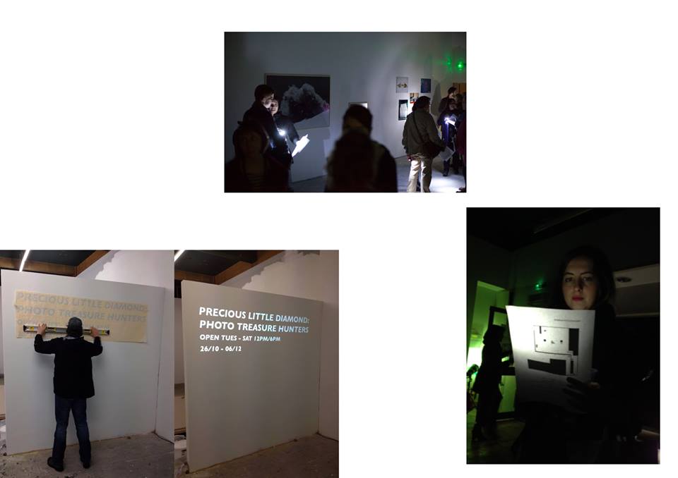
REVIEW: 'Precious Little Diamond' at The Newbridge Project,
Newcastle upon Tyne
By David Meadows
When stood outside The NewBridge Project Space you’d be forgiven for assuming that this was just another disused office that the city has neglected. It’s boarded up, blocked out windows do little service to an exhibition as imaginative as this one, and you soon find the deceptive exterior to be a rather fitting one.
The Social: Encountering Photography Festival announces its arrival on this side of the Tyne with: Precious Little Diamond: Photo Treasure Hunters; an international group exhibition that takes great delight in playing with the concept of curiosity. In her statement, curator Kuba Ryniewicz likens the photographer to that of an acquisitive hunter, pursuing new aesthetics through the exploration of his or her surroundings. The treasure, in this case, is not in the event photographed but in the photographing of the event; it is found in the pursuit of the image.
The Social: Encountering Photography Festival announces its arrival on this side of the Tyne with: Precious Little Diamond: Photo Treasure Hunters; an international group exhibition that takes great delight in playing with the concept of curiosity. In her statement, curator Kuba Ryniewicz likens the photographer to that of an acquisitive hunter, pursuing new aesthetics through the exploration of his or her surroundings. The treasure, in this case, is not in the event photographed but in the photographing of the event; it is found in the pursuit of the image.
Images courtesy of the Newbridge Project Space and the artists
In contemporary society, photography is becoming practiced less as an art form and more often a way of certifying experience. This is becoming increasingly evident with the recent aggressive development in computer technology. In an age of instantly technologies such as Facebook and Instagram, whereby every experience is carelessly captured on camera phone and flaunted on social media, here is an exhibition that is very much of its time, yet, demands us to rediscover the joy of exploring and seeking out the treasure of aesthetic pleasure. And so, just as these artists have mapped their surroundings and sought out their image, so too now are the visitors invited to participate in their hunting.
Upon arrival you are greeted with all you need; a warm welcome, a map and a torch. And then you are left, alone in the dark, free to explore as you wish.
It’s an amusing sensation, to stand in a gallery with the lights off, nothing but your own light to guide you. Photography exhibitions tend to be rather museum like in their presentation, and so it is refreshing in this case to see a gallery and its curator to have so much fun with concept and presentation. When viewing the space, especially the basement, it is intentionally left unclear as to what is part of the exhibition and what isn’t; for example, Peter Sutherland’s ‘Untitled’ video piece is displayed in the kitchen; far from the location being distracting, it in fact compliments the concept effectively.
If you are to follow the map then you are first presented with the work of Jim Mangan and his excerpts from the series ‘BEDU.’ Here, the naked human figure is presented rising up from the Sahara landscape, reborn in the sands of baptism. It’s a stunning introduction to an exhibition that grabs your attention and refuses to let go. No more so perhaps than Estelle Hanania’s enticing colour excerpt from her series Shady. This large print shows a flame detained in an outstretched hand; blurring the lines between fantasy and reality, the documentary and the abstract. Hanania manipulates the cameras’ ability to solidify moments of transience, enticing a deep sense of wonder and mystery. Alongside, curator Kuba Ryniewicz finds a galaxy in a stream of bubbling water, focusing our attention on the everyday moments we don’t see, or even look to see.
Scattered around the gallery are a series of cabinets that reveal the flea-market findings from the likes of South Shields to Mumbai. There is something almost perverse about prying into the documents of strangers, the lost souvenirs of family memories. It is a voyeuristic thread that runs throughout the course of the exhibition.
Passing the musings of Bridget Collins, your light then leads you down into to the basement where Ola Sliwczynska captures the random in the everyday; the beauty in the accidental. Harsh lighting illuminates virgin white snow settling on rusted motors, gardeners maintain the graveyards, suppressing nature. The work of Sliwczynska adorns the staircase walls, hung like family photographs, leading you to the final urban scenery of Peter Sutherland’s video work.
Precious Little Diamond: Treasure Hunters is a fitting instalment to The Social Festival. It’s success lies in making the spectator share the arbitrary nature of the choices made by each photographer, in turn asking us to make choices of our own. What are we trying to see here? What is it that we are looking for and why?
By the time I was eventually leaving the gallery I found myself planning a return, eager to discover what else could be found in the riches of Precious Little Diamond.
http://thenewbridgeproject.com/
David Meadows is an artist and writer based in Newcastle Upon Tyne at Graduate Studios Northumbria
17.10.13 - 17.11.13
Review: CIRCA PROJECTS PRESENT 'Does the IT FIT', BY JOANNE TATHAM AND TOM O'SULLIVAN,
THE STEPHENSON WORKS, NEWCASTLE UPON TYNE
BY RACHEL MCDERMOTT
The finale of CIRCA’s fifteen month programme Space Release concludes with Joanne Tatham & Tom O’Sullivan’s DOES THE IT FIT. Most commonly known for their large-scale sculptures, that offset preconceptions of built space and aesthetic function, Tatham and O’Sullivan are concerned with context in which their work is shown. In DOES THE IT FIT, they use the landmark site of the exhibition, the once industrial Stephenson Works, as a cyclical project of creation and reflection.
Upon entering the Stephenson works, one cannot help but find the site impressive. A grade II listed building, it’s rough, rugged and dusty, but it was built to last, and that gives it potency. The boiler shop space is a vast warehouse with all the charm of an age gone by, with the addition of a few unexpected modern alterations. In the corner of this space stands one of Tatham and O’Sullivan’s overbearing installations; a rainbow painted building façade, very nearly the height of the space, stands dazzling. It has a face: two round wide eyes, a cone for a nose and a shocked ‘O’ for a mouth. It looks embarrassed, as though a character from a children’s television programme has run off to hide and is very shocked to have been found. The flatness of colour and the sharpness of geometry make a stark contrast to the historic industrial setting, it is certainly the last thing that you expect to see in a space such as this. In close quarters the scale of this work is impressive, governing the space it inhabits.
Working collaboratively since 1995, Tatham and O’Sullivan met at Glasgow School of Art. More recently based in Newcastle upon Tyne, they have become recognised as significant artists, performers and curators, affirmed by their nomination for the Northern Art Prize 2013. Stylistically, Tatham and O’Sullivan paint minimalist graphic renderings on geometrically defined three-dimensional forms. Though, rather than nodding toward minimalism, often the resulting installations resonate more with a sense of the ‘happenings’ of the 1960’s; setting up socio-cultural experiments within the parameters of the exhibition space.
Upstairs in the Stephenson works there is a mezzanine floor which looks down through windows into the boiler shop. A large painted curve occupies this space. Less of an architectural structure and more of a three-dimensional shape, it’s almost the breadth of the gallery. It has been painted on one side in flat colours of black and grey striped sections, with pink and purple cell like forms at the forefront of the picture plane. Aside from physically altering our perception and navigation of the space, this work challenges our perceptions of three-dimensions.
Whilst Tatham and O’Sullivan make three-dimensional forms, these often retain the quality of two-dimensional works. The painted surfaces are flat colour, and the backs of works are often left unpainted. The result equates to the sense of a stage set, a kind of non-site for viewers to inhabit. I get the impression that it’s okay if it only ‘works’ from certain angles, because it’s not real-life, it’s art. But when you are stood in the mezzanine space looking down into the boiler shop and notice those wide round eyes watching you, you may have to pinch yourself to remind you that it’s not real.
On the back of this curved sculpture another work leans upright. David Dye’s stylised depiction of a deer-like form in paint on wood is distinctively unlike Tatham and O’Sullivan’s work, and yet it physically leans against it. Alongside the exhibition is a programme of events taking place every Thursday evening in November. On each of these nights there is a presentation by a speaker or performer, and another piece of work is added to the exhibition. Tatham and O’Sullivan have taken on the role of artist and curator, literally curating an exhibition to take place within their own exhibition.
A series of photographs are presented in the adjacent gallery space. Combined with a piece of text you are handed upon entrance, they trace the historical and cultural significance of the sites in which these photographs depict, and are hung. Presented in unpolished raw frames, the content of the monochrome photographs echoes the sculptural forms in the boiler shop and mezzanine floor. The piece of written text traces significant places and businesses which played a role in shaping the development of the arts in Newcastle upon Tyne. Tatham and O’Sullivan place themselves within this context, siting themselves within the larger story of the arts in Newcastle upon Tyne.
A curious exhibition that promises to ripen throughout its duration, DOES THE IT FIT challenges viewers to reflect upon the relationship between the art object and the site in which it resides. Tatham and O’Sullivan are conscientious in their treatment of local history but experimental in their project in which exhibition becomes event and curated group show, simultaneously.
DOES THE IT FIT is on display at the Stephenson Works until 14 December 2013. Further information on the programme of events is available from http://circaprojects.org/programme/space-release-18/
Rachel McDermott is an Artist and Writer based in Newcastle upon Tyne.
26.7.13 - 3.11.13
Review: Thomas Scheibitz One-Time Pad, BALTIC, Gateshead
by Lily Mellor
FREE Admission
Images courtesy of the artist and BALTIC, photography by Colin Davison
Leading German painter and sculptor, Thomas Scheibitz, has taken over two-floors of the Baltic Mill and transformed them into his own alternate world of bizarre shapes and striking colours. Reaction to his first major UK exhibition has been split down the middle; people either love it or hate it; but everybody has an opinion, so he must be doing something right. Titled One-Time Pad, in reference to the WW1 code system, this exhibition is admittedly hard to access and a lot of people find themselves leaving bewildered. However, if given the time and concentration required, then the true genius of Scheibitz can be unlocked.
Trained as a sculptor but known primarily as a painter, with some drawing on the side too, Scheibitz offers works for all interests. Just the sheer volume of production is staggering in itself. He argues that in today’s society of image bombardment and constant production, it would be impossible to produce anything truly abstract, and therefore he doesn’t try. Instead, his works straddle the line between abstraction and figuration. Deceptively rough at first glance, Scheibitz’s works are geometrically sound and packed with layers. The unique shapes of his sculptures suddenly don’t seem so new as we find ourselves having heated debates about whether it’s meant to be a spaceship or a toaster. The truth is, it’s neither and the pleasure of this exhibition lies in the individual interpretations. It is of human nature to try and find context in order to feel satisfied that we ‘get it’, but you don’t have to be an art buff to relate to Scheibitz’s works - there’s no age capture zone, no class selection – it speaks to everyone. Children can engage as much as adults if not more; since they don’t try and interpret logically, they are perfectly accepting that one might find a seal and a wise man in the same frame.
Created especially for his exhibition at Baltic, Monogramm (2013) is a replica of the letter ‘S’ from the sign on the front of the old mill. As the first letter of his surname and measuring exactly the same height as the artist, this work could be described as a self-portrait. However, hung exactly parallel to the sign on the waterfront, this piece also speaks of his relationship to the show and the North-East in general – something for all the patriotic Geordies that might attend.
The joy of Scheibitz comes from the comparisons made between pieces. Meticulously curated, we are able to pull trending motifs from works around the space, which change depending on our position within the gallery. Reflecting the refreshing way in which Scheibitz paints, we too are able to experience his paintings in a new light each time that we come to see it – each visit offers something new, just because you’ve seen it before, doesn’t mean you’ve seen it all.
Lily Mellor is an artist and writer currently studying MFA Fine Art at Northumbria University
11.10.13 - 3.11.13
Review: Mark Fell Self and Now
BALTIC 39 Project Space, Newcastle upon Tyne
In Association with TUSK Festival
by Rachel McDermott
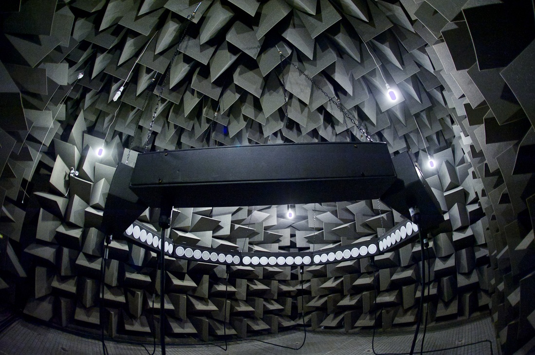
Mark Fell Anechoic Chamber Installation view 2013, Courtesy Salford Sonic Fusion Festival, University of Salford
Standing at the junction between art, music and technology, Mark Fell is concerned with sound. His sonic installations explore the way in which our perceptions of space, speed and matter are altered by different sonic environments. I went along to see his most recent exhibition, Self and Now at the BALTIC 39 Project Space.
The exhibition is made up of three sonic installations; the first of these, 64 Beautiful Phase Violations (2013), is an octagonal arrangement of sixty-four speakers, stood at head height. Though this system was originally developed for research into Wave Field Synthesis, Fell rejects this application of the technology, and instead has created his own software enabling him to alter the frequency and phase of the oscillators in each speaker. A combination of white noise, base, sirens and French speaking is emitted from the speakers, but rather than using these to create a rhythm, these sounds are unanticipated and disrupted. Once inside this circle of speakers, the sound quality is incredible. The intensity of the noise almost seems to tap into something neurological; sound becomes substance, and can be felt.
In an interview, Fell described his working process as ‘...looking for anomalies or defects in spatial fields.’ This is perhaps more apparent in his work Impossible Water Temple (2013); in this work, a speaker is hung from a rotating disk on the ceiling, spinning at a constant speed. As the disk rotates, the speaker orbits the central point. This spectacle is bathed on either side by two lighting rigs, both of which move slowly between warm and cold colour palettes. The sound emitting from the speaker appears to be a perpetually ascending pitch, the ‘Shepherd tone’; an illusion named after the cognitive scientist Roger Shepherd whom described it in 1964. As a viewer we may stand around the outer edge of the speaker’s orbit, and meditatively follow the speakers journey with our eyes and ears. Soon it seems that the rotation speed is increasing, relative to the increasing pitch emitting from the speaker, but this is an illusion. Our spatial awareness is altered by the sound, the sound of a false ascending pitch. We may also stand in the centre of the installation, becoming the singularity of which the speaker orbits.
Mark Fell admits to being heavily influenced by German philosopher Martin Heidegger, whose ideas indicate that absorbed, non-theoretical modes of activity offer more fundamental understanding of physical realities, than detached and theoretical analysis. Heidegger’s influence is obvious in the environments Fell creates; he sets up these sonic spaces as one would an experiment, the inhabitants of these environments becoming the subject. A variety of sonic phenomena are directed toward you, and aimed to alter and heighten human perception in particular ways.
Factoid #3 (2010) consists of a small blacked-out room, inside we are blind, and have no perception of the space we inhabit. All this changes in a sudden flash of a strobe light. As the light flashes an electronic noise sounds simultaneously, and an inflated red balloon is revealed, frozen in mid flight. A moment later we are once again in complete darkness. The work in fact consists of an inflated balloon hung from the ceiling on a string; an electric fan encourages the balloon to dance throughout the space. The flashing is not rhythmic, it is disruptive, we are unable to anticipate when we are going to see again, and where the red balloon will be. An incredibly intense experience, it is almost intolerable after a few minutes, though if you chance a look at the fellow inhabitants of the space, you will witness a frozen Cheshire cat grin on every face.
Mark Fell uses existing technology in ways that redefine its function. His work is both beautifully subtle yet raw, and at times humorous. He uses complex technological systems to tap into something quintessentially human; the curiosity inherent within us that drives questioning. It is about being completely absorbed within an environment and becoming aware of your position within that framework, and subsequently, that position shifting unexpectedly. A distinctive exhibition that will appeal to many, it is certainly worth a look, and a listen…
1. FELL, M. 2013. ‘Listen: Q&A with Mark Fell and a recording of 64 Beautiful Phase Violations’. The Wire [online]. [Accessed 11 October 2013]. Available from: http://thewire.co.uk/audio/in-conversation/q_a_mark-fell_s-in-an-anechoic-chamber
2. FELL, M. 2013. ‘Collateral Damage: Mark Fell’. The Wire [online]. [Accessed 10 October 2013]. Available from: http://thewire.co.uk/in-writing/essays/collateral-damage-mark-fell
Rachel McDermott is an artist and writer based in Newcastle upon Tyne.
14.9.13 - 3.11.13
Review: ‘Run Colour Run’, Daisy de Villeneuve at The Laing, Newcastle upon Tyne
by David Meadows
FREE ENTRY
Images courtesy of the artist
The Bupa Great North Run has been brought to us once again, encouraging streams of participants to spill out onto the streets in various trainer, lycra, and costume combinations. Its wave of influence is felt throughout the North East both before and after the event; diverting its roads, feeding its charities and now filling and, (in the Laing’s case), colouring its galleries.
Established in 2005, Great North Run Culture accompanies the world’s largest half marathon, promoting and developing it by commissioning artworks annually which explore the unique and somewhat unlikely partnership between sport and art. This year’s efforts engross the city across a multitude of venues (Baltic 39, The Sage, Tyneside Cinema and The Laing), with works encompassing various media including film, performance, radio and illustration. ‘Moving Image’ commission winner Melanie Manchot focused on remoulding and reshaping the urban landscape in video installation with Tracer, Adam Chodzko’s Rising warned all of a dystopian future and Paul Smith sang us a song of perseverance in A Mind Full of Nothing but Continue, and Daisy de Villeneuve’s Run Colour Run is evidently one for the crowd.
Daisy de Villeneuve; illustrator, designer, writer, has made a name for herself through her felt tip based illustrations, working for a wealth of clients including Topshop, Nike and Vogue. She is a rare success of both commercial and artistic practice, developing her own unique, aesthetic langue as one which is instantly recognised and identifiable.
Her works for The Laing are tucked away, aside the main first floor galleries, in the smaller Exhibition Gallery slightly separate from the rest to the first left at the top of the stairs. The exhibition is composed of fifteen vibrant drawings which surround you on the four gallery walls, depicting visually arresting faces. Each portrait, shows is sitter isolated from context in a white landscape. The works offer us an insight into the abundance of dynamism and diversity on such a day, allowing us to meet staff, participants and supporters.
|
In her statement Daisy describes the method behind her practice; roaming the sites and locations of The Run, photographing anything and everything that appeared visually of interest to her. She has gone on record to say that by operating behind the scenes, she hopes to illuminate a different perspective on the carnival atmosphere of the much loved event.
She interferes with and influences these original photographic portraits bringing to them her trademark vibrancy and colour. Playing on her sharp sense of observation, each drawing is littered with cultural references and is in a sense a caricature of the original participant, giving a skewered but thoughtout representation of the said individual. The resulting felt-penned portraits show her findings. 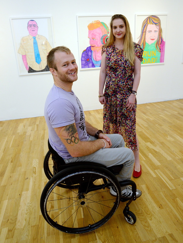
Josh Cassidy with Daisy de Villeneuve, Image courtesy of North News and Pictures
|
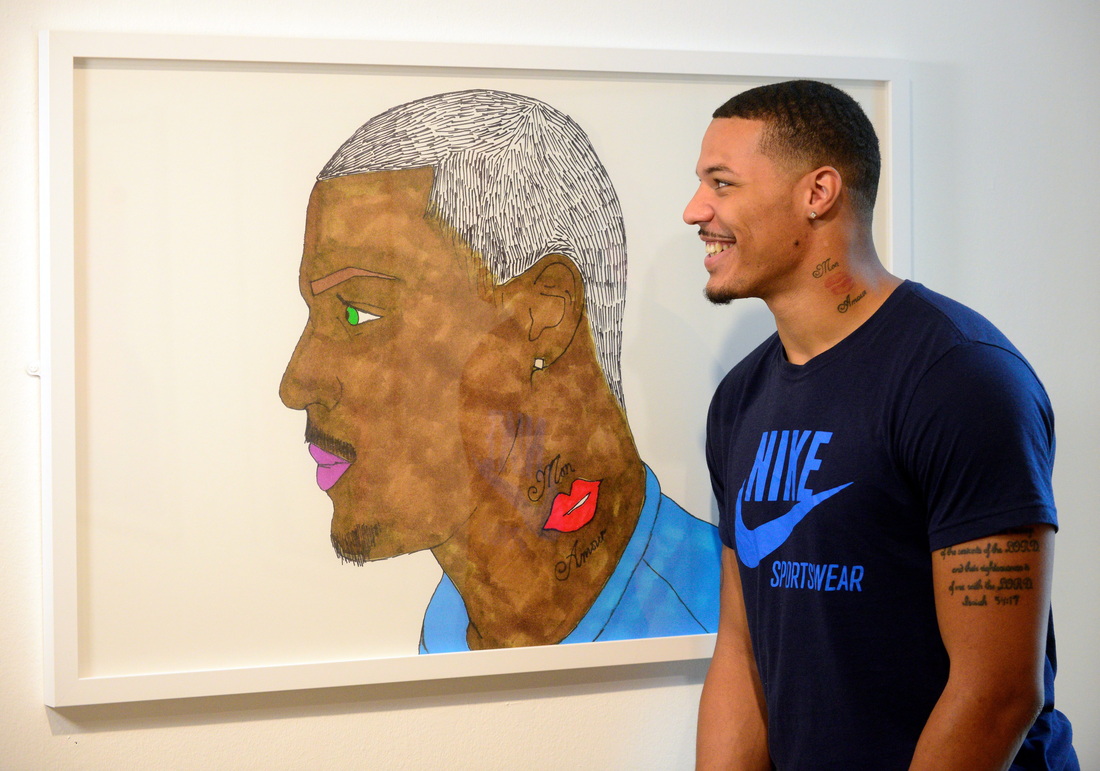
Ryan Bailey with his likeness, Image courtesy of North News and Pictures
Here we have the toothy grin of the buoyant runner, the devoted and exhausted athlete, the patriotism of the loyal spectator and the anxiety of the security guard, so focused he is oblivious to the frivolities. There are even familiar faces depiected, including Paralympian Josh Cassidy, and US Olympic track and field silver medallist Ryan Bailey. Each original A4 drawing is executed by hand in felt-tip pen, before being blown up and exhibited as a print. Thankfully nothing is lost in the process; closer inspection still reveals its raw detail, its bleeding colour and all the imperfections that are offered by this childlike medium that is often left under-appreciated.
Daisy de Villeneuve has tapped into the very character of the event, demonstrating the enduring success of this endurance run; showing us why thousands of participants fill its starting line, and the masses line streets to support strangers. Through Run Colour Run, she has created perhaps the most accessible of this year’s Great North Run Culture commissions, and has in part inspired the participants of ‘Children North East’ along the way, whose efforts adorn the windowed walls of the city library. However a quick flick through the book of comments will reveal opinions polarized. The usual suspects are all there to question the works artistic talent, and yet to say that these portraits are childish is by no means a criticism. In fact, it is this naivety and its sense of fun that grounds the work and gives it its energy. |
There is a clear, sense of identity that underscores the output of Daisy de Villeneuve; a feat which can take some artists an entire career to discover. Yes, there is a clear influence of Pop Art evident here, especially British, (Hockney springs to mind) yet these influences are apparent and not intrusive. Whether you like or dislike the work, this is very much the world of Daisy de Villeneuve and you cannot help but applaud that. Daisy de Villeneuve celebrates the diversity and exuberance of this exciting event in her equally unique and visceral language, needless to say an enjoyable exhibition well worth a visit.
@GNRCulture
David Meadows is an artist currently based at Graduate Studios Northumbria
@GNRCulture
David Meadows is an artist currently based at Graduate Studios Northumbria
19.9.13 - 26.10.13
If a near 100 year old Modernist/Abstract/Cubist Text, challenging the way we read, and questioning our use of words by separating them from their usual context and meaning interests you, then Suppose An Eyes is the exhibition for you.
It may seem a bold step taking a piece of text that is nearing its centenary and testing its relevance in contemporary art practice. However that is exactly what artists Flora Whiteley, Jacqueline Utley and Lady Lucy are doing. Suppose an Eyes takes Gertrude Stein's seminal work Tender Buttons and uses it as a reference point within their artistic practices; taking a work that is seen as a text equivalent of Cubism, and seeing how it can stand up today through contemporary painting and video installation. The work has toured internationally through three different mediums (Exhibitions, artist talks and an accompanying publication), each discussing Steins Tender Buttons in its own way, the works currently showing at Vane have previously been shown in Berlin and London; cementing Newcastle as a keystone for contemporary art in the UK. 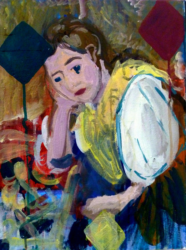
Lady Lucy, Bonnard Picasso Cezanne: Interior Harlequin Girl, 2013, water based oil on canvas, 40x36.2cm, Image Courtesy of Vane
|
Flora Whiteley, Shake of the Head, 2012, oil and tempera on linen, 68x57cm, Image Courtesy of Vane, photography by Colin Davison
A common theme adopted by all three artists within this exhibition is capturing Steins use of the banal. Jacqueline Utley’s paintings sum this up perfectly; upon the surface the paintings seem to be crudely made still life’s, depicting dull interiors and flowers. However, they tap directly into the spirit of Stein; who in her own work showed that each poem was in itself an abstract text piece showcasing a still life. In Utley’s work you won’t find Photorealism, however you will find naïve looking paintings that I am sure on surface will garner jeers of, “I could paint that myself”, from a few people, however if you look past the surface you are drawn into the colour and texture, as with Stein’s writing; you can look beyond the nonsensical structure and just enjoy the sounds of the words and the rhythm in which they flow.
The same could be said of Flora Whiteley’s work; depicting sparse interiors, focusing upon everyday domestic objects familiar to us. This interest is demonstrated by her work Untitled Day Bed in which the intense colour of the background grabs your eyes and takes what would be a normally beige subject matter and adds a spark of interest towards it. However, unlike the work of Utley, Whitley’s work is much bolder and less childlike in its precision, demanding your attention, even if it is by its somewhat ugly pink background which I can assure you is hard to miss even in passing. The stand out piece of the exhibition has to be Lady Lucy’s The Price is Marked inside the Book, documenting the final days of a second hand book shop through still images merged into a slide show. The images themselves are very mundane and yet hypnotic. It is reminiscent of watching the football scores being read out on BBC 2 as a child or checking out the shipping forecast; something that is seemingly boring on the surface and yet you are captivated and realise you’ve been staring at the screen for what is now 20 minutes compelled, drawn into the footage of a place which no longer exists. |
To summarise, all of the work shown clearly relates to the text it originates from, you either get it and love it, or are just left a bit confused and underwhelmed. Work which is sure to polarise opinions, just as Steins writing did nearly 100 years ago, is something to be celebrated in an age when many want to see something on the spot and be able to access a work and its meaning instantly. Suppose An Eyes disallows that, making you read up on its source material, begging you to dig deeper into the surrounding story in order to gain understanding of what you are looking at.
I ask myself do I feel Tender Buttons stood up to the test of being successfully transferred across to contemporary fine art? Well, all I can say is after viewing the exhibition I am left with the same feeling that I had whilst trying to read the Tender Buttons itself; hard to grasp at times, however I couldn’t turn away from it, it is truly engrossing even if you really don’t know why.
I ask myself do I feel Tender Buttons stood up to the test of being successfully transferred across to contemporary fine art? Well, all I can say is after viewing the exhibition I am left with the same feeling that I had whilst trying to read the Tender Buttons itself; hard to grasp at times, however I couldn’t turn away from it, it is truly engrossing even if you really don’t know why.
Jacqueline Utley, Meeting at Nancy’s, 2013, watercolour on paper, 18x23cm, Image Courtesy of Vane
Simon Briggs is an artist and writer living and working in Newcastle upon Tyne, he is currently based at Graduate Studios Northumbria
21.7.13 - 13.10.13
Review: Heather Phillipson Yes, surprising is existence in the post-vegetal cosmorama at BALTIC
by Rachel Mcdermot
FREE ENTRY
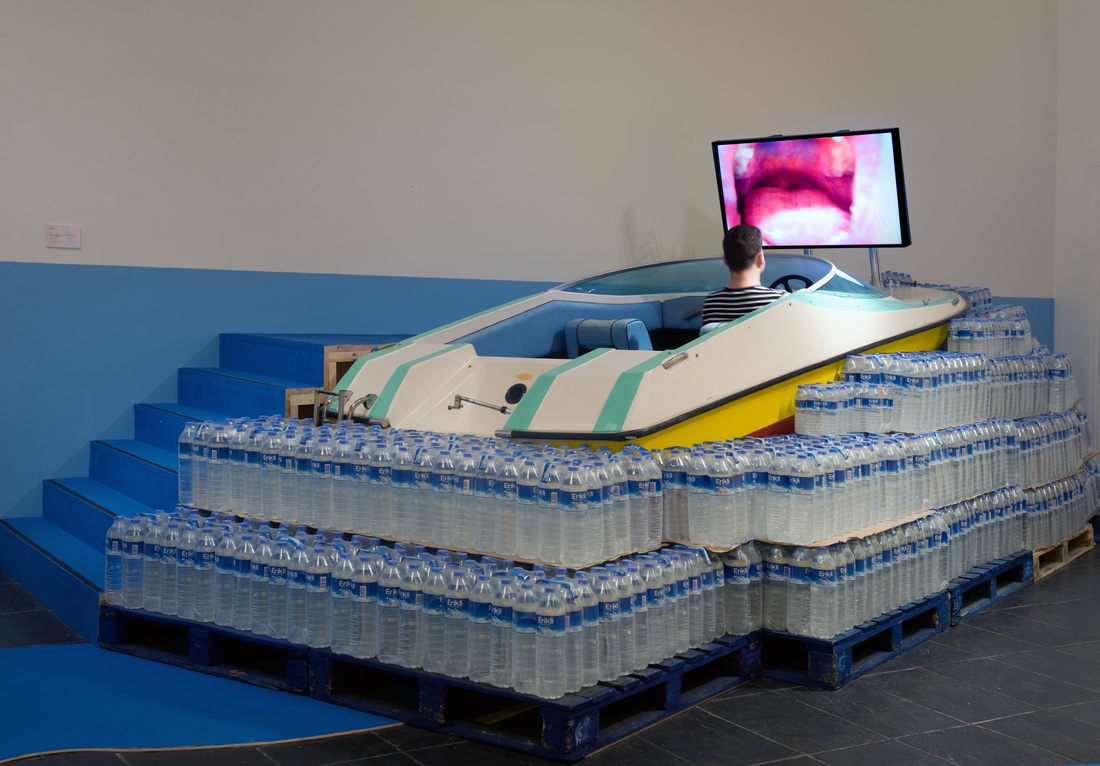
Images courtesy of BALTIC, photography by Colin Davison
|
Walking through a doorway surrounded by archways of pastel pinks and blue, I enter a narrow dark corridor. Walking firstly up, then around and down, I wonder whether I have in fact stumbled upon a misplaced ‘House of Fun’, escaped from the fair. I emerge into a dimly lit, hollow, round space.
‘Are you alright back there?’ Heather asks me. A tilted screen hangs high above, a pile of tempting pillows below; I take an (extremely comfortable) seat. Heather Phillipson’s exhibition, Yes, surprising is existence in the post-vegetal cosmorama, challenges viewers to take a step back, to rethink habits, preconceptions and everyday journeys. In her immersive works, she cites you, the observer, as the subject of her attention, and she will remind you of it. As well as directly addressing you, she also creates a site for you to inhabit; a stage-set for you to roam as she carefully directs you around the exhibition space. For, Immediately and for a Short Time Balloons Weapons Too-Tight Clothing Worries of All Kinds, we are sat on comfy pillows in a dark red womb-like room whilst Phillipson prepares us in her soothing, monotone voice. Imagery flickers across the screen, some hand shot, but most sourced online. Her works are a deconstructed narrative, a sensual collage of sight, sound and touch. Popular music echoes through or disrupts the narration, the video becomes unsettled by flashing stills, and Phillipson continually talks to you; in a very ordinary kind of way. |
‘I’m glad you turned up on such a crap day.’
At one point, whilst (now reclining) on those comfy pillows, she brushes your teeth, taking a toothbrush to the camera lens, and then gives you a shave. It’s all finished off rather nicely with a piece of cucumber on each eye. But she doesn’t let you relax for long. The screen goes black, and the narration stops, replaced by the sounds of war, gunfire and explosions. Don’t to be too alarmed, she soon returns to talking to you and now she is washing her hands. We don’t have control over everything, but we do have control over washing our hands.
It’s time to move on. Emerging into a brightly lit space, I travel downstream toward my ride. It’s a speedboat riding a wave made of bottled Turkish water. Looking back, floral, brightly coloured archways radiate from the doorway and on either side two large bananas reach to each side of the gallery. The whole structure combined evokes the birthing position; it seems we have been rebirthed into the world, or rather a parallel world.
Once you have climbed into the speedboat, you are in prime position for the next journey, a journey into the mouth. In addition to making visual art, Heather Phillipson is a successful poet, most recently selected for the Guardian’s ‘Poem of the Week’ series. The spoken word is important to Phillipson who plays around with words; their texture, their rhythm, and their limitations.
‘Imagine managing an imaginary menagerie?’ She muses.
|
Taking a waterslide down the mouth into the throat, Phillipson places you a discomforting distance from the inside of the mouth. The mouth is examined as a tool, an entrance and an exit. Words trip out in broken rhythm as tongue licks tooth.
Diverted by a signpost, Phillipson directs you to enter the final space, where you encounter a work titled A is to D What E is to H. A yellow-painted Peugeot has its doors open wide, it’s time to hop in for another ride. Once you are strapped in and sitting comfortably, you can divert your attention to the video projected upon the windscreen. This time we’ll be thinking about French Kissing, at least that’s what she keeps pointing out to you, though she is actually more concerned with French cuisine. She talks in a stream of consciousness, meandering around the topic. |
|
‘I’m not bored by the way, this is just my tone of voice,’ She explains.
Leaving the exhibition is not the end. To take you on your way, Phillipson has created an audiovisual guided tour from BALTIC to BALTIC 39. Staged as a workout video, aptly titled ‘Cardiovascular Vernacular (as in. ‘It’s Time for my Regular Cardiovascular Vernacular’),’ Phillipson narrates the sites and sounds of Newcastle upon Tyne. She leads you up alleyways to share leftover beer by the castle keep and takes a closer look at stains and graffiti on public stairwells, with plenty of rest stops and time to ponder at bus stops and benches.
A refreshing twist upon the everyday, Phillipson’s eccentric approach is a comedic deconstruction of social anxieties and everyday experience. Phillipson’s work resides in the interesting space between humour and the uncanny, using material familiar to us, she makes the old new by detaching it from its usual surroundings. It’s about arriving in the world, her world, and using it as an opportunity to re-look at our own.
Rachel McDermott is an Artist and Writer based in Newcastle upon Tyne.
19.7.13 - 13.10.13
“...you follow your instincts, and then you think, and then you follow your instincts...” Although the name Alex Katz is still by no means a household one, Katz’ impressive career has been simmering along across the pond since well before many of arts stars could even hold a paint brush. The current show at MIMA follows close on the heels of the recent, even larger Katz retrospective down at the Tate St Ives. MIMA’s show boasts a selection of the predictable gigantic 12x8 foot canvases, as well as more modest scale works, collages (which Katz regards as drawings) and some 36 drawings in various media including graphite, charcoal and conté; never before seen in the UK.
|
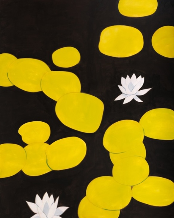
Homage to Monet 9 (2009) Oil on linen 304.8 x 243.8 cm Collection of the artist
|
The exhibition opens with a selection of Katz’ iconic seascapes, with a couple of sensitively executed collages, large oils and one of the many works depicting the artist with his wife Ada, here reclining on the beach. The following room focuses exclusively on his drawings; Katz’ characteristic, rather unrefined hand, marks out his friend’s and family’s profiles with minimal use of line. Shadows and shaded areas are distinct large flat blocks of tone, much like the planes of colour which Euan Uglow used to carve out his model’s bodies. The next large gallery space hosts the iconic flower paintings and summery Maine landscapes, all neatly tied together by the monstrous Homage to Monet #9 (2002), bluntly directing our attention to one of Katz’ key influences. It is the contents final room which really lifts the exhibition, perhaps saving the best till last; displaying a selection of paintings, drawings and collages from Katz’ Night Paintings period. The walls of each gallery space have been sensitively painted with a pastel palette chosen by the artist to compliment the works which they house, a tactic which creates a subtly stimulating backdrop, accentuating hues within the works.
Born in 1927 Katz’ practice still thrives and his creative output has been relentless; the dates of the works featured demonstrate the length of his career with pieces from as early as 1949 right up to very recent works from 2012. Growing up in New York, Katz was encouraged by his parents to pursue his interest in arts and attended the prestigious Cooper Union School of Art in Manhattan, where he has described drawing everyday and learning his craft as a draftsman. Katz modestly has never claimed to be a natural talent, all his skills being the result of practice. Stoically Katz still strongly advocates the values of craft and draftsmanship in an age of conceptual art, although some may hear this with slight disbelief; the graphite works standing out clearly as the weakest works in the show.
Born in 1927 Katz’ practice still thrives and his creative output has been relentless; the dates of the works featured demonstrate the length of his career with pieces from as early as 1949 right up to very recent works from 2012. Growing up in New York, Katz was encouraged by his parents to pursue his interest in arts and attended the prestigious Cooper Union School of Art in Manhattan, where he has described drawing everyday and learning his craft as a draftsman. Katz modestly has never claimed to be a natural talent, all his skills being the result of practice. Stoically Katz still strongly advocates the values of craft and draftsmanship in an age of conceptual art, although some may hear this with slight disbelief; the graphite works standing out clearly as the weakest works in the show.
Anna (2009) Charcoal on paper 38.7 x 57.5 cm Collection of the artist
It was whilst studying at the Skowhegan School of Painting and Sculpture, Maine, that Katz was encouraged to paint ‘en plein air’, a pivotal moment in the development of Katz’ work. In his chase to capture brief moments and exchanges between people in his paintings Katz later abandoned the initial sketching before painting altogether and moving out of the studio assisted this goal further. Even when making portraits the initial ‘sketch’ will be made on a small board in a short sitting of a couple of hours before being blown up and painting in one session later. Choosing instead to lay down the line in paint, working alla prima, Katz creates some beautiful moments in the paint work where the oils blend slightly with the layers underneath dragging out partially hidden tones, as demonstrated by the smeary window panes in West Window (1979).
So much of Katz’ process is about attempting to apprehend what the artist has described as ‘click moments’; he may be watching his son Vincent, or walking through the landscape in his beloved Maine when suddenly he will ‘see’ a painting. The obvious example of course is his wife Ada, to whom he has been married for over 50 years and whom he has made over 250 paintings, Katz describes seeing something new in her and wanting to capture it in each new painting of her he makes. Ada has also served as a model for the changing fashions over the years, having sported the iconic Jackie O hair cut in the 1950s and later huge black bug eyed sun glasses. Katz has a personal interest in fashion, a fitting enthusiasm for an artist whose paintings capture moments as fleeting as the most ephemeral of industries.
By pre-mixing his paints and then completing each work in a single sitting of no more than seven hours, Katz’ process is intense and toilsome, yet none of that outpouring of energy is present in his detached paintings and drawings. Influenced by Cezanne and the cubists, unlike many of his generation Katz was not seduced by Abstract expressionism and developed the economic, reserved style with which his name is now synonymous. Now his work is regarded as a precursor to Pop Art, with its flatness and lack of emotion, yet still Katz work is so much about instinct. Katz has never been against the expression of his early contemporaries, it was just that their approaches were insufficient (or perhaps too much) in communicating the world as he was experiencing it. He has never been interested in narrative. He has never seen some subjects as superior to others. In Katz’ paintings we see all that the artist wants us to see and nothing more.
What makes the Night Paintings so alluring to the eye is their velvety depiction of night, Katz’ keen eye for colour recognises the individuality of each night sky. These paintings seem to represent so little they are almost abstract; it is as though you are stood in the pitch black, your pupils struggle to adjust, searching into the gloom to find form and make sense of your surroundings. Black Brook (1992) crops a moody scene of trees reflected along the shore of a rocky brook to the point that it is disorientating and the spectator feels as though tumbling head over heels into the painting.
Overall the exhibition doesn’t flow quite as seemlessly as it might have done, despite the best efforts of the painted gallery walls to bind the show together. The show shows so many strands of such an established practice that perhaps it doesn’t quite do Katz justice. However, this doesn’t stop it being a decent introduction to the practice of an artist who isn’t quite as well known as he should be on this side of the pond, well worth a look and a good linger amongst the darkness of the Night Paintings.
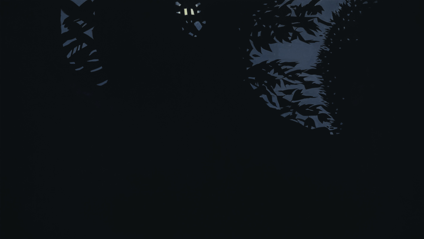
Full Moon (1988) Oil on linen, 260 x 457.2 cm ARTIST ROOMS Tate and National Galleries of Scotland. Presented by the artist 2011
13.9.13 - 12.10.13
|
All Images courtesy of Neon Arts
|
It’s been a tough year for the arts and the artists graduating from art schools across the country. With heavy cuts equating to less funding for arts projects, it seems to be becoming more and more common that rather than presenting work in conventional gallery settings, empty shops are being converted into ad hoc exhibition spaces.
Recently established, ‘Neon Arts’ sites itself as an artist-led social enterprise, aiming to showcase contemporary art in changing venues across the North East. Set up by Northumbria University alumni Sarah Riseborough, James Routlege and MFA candidate Joanna Hutton, Neon Arts aims to reclassify abandoned or derelict spaces as a site for visual art. I went along see their first exhibition, Flesh, in Hexham.
A historic market town, Hexham is a far cry from Newcastle. Conservative by nature, on first appearances Hexham seemed as though nothing had altered there for the past fifty years. I happened upon a conversation with a local; the gentleman had noticed a change in Hexham, and pointed out many empty shop units that had closed down over the past year. I arrived at my empty shop, empty no more; a sign reading ‘Neon Arts’ hanging in the window.
The artists selected for this exhibition were challenged to make work in response to Hexham’s past, particularly the skinning and tanning trades. The preview night coincided with the Heritage Open Days, offering a different kind of cultural presentation rather than touring the abbey, or listening to a talk on the history of Hexham.
In the gallery window lay the remains of an object; clumps of stuffing and sponge, lie atop haggard bits of wood and torn leather. Rachel Errington’s Mayhem (2013), is in fact the remains of a performance carried out on the opening night. Using a hammer, crowbar and screwdriver, she violently deconstructed a leather chair, using the material remains to create the sculpture which now sits in the bay window of the gallery. An intelligent response to the exhibition theme, Errington’s resulting sculpture not only referenced the historic trades of the town, but also the nature of the gallery space in which it was installed.
I admit ‘gallery’ is a strong and misleading term; the space itself is anything other than a white cube, instead, the artists installed their work without making any alterations to the space. The walls are a combination of half painted textured wallpaper with fitted furnishings hung upon them and a raggedy carpet covering the floor, this space very much still bares the trace of the gift shop and café that it once was.
In the centre of the first room is Emily Hesse’s False Ceiling (2013). A great black sheet, made of fishing sacks, hangs uncomfortably low across the dimension of the space. As a viewer, she directs us to walk under the work, crouching through the space, toward an old school desk at the far end. The work has an almost ghostly presence about it; ironic, as later I was told that the space was in fact haunted (!), another eccentricity of this strange little gallery.
Rounding a corner, I enter a space with a small open-plan kitchen. Upon the carpet sits Joanna Hutton’s Rendered Ineffective (2013). An open box made entirely of beef dripping sat atop a sheet of cotton. Its’ stylised modernist form, against the grotesque materiality of its making opens a conflicting dialogue regarding the relationship between structure and substance. The domestic setting of these works certainly impact their reception, Hutton’s box becomes a curious remnant of activity, in a site that feels frozen in time.
Through a kitchen hatch in the wall, one may view James Watts Old God (2013). Anyone who knows the work of Watts would recognize his hand instantaneously. A complex network of black threads span a corner, with two plant stems tied high into the structure. Inside each plant stem, black syrup has been poured, the excess slowly trickling down the thread structure. This work is arguably the most alive, or perhaps dead? The viscous black syrup like ectoplasm, the life seeping from the plant forms.
Walking back through the space, I notice Mark Lyon’s Anamnesis I and II (2013). Beautifully subtle works, which rather than jumping out of this domestic setting, seem to be intertwined with it. The work, made up of two white boards with intricate grey markings, seem to mirror the dust and cobwebs of this empty shop, as if they manifested out of the space itself.
While I looked around this little gallery, on several occasions I caught sight of locals peering in the window, with questioning looks upon their faces, few dared to cross the threshold. I hope this will change; as well as the exhibition there is an event programme of artists talks in an attempt to open the doors wider to the local community.
A curious exhibition in a curious place, Neon Arts seems to be on track for showcasing emerging artistic talent in unexpected sites. As I left the gallery, I reflected on how reassuring it is that artists take on such places that are no longer wanted nor needed, using them as a driver for creative activity, offering their findings to the public gaze.
13.9.13 - 17.10.13
Review: Eleanor Wright Thin Cities , gALLERY nORTH
by rebecca travis
free entry
Contemporary city regeneration projects often revolve around pieces of iconic statement architecture, rendering it as some kind of divine means by which to elevate the profile of a city. The trend started in the late 90s with the ‘Bilbao effect’, in which the global attention and tourist attendance of Bilbao was raised via the architectural prowess of the Guggenheim. Since then, a sea of shimmering architectural visions has appeared in cities throughout the world, hoping to offer the same kind of symbolism associated with modernity, progress and growth. The notion that buildings could offer so much in sensibility, not just in physical presence is a key idea to the works of Eleanor Wright, whose BXNU residency in Newcastle (a city much applauded for its cultural regeneration, including the elliptical Millenium Bridge and Norman Foster’s Sage) sees her respond to the surrounding architecture, in parallel with her research into digital visionary architect Zaha Hadid.
Much of the work in the show is informed by Hadid’s use of computer-aided design to create flawless contemporary icons, in particular the Heyday Aliyev Cultural Centre in Baku, Azerbaijan. Wright uses an array of corporate man-made materials to respond to these immaculate constructions, creating sculptural interventions that not only echo the architecture of Gallery North, but the 1960s Civic Centre opposite. Two works entitled FlatMatt (2013) occupy the expansive floor space. The first, made from shimmering PVC, ppls on the ground and seductively glitters under the gallery lighting. It is made up of hin strips of waved plastic, meticulously hand cut and layered together to create a woven design. The second is formed with sheet rubber, fantastically matt in comparison to its PVC partner. Its terracotta colour is reminiscent of tiles, and the interlocking design of arrowheads and archways reflects traditional geometric forms. That the process towards creating these sculptural mats is so physically labour intensive, offsets the design process of Hadid made via digital platform, yet the strive for apparent beauty and ‘perfection’ runs concurrently through both.
Much of the work in the show is informed by Hadid’s use of computer-aided design to create flawless contemporary icons, in particular the Heyday Aliyev Cultural Centre in Baku, Azerbaijan. Wright uses an array of corporate man-made materials to respond to these immaculate constructions, creating sculptural interventions that not only echo the architecture of Gallery North, but the 1960s Civic Centre opposite. Two works entitled FlatMatt (2013) occupy the expansive floor space. The first, made from shimmering PVC, ppls on the ground and seductively glitters under the gallery lighting. It is made up of hin strips of waved plastic, meticulously hand cut and layered together to create a woven design. The second is formed with sheet rubber, fantastically matt in comparison to its PVC partner. Its terracotta colour is reminiscent of tiles, and the interlocking design of arrowheads and archways reflects traditional geometric forms. That the process towards creating these sculptural mats is so physically labour intensive, offsets the design process of Hadid made via digital platform, yet the strive for apparent beauty and ‘perfection’ runs concurrently through both.
Image courtesy of the artist
However, the aim for visual perfection and its realistic placement in a hazard-ridden world is not necessarily reconcilable. Shortly after opening, Hadid’s Baku Cultural Centre suffered superficial damage in a fire. Although in a physical sense the damage was only skin-deep, the integral iconic perception was tainted. Wright has incorporated this into her presentation via a film comprised of edited YouTube videos of the fire as it happened. By consequence of the viral internet phenomena, the harming visuals of the blaze were shared worldwide in minutes, documenting the damage and permanently sealing it on the web.
As if to confirm this, the front and back windows of the gallery have been clad in one-way reflective vinyl, depicting the flames in large-scale. More often used in advertising display, in this case the vinyl reveals and disappears depending on your placement inside or outside the building, marking your position and relationship to the architecture at the particular time.
A final addition to the exhibition is a pair of heraldic seahorse sculptures, an emblem taken from the Newcastle City coat of arms and repeated atop the tower of the Civic Centre. Detached from their original settings, rendered in block colour and devoid of features, they appear like glossy corporate symbols, perhaps acting as a metaphor for the brand infused architecture seen in current developments.
Wright’s sensitive use of the gallery space and connective research into both her immediate surroundings and in the wider world of iconographic architecture, results in an exhibition that combines meticulous attention to materials and place, with an emphasis on the physical process of making. The accumulative feeling permeating Thin Cities is that with numerous developments relying on similar style of architecture by which to launch a new cultural campaign, the overall effect is one of a globalised style, as opposed to an individual and considered urban cityscape.
Rebecca Travis is an artist and writer currently living and working in Newcastle upon Tyne
4.9.13-6.10.13
Review: ‘Figure One’ at BALTIC 39, part one: Ben Sansbury’s 0 Gravity
By Lily Mellor
FREE ADMISSION
WEDNESDAYS – SUNDAYS 12-6
Figure One is BALTIC 39's latest and perhaps most exciting exhibition to date. PEEL writer Lily Mellor heads over and reports back on Ben Sansbury's 0 Gravity, look out over the next couple of weeks for more from Mellor on Figure One as the exhibition and events continue.
Anyone who practices art will know about failure. In fact, anyone and everyone who visits an exhibition might consider themselves a bit of an art critic and connoisseur of failure. The inevitability of art flops is a sensitive subject when we find ourselves in a gallery context, but the mistake here is to think that failure has to be negative. BALTIC 39 has taken a bold step in the march towards embracing failure; celebrating it even, with their current series of short exhibitions and events, Figure One. With over 16 emerging artists, producing 11 exhibitions over a five-week period, audiences are given access to the workings, progressions, starting points, stepping stones, experiments that would usually be dropped before exhibition. And, for the lucky artists chosen to be involved, an opportunity to consider their work in a public context and stimulate advancement.
(above) Ben Sansbury with his work. (right) detail of 0 Gravity
Images courtesy of BALTIC, photography by Colin Davison Notable from the first set of exhibitions is Ben Sansbury’s 0 Gravity, which effectively coincides with the British Science Festival: Newcastle (7.9.13-12.9.13). Although this piece continues to pursue his fascination with myth, Sansbury has chosen to work alongside computer engineer Peter Mackenzie to create a piece deeply rooted in the art-science crossover. His installation is complex as usual, but complex in a concentrated sense, with a lot of work behind a rather tiny output; sound waves cause individual polystyrene balls to defy gravity, hence the title. Impressive, but as we watch the results being amplified onto the gallery wall by means of a projector, one cannot help but smirk at the tragic humour of the scale.
|
|
The artist seems to be challenging the laws of physics one baby step at a time, but maybe that’s part of the appeal. With this the only piece on show by Sansbury, we are convinced of it’s importance and are filled with satisfaction that we have indeed witnessed something worthwhile, something history making. Sansbury may one day be considered a genius, but only if he uses his exhibit here as a rehearsal before creating bigger and better things using this technology.
Being part of the first set of shows in Figure One means that, unfortunately, many will have missed Sansbury’s invention, but that’s not to say that you’ve missed out. There are still 14 artists yet to exhibit in this quick-fire celebration of progress.
Being part of the first set of shows in Figure One means that, unfortunately, many will have missed Sansbury’s invention, but that’s not to say that you’ve missed out. There are still 14 artists yet to exhibit in this quick-fire celebration of progress.
Ben Sansbury, Figure One, at BALTIC 39
Image courtesy of BALTIC, photography by Colin Davison
Image courtesy of BALTIC, photography by Colin Davison
For further information on BALTIC events and exhibitions, including whats on at BALTIC 39, go to:
13.9.13 - 4.10.13
Review: ‘Tracer’ by Melanie Manchot at the Woon Studio, BALTIC 39
part of Great North Run Culture
by Lucy Moss
FREE ENTRY
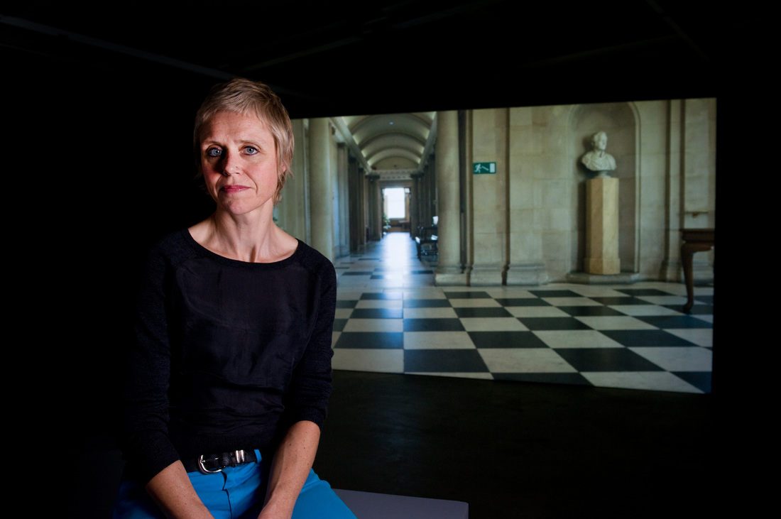
Melanie Manchot with her work Tracer. Image courtesy of Colin Davison and BUPA Great North Run Culture
Often focusing on peoples behaviour in the public arena, Melanie Manchot could be thought of as an unconventional landscape artist. Manchot looks at the importance of the places we are surrounded by, considering the effects of our habitat on our actions, as well as our emotions. Her current exhibition at BALTIC 39; a dual-screen film piece, follows the journey of ten ‘Pakourist's’ (or 'Free Runners'), around the urban arena of the North East. The work was created as part of the annual synthesis between art and athletics in Newcastle upon Tyne, as part of a series of events and exhibitions which take place during the weeks surrounding the Great North Run, as part of ‘BUPA Great North Run Culture’. Artists are invited to create and exhibit artworks that have a connection to the landscape and culture of the city, mixing together the unlikely pairing of artistic and sporting practices, and this work falls dead centre.
In fact the crossover between the arts and athletics, especially martial art and dance forms like ‘Parkour’, can sometimes seem a little arbitrary. Their similarities in spatial, performative and self-transcendental aspects are clear. As the name of Manchot's film 'Tracer' suggests, it's easy to imagine the lines of the Parkourist's movements, as lines drawn or ‘traced’ onto the landscape. Through simple substitution of choreographing the body rather than the line, the body becomes a sculpture in flux. The form becomes the path taken through the landscape, each turn and spin dictating the texture and quality of the mark left behind. It is an expressive yet immaterial drawing upon the ground of the city, that is prepared for the run which then leaves traces of its own; abandoned empty water bottles and broken finish line tape. Echoes left by the runners footsteps in the arches of the motorways; traces, some material, some fleeting and insubstantial of this event become drawing.
The industrial elegance of Newcastle's concrete landscape acts something like clay in the hands of the Parkourist's, who sculpt the surrounding architecture through movement; as their motions are dictated by the structures they move through. It’s a street ballet; a spinning mixture of dynamism and grace, of actions that in different hands would be nothing short of terminal stupidity. Instead it's kind of spectacular.
Parkour compliments the North's contrasting arena of ragged grandeur and sheer iron scale, showcasing this mixed environment of the forgotten and the iconic. Grimy tunnels and abandoned underpasses are traversed in exactly the same way as the precarious curves of the Sage roof and the Tyne bridge. It doesn't matter, each are equally passable to the performers, whatever their perceived accessibility or security, they use the landscape like a cat would - as if it were their own. As they interact with these urban structures outside of what is normally expected, in a feral choreography, these obstacles become their stage. However, the performers don't seem to be grandstanding; whether through the use of intimate shots, or panoramic views, these figures feel to be solitary, alone in the urban landscape. Even when performing as a group, it feels closer to watching the flow of a wolf pack than witnessing grandiose, dramatic acrobatics.
Although the Free Running receives its share of negative stereotypes, it is far from being a damaging or disrespectful activity. Parkour is a celebration of its surroundings, a playful subversion of urban spaces. Its focus is the freedom of interacting consciously with the environment, instead of passively being placed there. This consciousness of physicality is a theme shared with the arts, although importantly different; for Parkour this attitude is a way of life, for the arts it is not something practiced as much as reflected upon. However, while part of their philosophy is to leave no trace except their immaterial presence in a place, the performance still retains an illicit air. The camera emphasises the forbidden quality of the dance in sweeping shots that give the impression of sideways glances, only just catching a movement out of the corner of the eye, giving an aura of elusiveness.
As a two-dimensional medium it is unsurprising that, while being a very well executed film which flows smoothly and is effortlessly engaging throughout, it definitely lacks some of the atmosphere that would have been present during the live event. Experiencing Parkourist's in action must have quite a spontaneous flavour to it, and indeed the resulting film steers safely away from feeling overly choreographed. However, as the core ideology of this work emerges from the momentary re-invention of a space as the athletes perform; remote viewing diminishes the capacity of the audience to be quite as spatially involved in the performance. That said capturing the fleeting nature of the Parkourist's 'drawing' on film, a time based media, is most apt to describe the synergy of the artist's and Parkourist's thoughts and philosophies. To conclude, Manchot's work is an innovative reinterpretation of the ideology of the Great North Run.
Lucy Moss is currently in her Third Year studying BA Fine Art at Northumbria University
For further information about The Great North Run and BUPA Great North Run Culture please go to:
10.8.13 - 22.9.13
Review: CIRCA Presents iam with Greville Worthington: Learn to Read Differently
with work from Carl Andre, Craig Dworkin, Eric Zboya, Gareth Long, Garry Neill Kennedy, Greville Worthington, Kate Briggs, Kenneth Goldsmith, Lawrence Weiner, Lucia della Paolera, Nick Thurston, Robert Fitterman, Simon Morris
by Rachel McDermott
Northern Gallery for Contemporary Art (Project Space)
FREE
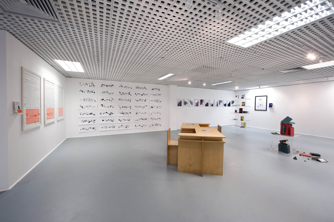
Images courtesy of NGCA and the artists, photography by Colin Davison
“The desire to read a work of art is the annihilation of the possibility of experiencing that work of art.” (Carl Andre).
We are challenged immediately by the title of this exhibition to Learn to Read Differently, which proposes that the gap between linguistics and aesthetics can be mediated through the act of reading. CIRCA Projects brings together disparate works of art and literature, investigating the nature of knowledge exchange artworks reduce complex literary devices to grammatical functions, or open an epistemological enquiry into what one may consider as reading.
For this presentation at the NGCA, (Northern Gallery for Contemporary Art), CIRCA Projects initiated a collaborative project between ‘iam’ and the art collector and endorser Greville Worthington. ‘Information as material’ or ‘iam’ describe themselves as,
For this presentation at the NGCA, (Northern Gallery for Contemporary Art), CIRCA Projects initiated a collaborative project between ‘iam’ and the art collector and endorser Greville Worthington. ‘Information as material’ or ‘iam’ describe themselves as,
‘...an independent imprint that publishes work by artists who use extant material — selecting it and reframing it to generate new meanings — and who, in doing so, disrupt the existing order of things.’
- Simon Morris
- Simon Morris
Established by English artist Simon Morris, iam is a collection of artists, writers and academics. Using works from both iam’s artist circle and Worthington’s collection, CIRCA propose to open a dialogue between the visual arts and linguistics through focusing upon the act of reading. A combination of disparate objects, images and text, the resultant exhibition challenges ideas of communication, and the processes by which we read. How do we read? Can we still read without language? Do we read aesthetics? Harking to the semiotic movement from sign to signification, we are asked to ponder to what extent the trail of signification strays through the act of reading.
Crossing the threshold of the exhibition space, one must walk across a rug on the floor. It is in fact a piece of work by iam member Craig Dworkin. The rug has text upon it, though mostly nonsensical, it lists what appears to be a set of chemicals and measurements. Fact (2013), is actually an exact list of ingredients and processes that make up the rug, including the text upon it. The ontology of the piece is entirely self-referential; the reading of the work becomes the methodology for its production; it is a cyclical process of deconstruction and generation.
Works of varying size and medium are hung upon the walls of the office-like gallery space. One of them, by iam artist Kate Briggs, is made up of twenty-one A4 pages pinned to the walls, The Story in It’ (2013), from a distance, appears to be twenty-one pages of typed text, though upon closer inspection it is in fact a single line, traversing within the confines of line spacing. Briggs used an Eye-Link 1000 to create the work; whilst she read a twenty-one-page short story (H. James (1903)The Story in It), the machine tracked and replicated her eye movements upon the A4 pages. As a viewer, one is forced into the conundrum of reading Briggs reading fiction, the content of which remains entirely hidden from us.
In the centre of the space is an industrial looking modernist style wooden desk. A geometric ‘S’ shape, two chairs sit within the stylised curves of the desk and two books sit atop, one by Simon Morris, the other Jack Keroac. Created by artist Gareth Long (though commissioned by Simon Morris), Bouvard et Péchuchet’s Invented Desk for Copying (2010), imagines an ending for Gustave Flaubert’s last novel, (an unfinished work), and is part of a series of sculptures made in direct response to this piece of literature. A nod toward a school desk, the desk seems to be a place of study. One can imagine a figure, copying these texts line by line, highlighting the relationship between consumption and production of information.
Nick Thurston’s (iam artist and editor) triptych of prints titled He (2009) are a series of enlarged excerpts taken from Samuel Beckett’s novel Watt (1953), stylised within the iconic book cover of the John Calder edition. Thurston takes Beckett’s revered words and reduces literary description to grammatical function.
‘As for his feet, sometimes he wore on each a noun, or on the one a noun and on the other a noun, or a noun, or a noun, or a noun and a noun… or pronoun adverb.’
(Thurston, 2009).
(Thurston, 2009).
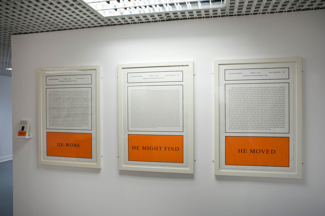
|
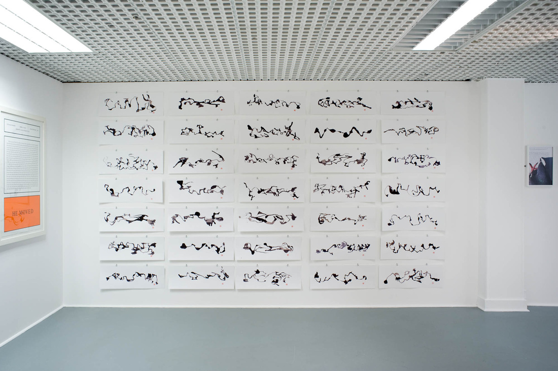
|
Images courtesy of NGCA and the artists, photography by Colin Davison
Thurston pares down language to its quintessential banality, an archaeology of language uncovering the mechanisms in place within esteemed literature, whilst simultaneously debasing it.
A particularly striking work is Worthington’s Reading Gloves (2013), consisting of three rows of five heat resistant gloves, hung to the walls. Stuffed hands reach outward like shelving units, in each hand is a burnt book. Blackened and charred, the narrative or information that the book once contained is now lost. Perhaps, if one were able to open the centre pages, some text may have survived, though the fragility of the book would most certainly mean that it would crumble if one were to attempt it. An ontological fracture, what happens to a book when it can no longer function as a book? How does one begin to read a work that has had its information removed?
This exhibition feels part-gallery, part-library, part-waiting room. Surrounded by visual and textual information, which (in the most part) has been manipulated in such a way to distort and even encourage an entropic ‘reading’ there is a sense of friction that steadily increases as one looks around.
There is more than your average share of highbrow name-dropping and philosophical reference, though I suspect that this is caught up within the deconstructive reasoning of the entire exhibition. As a viewer, you are led up a path by one work, and pulled back down by another. The exhibition seems to debase itself, and this whole melting pot is negotiated through the act of reading; reading the works on display, the guide, this review. And becoming aware of this interpretative process is perhaps what I took away from this exhibition. After all, in order to ‘learn to read differently,’ isn’t the first step to think about how we read to begin with?
Rachel McDermott is an Artist and Writer based in Newcastle upon Tyne.
1 ANDRE, C. 1961. Postcard to Simon Morris. IN: ‘CIRCA Projects; Programme’ [online]. Accessed: 10 September 2013. Available from: http://circaprojects.org/programme/learn-to-read-differently/
2 iam. 2013. ‘Information as Material; About us’ [online]. Accessed 10 September 2013. Available from:
http://www.informationasmaterial.org/about/
http://informationasmaterial.com/
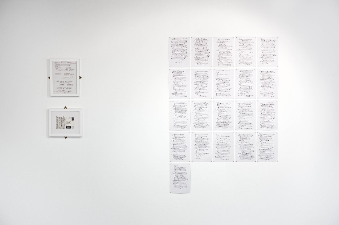
Images courtesy of NGCA and the artists, photography by Colin Davison
13.1.13
Interview: with louise ashcroft
BY lUCIE CHEVALLIER
The recent New Curators North East exhibition showcased a selection of promising artists from across the region. I asked Louise Ashcroft, Project Manager and Curator for the Departure Foundation, who organised the exhibition, for an insight into her approach to displaying and curating art.
The show in Sunderland looks great, where did the idea come from?
Thanks Lucie, our 'New Curators North East' - Emily White, Mark Bleakley and Kimberley Emeny - have worked really hard. All three shows are very different from one another, which is one of the reasons why it's particularly interesting. I think the show gives a snapshot of what's happening in the three main art schools in the North East. I've always been really energised by the atmosphere and attitude of the arts in Newcastle and I've curated a few shows and prizes in the Sunderland space, so am familiar with lots of the artists up here. It seemed the right time to offer the space up to some local artists. I invited the three winners of our recent North East Student Prize to curate a show each because they had all shown interest in organising exhibitions and collaborating with other artists. For me, being a catalyst for making shows and group activity happen is the key to survival, creative development and happiness after art school. This is something we want to facilitate through the foundation. I personally am not that interested in an authoritarian approach to curating - the cult of the curator is quite a new phenomenon (it seems that everyone is a curator these days!) and I think that this role should be put back in the hands of the artists themselves. Curators are often academics who use artists as a medium through which to illustrate their theories, which is why it is important for artists to reclaim this part of their practice, especially as the act of organising a show and thinking about the space around us encourages collaboration, cross-pollination and the development of peer-based support networks.
How does Departure Foundation work? Do you always use unconventional exhibition spaces?
Property owners let us use their buildings when they are between tenants. It's a great way for companies to support the arts and a fantastic opportunity for artists to show in some really interesting spaces. I've always been critical of the conventional gallery 'white cube' after reading Brian O'Doherty's book Inside the White Cube: The Ideology of the Gallery Space when I was an undergraduate. The conventional gallery space is by no means neutral, it is a symbolically loaded ideological context - a cathedral of modernism, which can sometimes limit work to being self-cannibalising. I'm not really interested in art about art, but more in art that relates to the World. Departure Foundation often organise shows in vacant office spaces, which can be really challenging because we can't always drill into walls and because the context is so dominant, but for me it's really important that we address these non-gallery environments as artists. These offices and industrial parks might not be as fashionable as a gritty warehouse setting (which has become a bit of a cliché anyway), but they are ubiquitous and they define this particular moment in our culture in the same way that perhaps the empty warehouse did in the early days of the Young British Artists. Great art should be of its time.
Is there a growing interest from building owners to rent their spaces to the foundation for art exhibitions?
Yes, we're building up a network of spaces across the UK. The art world can sometimes feel London-centric and since I've been working in cities all over the UK I've seen a lot of really great work and I'd like to make links between different cities and encourage more inter-regional collaboration. We provide free exhibition and/or studio space in London, Manchester, Birmingham, Leeds and Sunderland. I don't think many other organisations our size are doing anything this ambitious.
Do you think it is the way forward, considering the cuts to arts funding for galleries?
I'm talking from a personal perspective here. It's one way forward perhaps. As artists, we need to be doing more to fight the cuts and discrimination against the arts, especially following the government's proposals for the English Baccalaureate (replacing GCSE) in which the arts count for nothing points-wise. The creative industries are absolutely fundamental to the British economy and yet they are being completely side-lined by this government. As a nation, our ideas are all we have got (the rest of the World is much better equipped in terms of manufacturing and natural resources). Sometimes I wonder whether by finding alternatives we simply make it easier for the government to justify cutting the institutions, but it's hard to change the world overnight and I am a firm believer in being opportunistic and making the most of our collective energy as a community - right here and now, in the present, rather than dreaming of an imagined, perfect future that may never happen. We must stay pragmatic and get some work done! The act of making something is a radical act, and as an organisation I hope we can help artists to keep making things. Departure Foundation is gathering momentum and giving hundreds of artists the opportunities to show work, to gather together and learn from each other at a time when the rest of the art world is having the life squeezed out of it. Artists will always find a way to thrive and make great work. We want to support as many artists as possible by providing free studios, free exhibition spaces and by thinking differently!
In Sunderland in particular, it is tricky to hang canvasses, prints or photographs on the walls and is it a disadvantage for artists using these mediums, compared to those using sculpture for example?
It can be difficult to hang work in this space, because we have to keep the building exactly as we found it. We're like hermit crabs. Interestingly, though, it is sometime the limitations that lead to the most unexpectedly successful ways of presenting work. Free-standing sculpture is always a lot more comfortable in these office spaces, but artists are always resourceful and I think problem-solving is key to developing a successful creative practice. We must adapt to survive, and it is through these mutations that incredible things sometimes happen which push someone’s practice further than they might if they had stayed in the comfort zone of the conventional art space.
What is the public’s response, in general, to viewing shows outside of a traditional gallery space?
Most people are really enthusiastic about it. For one, it is an adventure being allowed into some of the spaces we work with, and I think people like the idea that these spaces are being used productively. People who are in the art world tend to be more used to curatorial conventions, which can make them more critical because it jars with their expectations. We've had some brilliant, really quite groundbreaking shows, and I think the public recognise this (we are certainly getting more and more visitors). We worked with hundreds of talented artists last year and I have learnt that if they are actively involved in the curatorial process then we can find ways to make the work successful. I suppose that's part of the Departure philosophy - the idea of a departure from convention; embrace new ideas, be bold and try new things out!
What are your plans for the foundation?
This year we will be mostly focusing on the same spaces as last year. I'm delegating some of the curating to different artists based locally, because I am currently doing a sculpture MA at The Royal College so I have less time. I think this could be a great thing, because now that the spaces are established within their art communities, people seem to want to be more directly involved in running and programming them. We'll continue to provide over fifty wonderful artists with free studios and we will continue to support more and more talented early-career artists by putting on shows and organising educational projects. Thanks to everyone who took part in our shows and prizes in 2012. It promises to be an extremely busy and very rewarding 2013 at Departure Foundation and we are really looking forward to it!
Have a look at the Departure Foundation’s website for their upcoming exhibitions at www.departurefoundation.com
Review: Matt Calderwood
Paper over the cracks
BALTIC 39
15th March-23rd June 2013
Risk, instability and leverage are words that have become all too familiar against the backdrop of the pervading economic crisis. In the context of Matt Calderwood’s first UK solo exhibition at BALTIC 39, the terms denote the artist’s carefully controlled sculptural systems where materials are transformed into extraordinary structures where every part is essential to maintain a delicate status quo and to avoid the system’s complete collapse- coalition take note.
Calderwood presents a selection of new and recent works including modular sculptures made out of painted plywood, cast rubber and steel. A selection of large-scale, monochrome prints mirror the geometry of several precariously balanced ‘C’ shaped sculptures that are a recurring motif throughout the exhibition. The texture and scale of the prints suggests they were made directly by inking the sculptures and pressing them onto the surface of the paper. This transition from object to image enables the artist to experiment with compositions that, in contrast to the sculptures, are unbound by the laws of gravity.
Continuing his exploration of co-dependency and the impact of environment and process on materials, Calderwood has stacked a series of interlocking Exposure sculptures on the gallery’s roof terrace. In surrendering the objects to the elements, is the artist relinquishing some of the control that characterises the exhibition? Well yes and no. Despite the weathering and decay to which the surfaces attest, the structures will be dismantled and reassembled inside the gallery, before they are allowed to collapse entirely.
Nevertheless, by exploiting the contingency suggested by the exhibition title, and in the absence of any intruding gallery texts, Calderwood succeeds in creating distinctive liminal works that encourage the viewer to construct their own narrative, which, like stepping out onto the roof terrace moments earlier, is a breath of fresh air.
Louise Winter
Image courtesy of the artist and BALTIC, photography by Colin Davison
